如何使用纯CSS3实现页面loading加载动画效果?相信很多没有经验的人对此束手无策,为此本文总结了问题出现的原因和解决方法,通过这篇文章希望你能解决这个问题。
制作页面loading 加载动画需要用到很多CSS3中的属性,比如:animation动画,display,transform属性等等,如有不清楚的小伙伴可以看看我以前的文章,之前都有介绍过,或者访问 CSS3视频教程 。
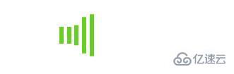
实例示范:制作一个柱状动画加载效果,条纹由长变短再变长,具体代码如下:
HTML部分:
<div class="box">
   <div class="r1"></div>
   <div class="r2"></div>
   <div class="r3"></div>
   <div class="r4"></div>
   <div class="r5"></div>
</div>CSS部分:
.box {
    margin: 100px auto;
    width: 50px;
    height: 60px;
   }
   .box>div {
    background-color: #67CF22;
    height: 100%;
    width: 6px;
    display: inline-block;
    -webkit-animation: stretchdelay 1.2s infinite ease-in-out;
    animation: stretchdelay 1.2s infinite ease-in-out;
   }
   .box .r2 {
    -webkit-animation-delay: -1.1s;
    animation-delay: -1.1s;
   }
   .box .r3 {
    -webkit-animation-delay: -1.0s;
    animation-delay: -1.0s;
   }
   .box .r4 {
    -webkit-animation-delay: -0.9s;
    animation-delay: -0.9s;
   }
   .box .r5 {
    -webkit-animation-delay: -0.8s;
    animation-delay: -0.8s;
   }
   @-webkit-keyframes stretchdelay {
    0%,
    40%,
    100% {
     -webkit-transform: scaleY(0.4)
    }
    20% {
     -webkit-transform: scaleY(1.0)
    }
   }
   @keyframes stretchdelay {
    0%,
    40%,
    100% {
     transform: scaleY(0.4);
     -webkit-transform: scaleY(0.4);
    }
    20% {
     transform: scaleY(1.0);
     -webkit-transform: scaleY(1.0);
    }
}效果如图所示:
看完上述内容,你们掌握如何使用纯CSS3实现页面loading加载动画效果的方法了吗?如果还想学到更多技能或想了解更多相关内容,欢迎关注亿速云行业资讯频道,感谢各位的阅读!
亿速云「云服务器」,即开即用、新一代英特尔至强铂金CPU、三副本存储NVMe SSD云盘,价格低至29元/月。点击查看>>
免责声明:本站发布的内容(图片、视频和文字)以原创、转载和分享为主,文章观点不代表本网站立场,如果涉及侵权请联系站长邮箱:is@yisu.com进行举报,并提供相关证据,一经查实,将立刻删除涉嫌侵权内容。


 计算
计算
 安全
安全 数据库
数据库 网络和加速
网络和加速 企业服务
企业服务


