这篇“纯CSS3+DIV怎么实现小三角形边框效果”文章,文中示例代码介绍的非常详细,具有一定的参考价值,感兴趣的小伙伴们一定要参考一下,对于“纯CSS3+DIV怎么实现小三角形边框效果”,小编整理了以下知识点,请大家跟着小编的步伐一步一步的慢慢理解,接下来就让我们进入主题吧。
具体代码如下所示:
html代码是这样的
<div class="arrow-up">
     <!--向上的三角-->
</div>
<div class="arrow-down">
    <!--向下的三角-->
</div>
<div class="arrow-left">
    <!--向左的三角-->
</div>
<div class="arrow-right">
    <!--向右的三角-->
</div>

下面用CSS3分别实现向上、下、左、右的三角形
/*箭头向上*/
.arrow-up {
    width:0;
    height:0;
    border-left:30px solid transparent;
    border-right:30px solid transparent;
    border-bottom:30px solid #fff;
}

 /*箭头向下*/
.arrow-down {
    width:0;
    height:0;
    border-left:20px solid transparent;
    border-right:20px solid transparent;
    border-top:20px solid #0066cc;
}

 /*箭头向左*/
.arrow-left {
    width:0;
    height:0;
    border-top:30px solid transparent;
    border-bottom:30px solid transparent;
    border-right:30px solid yellow;
}

/*箭头向右*/
.arrow-right {
    width:0;
    height:0;
    border-top:50px solid transparent;
    border-bottom: 50px solid transparent;
    border-left: 50px solid green;
}小程序示例
wxml
<view class="index_sale_lists">
<view class="sanjiao"></view>
<view class="index_sale_list">
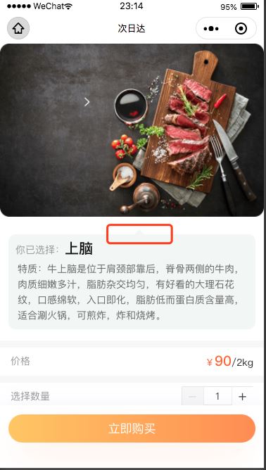
<view class="index_sale_choice">你已选择:<text>上脑</text></view>
<view class="index_sale_tezhi">
<text>
特质:牛上脑是位于肩颈部靠后,脊骨两侧的牛肉,肉质细嫩多汁,脂肪杂交均匀,有好看的大理石花纹,口感绵软,入口即化,脂肪低而蛋白质含量高,适合涮火锅,可煎炸,炸和烧烤。
</text>
</view>
</view>
</view>wxss
.index_sale_lists{
  margin: 50rpx 24rpx 0;
  background-color: #F2F6F4;
  border-radius: 20rpx;
  position: relative;
}
.sanjiao{
    position: absolute;
    left: 50%;
    top:-15rpx;
    width:0;
    height:0;
    border-left:10px solid transparent;
    border-right:10px solid transparent;
    border-bottom:10px solid #F2F6F4;
    /* z-index:-1; */
}以上是“纯CSS3+DIV怎么实现小三角形边框效果”这篇文章的所有内容,感谢各位的阅读!相信大家都有了一定的了解,希望分享的内容对大家有所帮助,如果还想学习更多知识,欢迎关注亿速云行业资讯频道!
亿速云「云服务器」,即开即用、新一代英特尔至强铂金CPU、三副本存储NVMe SSD云盘,价格低至29元/月。点击查看>>
免责声明:本站发布的内容(图片、视频和文字)以原创、转载和分享为主,文章观点不代表本网站立场,如果涉及侵权请联系站长邮箱:is@yisu.com进行举报,并提供相关证据,一经查实,将立刻删除涉嫌侵权内容。
原文链接:https://www.jb51.net/css/738583.html


 计算
计算
 安全
安全 数据库
数据库 网络和加速
网络和加速 企业服务
企业服务


