利用css3功能强大,我们可以直接完成旋转动画的制作,而跳过复杂的javascript。
html代码如下:demo01.html
  <!DCTYPE html>
      <head>
          <meta type="utf-8"/>
          <title>旋转动画</title>
          <link rel="stylesheet" type="text/css" href="demo01.css">
      </head>
      <body>
          <div class="container">
              <div id="around">
                  <figure>1<figure>
                  <figure>2<figure>
                  <figure>3<figure>
                  <figure>4<figure>
                  <figure>5<figure>
                  <figure>6<figure>
                  <figure>7<figure>
                  <figure>8<figure>
                  <figure>9<figure>
              </div>
          </div>
      </body>
  </html>


  css代码如下:demo01.css
  .container{
      width:210px;
      height:140px;
      position:relative;
      //3d视距,当为元素定义 perspective 属性时,其子元素会获得透视效果,而不是元素本身
      perspective:1000px;
      margin:50px auto 40px;
  }
  #around{
      width:100%;
      height:100%;
      //规定如何在 3D 空间中呈现被嵌套的元素
      transform-style:preserve-3d;
      position:absolute;
      //定义动画
      animation:myMove 10s infinite;
  }
  #around figure{
      display:block;
      position:relative;
      width:186px;
      height:116px;
      left:10px;
      top:10px;
      border:2px solid black;
      text-align:center;
      color:white;
      font-weight:bold;
      //与高度相等,使内容垂直居中显示
      line-height:116px;
  }
  #around figure:nth-child(1){
      transform: rotateY(0deg) translateZ(288px);
      background-color:red;
  }
   #around figure:nth-child(2){
      transform: rotateY(40deg) translateZ(288px);
      background-color:orange;
  }
   #around figure:nth-child(3){
      transform: rotateY(80deg) translateZ(288px);
      background-color:yellow;
  }
   #around figure:nth-child(4){
      transform: rotateY(120deg) translateZ(288px);
      background-color:green;
  }
   #around figure:nth-child(5){
      transform: rotateY(160deg) translateZ(288px);
      background-color:darkgreen;
  }
   #around figure:nth-child(6){
      transform: rotateY(200deg) translateZ(288px);
      background-color:blue;
  }
   #around figure:nth-child(7){
      transform: rotateY(240deg) translateZ(288px);
      background-color:purple;
  }
   #around figure:nth-child(8){
      transform: rotateY(280deg) translateZ(288px);
      background-color:navy;
  }
   #around figure:nth-child(9){
      transform: rotateY(320deg) translateZ(288px);
      background-color:pink;
  }
  #keyframes myMove{
    from{
      transform: rotateY(360deg);
    }
    to{
     transform: rotateY(0deg);
    }
}完成后的图示如下:
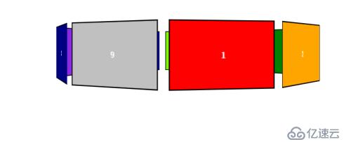
图片可以自动旋转。修改animation属性里的值可以实现无限循环(infinite)和多次循环(ease n).
如:animation:myMove 10s ease 2. myMove为动画函数,10s为完成动画所用时间。
亿速云「云服务器」,即开即用、新一代英特尔至强铂金CPU、三副本存储NVMe SSD云盘,价格低至29元/月。点击查看>>
免责声明:本站发布的内容(图片、视频和文字)以原创、转载和分享为主,文章观点不代表本网站立场,如果涉及侵权请联系站长邮箱:is@yisu.com进行举报,并提供相关证据,一经查实,将立刻删除涉嫌侵权内容。


 计算
计算
 安全
安全 数据库
数据库 网络和加速
网络和加速 企业服务
企业服务


