这篇文章主要介绍了使用CSS制作箭头符号的方法,具有一定借鉴价值,需要的朋友可以参考下。希望大家阅读完这篇文章后大有收获。下面让小编带着大家一起了解一下。
箭头符号我们是经常可以看到的,那么我们如何在不利用图像的情况下使用CSS制作箭头符号呢?
话不多说,下面我们直接来看正文~
用CSS制作的箭头图标的方法
只需要使用CSS就可以创建箭头而不需要利用图像
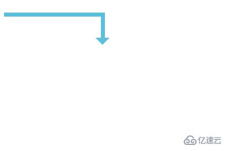
首先,让我们来看看如何实现一个箭头,我将来制作一个从左上角到右下角的L形箭头。
一个直角转弯的箭头。
代码如下
HTML代码
<!DOCTYPE html>
<html>
  <head>
  <meta charset="utf-8">
    <title>CSS arrow</title>
    <link rel="stylesheet" type="text/css" href="sample.css">
   <meta http-equiv="Content-Type" content="text/html" charset="UTF-8">
  </head>
  <body>
   <div class="arrow"></div>
  </body>
</html>CSS代码
sample.css
.arrow{
  position: relative;
  width: 200px;
  height: 50px;
  border-top: 8px solid #5bc0de;
  border-right: 8px solid #5bc0de;
  box-sizing: border-box;
}
.arrow::after{
  content: "";
  position: absolute;
  bottom: -14px;
  right: -17px;
  border-top: 14px solid #5bc0de;
  border-left: 14px solid transparent;
  border-right: 14px solid transparent;
}运行结果
在浏览器上显示如下效果
接下来介绍的几种箭头符号的制作HTML代码与上述相同,我们主要通过更改CSS代码来实现
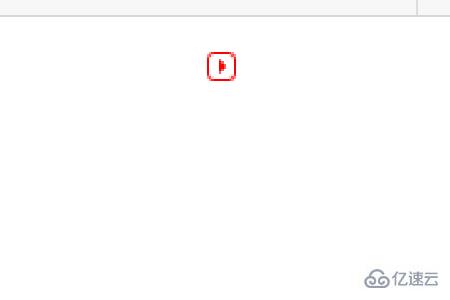
三角形的箭头
CSS代码
.arrow{
  position: relative;
  display: inline-block;
  padding: 0 0 0 16px;
  color: #000;
  vertical-align: middle;
  text-decoration: none;
  font-size: 15px;
}

.arrow::before{
  position: absolute;
  top: 0;
  bottom: 0;
  left: 0;
  margin: auto;
  content: "";
  vertical-align: middle;
  box-sizing: border-box;
  width: 12px;
  height: 12px;
  border: 1px solid #ff0000;
  -webkit-border-radius: 25%;
  border-radius: 25%;
}

.arrow::after{
  position: absolute;
  top: 0;
  bottom: 0;
  left: 0;
  margin: auto;
  content: "";
  vertical-align: middle;
  left: 5px;
  box-sizing: border-box;
  width: 3px;
  height: 3px;
  border: 3px solid transparent;
  border-left: 3px solid #ff0000;
}运行效果如下
将显示一个带有红色三角形的图标
“大于号”的箭头
CSS代码
.arrow{
  position: relative;
  display: inline-block;
  padding-left: 20px;
}

.arrow::before{
  content: '';
  width: 6px;
  height: 6px;
  border: 0px;
  border-top: solid 2px #5bc0de;
  border-right: solid 2px #5bc0de;
  -ms-transform: rotate(45deg);
  -webkit-transform: rotate(45deg);
  transform: rotate(45deg);
  position: absolute;
  top: 50%;
  left: 0;
  margin-top: -4px;
}运行结果
在浏览器上运行效果如下
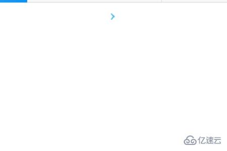
在网页上这个箭头符号是经常可以用到的
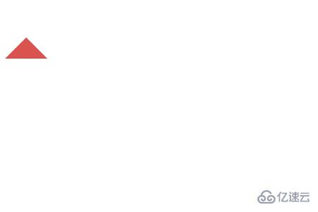
制作向上的箭头
CSS代码
.arrow{
  width: 0px;
  border-color: #d9534f;
  border-style: solid;
  border-width: 30px;
  border-left-color: transparent;
  border-top-color: transparent;
  border-right-color: transparent;
}运行效果
在浏览器上显示如下效果
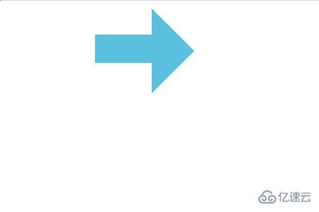
最后我们来看一下传统向右的箭头符号
CSS代码
.arrow {
  display:inline-block;
  height:40px;
  width:80px;
  background-color:#5bc0de;
  position:relative;
  top:40px;
}

.arrow:before {
  position:absolute;
  content:"";
  width:0;
  height:0;
  border:60px solid transparent;
  border-left:60px solid #5bc0de;
  left:80px;
  top:-37px;
}运行结果
在浏览器上将显示如下所示的效果
感谢你能够认真阅读完这篇文章,希望小编分享使用CSS制作箭头符号的方法内容对大家有帮助,同时也希望大家多多支持亿速云,关注亿速云行业资讯频道,遇到问题就找亿速云,详细的解决方法等着你来学习!
亿速云「云服务器」,即开即用、新一代英特尔至强铂金CPU、三副本存储NVMe SSD云盘,价格低至29元/月。点击查看>>
免责声明:本站发布的内容(图片、视频和文字)以原创、转载和分享为主,文章观点不代表本网站立场,如果涉及侵权请联系站长邮箱:is@yisu.com进行举报,并提供相关证据,一经查实,将立刻删除涉嫌侵权内容。


 计算
计算
 安全
安全 数据库
数据库 网络和加速
网络和加速 企业服务
企业服务


