小编给大家分享一下css实现圆与边框旋转动画的案例,相信大部分人都还不怎么了解,因此分享这篇文章给大家参考一下,希望大家阅读完这篇文章后大有收获,下面让我们一起去了解一下吧!
<div id="box">
    <div class="circle-out">
        <div class="circle-inner"> </div>
    </div>
    <div class="circle-part">
    </div>
    <div class="part1">
    </div>
</div> #box {
height:200px;
width:200px;
}
.circle-out{
height: inherit;
width: inherit;
display: inline-block;
text-align: center;
border: 20px solid blue;
border-radius: 50%;
}
/* 绘制弧形 */
.circle-part{
display: inline-block;
position: relative;
width:0px;
height: 0px;
border-radius: 50%;
border: 100px solid #0000ff05;
border-top: 100px solid blue;
top: -220px;
left: 20px;
transform: rotate(0deg);
animation: run-part 5s infinite;
}
.part1{
height: 0px;
width: 0px;
border-radius: 50%;
border:100px solid #fafafa;
border-top: 100px solid #ff000000;
position: relative;
top: -420px;
left: 20px;
transform: rotate(45deg);
animation: run-part1 5s infinite;
}
.circle-inner{
height: 0px;
width: 0px;
display: inline-block;
border-radius: 50%;
border: 20px solid blue;
top: 80px;
position: relative;
z-index: 1000;
}
@-webkit-keyframes run-part1{
0%{
transform: rotate(45deg);
}
100% {
transform: rotate(405deg);
}
}
@-webkit-keyframes run-part{
0%{
transform: rotate(0deg);
}
100% {
transform: rotate(360deg);
}
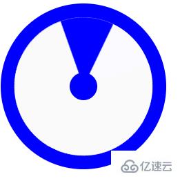
}从外观看到,该图形大致由:外圆,内圆及构扇形构成。
在本示例中,主要采用一个p,设置高与宽,背景不设置或白色。设置 border-radius为50%外圆圈,使用边框构成从而形成外圈。
.circle-out{
    height: inherit;
    width: inherit;
    border: 20px solid blue;
    display: inline-block;
    border-radius: 50%;
    text-align: center;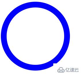
}效果图 :
内圆很简单,也是使用border完成的圆,设置boder-radius:50%实现的圆的效果,最后就是一个定位的事情。
扇形,在本示例中,实现的思路也是拼凑,外加旋转,利用边框border实现。
  .circle-part{
        //(1)
        display: inline-block;
        width:0px;
        height: 0px;

        //(2)
        border-radius: 50%;
        border: 100px solid #0000ff05;
        border-top: 100px solid blue;

        //(3)
        position: relative;
        top: -220px;
        left: 20px;

        //(4)
        transform: rotate(0deg);
        animation: run-part 5s infinite;
}如上代码:
分为(1)、(2)、(3)、(4)部分,出去固定形状、动画外,比较重要的就在于(2)部分。
先绘制出1/4的圆(边框)。其他另外3/4的扇形以透明绘制。
相同的,另外使用另外一个圆进行相同的处理,这样两个圆就能重叠在一起,唯一不同的是:第二个圆设置那3/4圆作为白色,1/4设置为透明色。
这时,呈现的为1/4的扇形,背景为blue,而因为透明的原因1/4是完全暴露的。
最后,由于最后的圆为顶层元素,所以当顶层元素发生旋转时,蓝色的扇形部分就会被顶层元素那3/4的扇形区域所遮蔽。从而达到最后的效果。
代码最后加上自己的动画,实现最后的效果。
以上是css实现圆与边框旋转动画的案例的所有内容,感谢各位的阅读!相信大家都有了一定的了解,希望分享的内容对大家有所帮助,如果还想学习更多知识,欢迎关注亿速云行业资讯频道!
亿速云「云服务器」,即开即用、新一代英特尔至强铂金CPU、三副本存储NVMe SSD云盘,价格低至29元/月。点击查看>>
免责声明:本站发布的内容(图片、视频和文字)以原创、转载和分享为主,文章观点不代表本网站立场,如果涉及侵权请联系站长邮箱:is@yisu.com进行举报,并提供相关证据,一经查实,将立刻删除涉嫌侵权内容。


 计算
计算
 安全
安全 数据库
数据库 网络和加速
网络和加速 企业服务
企业服务


