小编给大家分享一下怎么使用纯CSS实现一把剪刀的效果,相信大部分人都还不怎么了解,因此分享这篇文章给大家参考一下,希望大家阅读完这篇文章后大有收获,下面让我们一起去了解一下吧!
https://github.com/comehope/front-end-daily-challenges
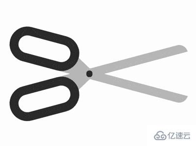
定义 dom,容器中包含 2 个 .half 元素,各表示剪刀的半边,它的子元素 handle 表示刀柄,blade 表示刀,最后的 .joint 表示连接左右两部分铆钉:
<figure class="scissors">
    <div class="half">
        <span class="handle"></span>
        <span class="blade"></span>
    </div>
    <div class="half">
        <span class="blade"></span>
        <span class="handle"></span>
    </div>
    <div class="joint"></div>
</figure>居中显示:
body {
    margin: 0;
    height: 100vh;
    display: flex;
    align-items: center;
    justify-content: center;
}定义容器尺寸,其中 outline 是辅助线:
.scissors {
    width: 21em;
    height: 7em;
    outline: 1px dashed;
}定义半边剪刀的尺寸,其中 outline 是辅助线:
.scissors {
    position: relative;
}

.half {
    position: absolute;
    width: inherit;
    height: 4em;
    outline: 1px dashed red;
}画出刀柄:
.handle {
    position: absolute;
    box-sizing: border-box;
    width: 8em;
    height: inherit;
    border: 1em solid #333;
    border-radius: 2em;
}画出刀,用圆角属性画出了顶部的刀尖:
.blade {
    position: absolute;
    width: 15em;
    height: 1em;
    background-color: silver;
    top: 3em;
    left: 6em;
    border-radius: 0 0 1em 0;
    z-index: -1;
}用伪元素在刀的底部画一个三角形,使刀与刀柄连接得更牢固:
.blade::before {
    content: '';
    position: absolute;
    border-style: solid;
    border-width: 0 1.8em 1em 1.8em;
    border-color: transparent transparent silver transparent;
    top: -1em;
    left: 0.2em;
}使半边刀倾斜:
.half {
    transform-origin: 45% bottom;
    transform: rotate(15deg);
}利用 scale() 函数画出剪刀的另一半:
.half {
    transform-origin: 45% bottom;
    transform: rotate(calc(15deg * var(--direction))) scaleY(var(--direction));
}

.half:nth-child(1) {
    --direction: 1;
    top: 0;
}

.half:nth-child(2) {
    --direction: -1;
    top: -1em;
}画出连接左右半边的铆钉:
.joint {
    position: absolute;
    width: 0.7em;
    height: 0.7em;
    background-color: #333;
    border-radius: 50%;
    top: calc(50% - 0.7em / 2);
    left: 45%;
}增加动画鼠标悬停时的动画效果:
.scissors:hover .half {
    animation: cut 2s ease-out;
}

@keyframes cut {
    20%, 60% {
        transform: rotate(calc(30deg * var(--direction))) scaleY(var(--direction));
    }

    40%, 80% {
        transform: rotate(calc(5deg * var(--direction))) scaleY(var(--direction));
    }
}最后,别忘了删掉辅助线。
以上是怎么使用纯CSS实现一把剪刀的效果的所有内容,感谢各位的阅读!相信大家都有了一定的了解,希望分享的内容对大家有所帮助,如果还想学习更多知识,欢迎关注亿速云行业资讯频道!
亿速云「云服务器」,即开即用、新一代英特尔至强铂金CPU、三副本存储NVMe SSD云盘,价格低至29元/月。点击查看>>
免责声明:本站发布的内容(图片、视频和文字)以原创、转载和分享为主,文章观点不代表本网站立场,如果涉及侵权请联系站长邮箱:is@yisu.com进行举报,并提供相关证据,一经查实,将立刻删除涉嫌侵权内容。


 计算
计算
 安全
安全 数据库
数据库 网络和加速
网络和加速 企业服务
企业服务


