今天就跟大家聊聊有关纯CSS如何实现一个沙漏的动画效果,可能很多人都不太了解,为了让大家更加了解,小编给大家总结了以下内容,希望大家根据这篇文章可以有所收获。
https://github.com/comehope/front-end-daily-challenges
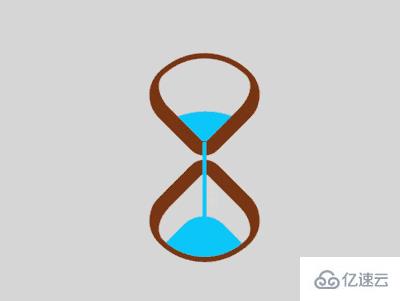
定义 dom,容器中包含 2 个元素,分别代表沙漏的上半部和下半部:
<div class="loader">
    <span class="top"></span>
    <span class="bottom"></span>
</div>
居中显示:
body {
    margin: 0;
    height: 100vh;
    display: flex;
    align-items: center;
    justify-content: center;
    background-color: gainsboro;
}
定义容器尺寸,并设置子元素整体布局:
.loader {
    width: 4.3em;
    height: 9.8em;
    font-size: 10px;
    position: relative;
    display: flex;
    flex-direction: column;
    align-items: center;
    justify-content: space-between;
}
画出 2 个正方形:
.top,
.bottom {
    width: 3.5em;
    height: 3.5em;
    border-style: solid;
    border-color: saddlebrown;
}
通过边框、圆角和旋转,把 2 个正方形变成沙漏形状:
.top,
.bottom {
    border-width: 0.2em 0.2em 0.6em 0.6em;
    border-radius: 50% 100% 50% 30%;
}

.top {
    transform: rotate(-45deg);
}

.bottom {
    transform: rotate(135deg);
}
用伪元素画出沙子,上部的沙子的顶部是大圆弧,下部的沙子的顶部是小圆弧:
.top::before,
.bottom::before {
    content: '';
    position: absolute;
    width: inherit;
    height: inherit;
    background-color: deepskyblue;
}

.top::before {
    border-radius: 0 100% 0 0;
}

.bottom::before {
    border-radius: 0 0 0 35%;
}
定义沙子的动画属性:
.top::before,
.bottom::before {
    animation: 2s linear infinite;
}
增加沙子从沙漏的上半部落下的动画效果:
.top::before {
    animation-name: drop-sand;
}

@keyframes drop-sand {
    to {
        transform: translate(-2.5em, 2.5em);
    }
}
增加沙子的沙漏在下半部堆积的动画效果:
.bottom::before {
    transform: translate(2.5em, -2.5em);
    animation-name: fill-sand;
}

@keyframes fill-sand {
    to {
        transform: translate(0, 0);
    }
}
隐藏沙漏上半部和下半部容器外的部分,此时上面 2 个动画的叠加效果是沙子从上半部漏下,慢慢在下半部堆积:
.top,
.bottom {
    overflow: hidden;
}
用外层容器的伪元素制作一个窄长条,模拟流动的沙子:
.loader::after {
    content: '';
    position: absolute;
    width: 0.2em;
    height: 4.8em;
    background-color: deepskyblue;
    top: 1em;
}
增加沙子流动的动画效果:
.loader::after {
    animation: flow 2s linear infinite;
}

@keyframes flow {
    10%, 100% {
        transform: translateY(3.2em);
    }
}
最后,增加沙漏的翻转动画:
.loader {
    animation: rotating 2s linear infinite;
}

@keyframes rotating {
    0%, 90% {
        transform: rotate(0);
    }

    100% {
        transform: rotate(0.5turn);
    }
}
大功告成!
看完上述内容,你们对纯CSS如何实现一个沙漏的动画效果有进一步的了解吗?如果还想了解更多知识或者相关内容,请关注亿速云行业资讯频道,感谢大家的支持。
免责声明:本站发布的内容(图片、视频和文字)以原创、转载和分享为主,文章观点不代表本网站立场,如果涉及侵权请联系站长邮箱:is@yisu.com进行举报,并提供相关证据,一经查实,将立刻删除涉嫌侵权内容。


