实现思路:
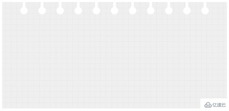
网格背景,由css3的线性渐变来实现。
纸上的打孔,由圆和圆柱组成,多个打孔,可以由box-shadow的平铺来实现。
实际代码:
<!DOCTYPE html>
<html>
<head>
  <meta charset="UTF-8">
  <title>Title</title>
<style>
.bg-grid {
    height: 400px;
    padding: 10px;
    padding-top: 64px;
    background-color: #efefef;
    background-image:   linear-gradient(#e7e6e6 1px, transparent 0),
                        linear-gradient(90deg, #e7e6e6 1px, transparent 0);
    background-size: 21px 21px, 21px 21px;
    background-position: center;
}

.bg-grid:before,
.bg-grid:after{
    content: '';
    position: absolute;
    z-index: 0;
    left: 50%;
    transform: translateX(-50%);
    display: inline-block;
    background-color: #fff;
    height: 28px;
    box-shadow: 68px 0 0 0 #fff,
                calc(68px * 2) 0 0 0 #fff,
                calc(68px * 3) 0 0 0 #fff,
                calc(68px * 4) 0 0 0 #fff,
                calc(68px * 5) 0 0 0 #fff,
                -68px 0 0 0 #fff,
                calc(68px * -2) 0 0 0 #fff,
                calc(68px * -3) 0 0 0 #fff,
                calc(68px * -4) 0 0 0 #fff,
                calc(68px * -5) 0 0 0 #fff;
}
.bg-grid:before {
    top: 0;
    width: 10px;
}

.bg-grid:after {
    top: 26px;
    width: 28px;
    border-radius: 50%;
}
.bg-grid{

}
</style>
</head>
<body>
<div></div>

</body>
</html>
以上就是纯css3实现信纸/同学录效果(代码示例)的详细内容,更多请关注亿速云其它相关文章!
免责声明:本站发布的内容(图片、视频和文字)以原创、转载和分享为主,文章观点不代表本网站立场,如果涉及侵权请联系站长邮箱:is@yisu.com进行举报,并提供相关证据,一经查实,将立刻删除涉嫌侵权内容。


