这篇文章主要介绍了Android如何实现图片一边的三角形边框效果,具有一定借鉴价值,感兴趣的朋友可以参考下,希望大家阅读完这篇文章之后大有收获,下面让小编带着大家一起了解一下。
在每一个图片的某一侧都可以展示出一个三角形的边框视图,就是咱们的三角形标签视图。这个视图在电商类APP当中比较常用,使用过ebay的同学应该都还记得有些商品的左上角或者右上角都会显示一个三角形的边框,用于给人一个直观的商品正在促销,或者刚刚上线的直观感受。我们可以看看实现后的效果如下:
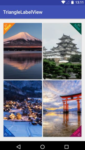
在真实的APP当中,我们还会加上一个SrcollView控件,这样子才可以进行不断地上下浏览。我们这里主要是为了让大家明白这个视图是该如何实现的,就不演示SrcollView控件下的做法了,直接在线性布局下做一个简单的说明。由于在线性布局上面一共具有四张图,因此咱们可以先单独编写每一个imageview的自定义view,然后<include>的语法将他们组合起来,这样可以提高UI开发的效率,进行协同工作与开发。首先咱们先实现左上角和右上角的triangle view.
在build.gradle文件当中相应地方添加如下代码,导入相应的maven库:
allprojects {
    repositories {
      ...
      maven { url "https://jitpack.io" }
    }
}之后在另一个build.gradle文件当中添加库:
dependencies {
      implementation 'com.github.shts:TriangleLabelView:1.1.2'
}咱们的前期工作就这样做好啦,现在就开始正式编写咱们的每一个三角形边框视图啦,首先是第一个位于左上角的视图
一.card_left_top.xml:
<?xml version="1.0" encoding="utf-8"?>
<android.support.v7.widget.CardView xmlns:android="http://schemas.android.com/apk/res/android"
  xmlns:app="http://schemas.android.com/apk/res-auto"
  android:layout_width="match_parent"
  android:layout_height="match_parent">

  <RelativeLayout
    android:layout_width="match_parent"
    android:layout_height="match_parent">
    <ImageView
      android:id="@+id/image"
      android:scaleType="centerCrop"
      android:src="@drawable/s_image_2"
      android:layout_width="match_parent"
      android:layout_height="match_parent" />
    <jp.shts.android.library.TriangleLabelView
      android:layout_width="match_parent"
      android:layout_height="match_parent"
      android:layout_alignParentLeft="true"
      android:layout_alignParentTop="true"
      app:backgroundColor="@color/yellow_900"
      app:corner="leftTop"
      app:labelBottomPadding="5dp"
      app:labelCenterPadding="0dp"
      app:labelTopPadding="10dp"
      app:primaryText="New"
      app:primaryTextColor="@color/yellow_500"
      app:primaryTextSize="16sp"
      app:secondaryText="01"
      app:secondaryTextColor="@color/yellow_100"
      app:secondaryTextSize="11sp" />
  </RelativeLayout>
</android.support.v7.widget.CardView>编写好后在preview当中显示如下:

下面是位于右上角的视图
二.card_right_top.xml:
<?xml version="1.0" encoding="utf-8"?>
<android.support.v7.widget.CardView xmlns:android="http://schemas.android.com/apk/res/android"
  xmlns:app="http://schemas.android.com/apk/res-auto"
  android:layout_width="match_parent"
  android:layout_height="match_parent">

  <RelativeLayout
    android:layout_width="match_parent"
    android:layout_height="match_parent">
    <ImageView
      android:id="@+id/image"
      android:scaleType="centerCrop"
      android:src="@drawable/s_image_4"
      android:layout_width="match_parent"
      android:layout_height="match_parent" />
    <jp.shts.android.library.TriangleLabelView
      android:layout_width="match_parent"
      android:layout_height="match_parent"
      android:layout_alignParentRight="true"
      android:layout_alignParentTop="true"
      app:backgroundColor="@color/teal_900"
      app:corner="rightTop"
      app:labelBottomPadding="5dp"
      app:labelCenterPadding="0dp"
      app:labelTopPadding="10dp"
      app:primaryText="New"
      app:primaryTextColor="@color/teal_500"
      app:primaryTextSize="16sp"
      app:secondaryText="01"
      app:secondaryTextColor="@color/teal_100"
      app:secondaryTextSize="11sp" />
  </RelativeLayout>
</android.support.v7.widget.CardView>三.card_right_buttom.xml:
<?xml version="1.0" encoding="utf-8"?>
<android.support.v7.widget.CardView xmlns:android="http://schemas.android.com/apk/res/android"
  xmlns:app="http://schemas.android.com/apk/res-auto"
  android:layout_width="match_parent"
  android:layout_height="match_parent">

  <RelativeLayout
    android:layout_width="match_parent"
    android:layout_height="match_parent">
    <ImageView
      android:id="@+id/image"
      android:scaleType="centerCrop"
      android:src="@drawable/s_image_3"
      android:layout_width="match_parent"
      android:layout_height="match_parent" />
    <jp.shts.android.library.TriangleLabelView
      android:layout_width="match_parent"
      android:layout_height="match_parent"
      android:layout_alignParentRight="true"
      android:layout_alignParentBottom="true"
      app:backgroundColor="@color/pink_900"
      app:corner="rightBottom"
      app:labelTopPadding="10dp"
      app:labelCenterPadding="5dp"
      app:labelBottomPadding="0dp"
      app:primaryText="New"
      app:primaryTextColor="@color/pink_500"
      app:primaryTextSize="16sp"
      app:secondaryText="01"
      app:secondaryTextColor="@color/pink_100"
      app:secondaryTextSize="11sp" />
  </RelativeLayout>
</android.support.v7.widget.CardView>四.card_left_buttom.xml:
<?xml version="1.0" encoding="utf-8"?>
<android.support.v7.widget.CardView xmlns:android="http://schemas.android.com/apk/res/android"
  xmlns:app="http://schemas.android.com/apk/res-auto"
  android:layout_width="match_parent"
  android:layout_height="match_parent">

  <RelativeLayout
    android:layout_width="match_parent"
    android:layout_height="match_parent">
    <ImageView
      android:id="@+id/image"
      android:src="@drawable/s_image_1"
      android:scaleType="centerCrop"
      android:layout_width="match_parent"
      android:layout_height="match_parent" />
    <jp.shts.android.library.TriangleLabelView
      android:layout_width="match_parent"
      android:layout_height="match_parent"
      android:layout_alignParentLeft="true"
      android:layout_alignParentBottom="true"
      app:backgroundColor="@color/blue_900"
      app:corner="leftBottom"
      app:labelTopPadding="10dp"
      app:labelCenterPadding="5dp"
      app:labelBottomPadding="0dp"
      app:primaryText="New"
      app:primaryTextColor="@color/blue_500"
      app:primaryTextSize="16sp"
      app:secondaryText="01"
      app:secondaryTextColor="@color/blue_100"
      app:secondaryTextSize="11sp" />
</RelativeLayout>最后咱们整合一下就OK啦!整合后的主活动的代码为:
五.activity_main.xml:
<?xml version="1.0" encoding="utf-8"?>
<LinearLayout xmlns:android="http://schemas.android.com/apk/res/android"
  xmlns:tools="http://schemas.android.com/tools"
  xmlns:app="http://schemas.android.com/apk/res-auto"
  android:layout_width="match_parent"
  android:layout_height="match_parent"
  android:orientation="vertical"
  tools:context=".Fragment2">
 <LinearLayout
    android:layout_width="match_parent"
    android:layout_height="0dp"
    android:layout_weight="1"
    android:orientation="horizontal">
    <include android:layout_width="0dp"
      android:layout_height="match_parent"
      android:layout_weight="1"
      android:layout_margin="2dp"
      android:id="@+id/left_top" layout="@layout/card_left_top" />
    <include android:layout_width="0dp"
      android:layout_height="match_parent"
      android:layout_weight="1"
      android:layout_margin="2dp"
      android:id="@+id/right_top" layout="@layout/card_right_top" />
  </LinearLayout>
  <LinearLayout
    android:layout_width="match_parent"
    android:layout_height="0dp"
    android:layout_weight="1"
    android:orientation="horizontal">
    <include android:layout_width="0dp"
      android:layout_height="match_parent"
      android:layout_weight="1"
      android:layout_margin="2dp"
      android:id="@+id/left_bottom" layout="@layout/card_left_bottom" />
    <include android:layout_width="0dp"
      android:layout_height="match_parent"
      android:layout_weight="1"
      android:layout_margin="2dp"
      android:id="@+id/right_bottom" layout="@layout/card_right_bottom" />
  </LinearLayout>

</LinearLayout>帅照:

感谢你能够认真阅读完这篇文章,希望小编分享的“Android如何实现图片一边的三角形边框效果”这篇文章对大家有帮助,同时也希望大家多多支持亿速云,关注亿速云行业资讯频道,更多相关知识等着你来学习!
亿速云「云服务器」,即开即用、新一代英特尔至强铂金CPU、三副本存储NVMe SSD云盘,价格低至29元/月。点击查看>>
免责声明:本站发布的内容(图片、视频和文字)以原创、转载和分享为主,文章观点不代表本网站立场,如果涉及侵权请联系站长邮箱:is@yisu.com进行举报,并提供相关证据,一经查实,将立刻删除涉嫌侵权内容。


 计算
计算
 安全
安全 数据库
数据库 网络和加速
网络和加速 企业服务
企业服务


