这篇文章主要讲解了Android自定义View圆形进度条控件的方法,内容清晰明了,对此有兴趣的小伙伴可以学习一下,相信大家阅读完之后会有帮助。
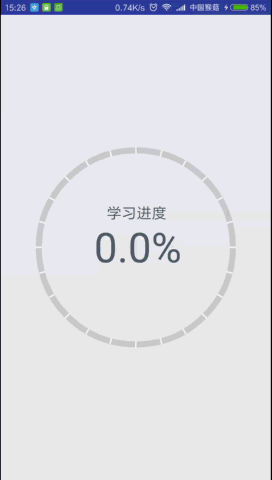
继续练习自定义View,这次带来的圆形进度条控件与之前的圆形百分比控件大同小异,这次涉及到了渐变渲染以及画布旋转等知识点,效果如下:
虽然步骤类似,但是我还是要写,毕竟基础的东西就是要多练
1、在res/values文件夹下新建attrs.xml文件,编写自定义属性:
<?xml version="1.0" encoding="utf-8"?>
<resources>
<declare-styleable name="CircleProgressView">
<!-- 弧线宽度 -->
<attr name="arcWidth" format="dimension" />
<!-- 刻度个数 -->
<attr name="scaleCount" format="integer" />
<!-- 渐变起始颜色 -->
<attr name="startColor" format="color" />
<!-- 渐变终止颜色 -->
<attr name="endColor" format="color" />
<!-- 标签说明文本 -->
<attr name="labelText" format="string" />
<!-- 文本颜色 -->
<attr name="textColor" format="color" />
<!-- 百分比文本字体大小 -->
<attr name="progressTextSize" format="dimension" />
<!-- 标签说明字体大小 -->
<attr name="labelTextSize" format="dimension" />
</declare-styleable>
</resources>2、新建CircleProgressView继承View,重写构造方法:
 public CircleProgressView(Context context) {
 this(context, null);
 }

 public CircleProgressView(Context context, AttributeSet attrs) {
 this(context, attrs, 0);
 }

 public CircleProgressView(Context context, AttributeSet attrs, int defStyleAttr) {
 super(context, attrs, defStyleAttr);
}3、在第三个构造方法中获取自定义属性的值:
 TypedArray ta = context.obtainStyledAttributes(attrs, R.styleable.CircleProgressView, defStyleAttr, 0);
 mArcWidth = ta.getDimension(R.styleable.CircleProgressView_arcWidth, DensityUtils.dp2px(context, 8));
 mScaleCount = ta.getInteger(R.styleable.CircleProgressView_scaleCount, 24);
 mStartColor = ta.getColor(R.styleable.CircleProgressView_startColor, Color.parseColor("#3FC199"));
 mEndColor = ta.getColor(R.styleable.CircleProgressView_endColor, Color.parseColor("#3294C1"));
 mColorArray = new int[]{mStartColor, mEndColor};
 mLabelText = ta.getString(R.styleable.CircleProgressView_labelText);
 mTextColor = ta.getColor(R.styleable.CircleProgressView_textColor, Color.parseColor("#4F5F6F"));
 mProgressTextSize = ta.getDimension(R.styleable.CircleProgressView_progressTextSize, 160);
 mLabelTextSize = ta.getDimension(R.styleable.CircleProgressView_labelTextSize, 64);
ta.recycle();4、创建画图所使用的对象,如Paint、Rect、RectF:
 mArcBackPaint = new Paint(Paint.ANTI_ALIAS_FLAG);
 mArcBackPaint.setStyle(Paint.Style.STROKE);
 mArcBackPaint.setStrokeWidth(mArcWidth);
 mArcBackPaint.setColor(Color.LTGRAY);

 mArcForePaint = new Paint(Paint.ANTI_ALIAS_FLAG);
 mArcForePaint.setStyle(Paint.Style.STROKE);
 mArcForePaint.setStrokeWidth(mArcWidth);

 mArcRectF = new RectF();

 mLinePaint = new Paint(Paint.ANTI_ALIAS_FLAG);
 mLinePaint.setStyle(Paint.Style.STROKE);
 mLinePaint.setColor(Color.WHITE);
 mLinePaint.setStrokeWidth(DensityUtils.dp2px(context, 2));

 mProgressTextPaint = new Paint(Paint.ANTI_ALIAS_FLAG);
 mProgressTextPaint.setStyle(Paint.Style.FILL);
 mProgressTextPaint.setColor(mTextColor);
 mProgressTextPaint.setTextSize(mProgressTextSize);

 mLabelTextPaint = new Paint(Paint.ANTI_ALIAS_FLAG);
 mLabelTextPaint.setStyle(Paint.Style.FILL);
 mLabelTextPaint.setColor(mTextColor);
 mLabelTextPaint.setTextSize(mLabelTextSize);

mTextRect = new Rect();5、重写onMeasure()方法,计算自定义View的宽高:
 @Override
 protected void onMeasure(int widthMeasureSpec, int heightMeasureSpec) {
 setMeasuredDimension(measuredDimension(widthMeasureSpec), measuredDimension(heightMeasureSpec));
 }

 private int measuredDimension(int measureSpec) {
 int result;
 int mode = MeasureSpec.getMode(measureSpec);
 int size = MeasureSpec.getSize(measureSpec);
 if (mode == MeasureSpec.EXACTLY) {
 result = size;
 } else {
 result = 800;
 if (mode == MeasureSpec.AT_MOST) {
 result = Math.min(result, size);
 }
 }
 return result;
}6、重写onDraw()方法,绘制圆弧、刻度线和百分比文本、标签说明文本,注意坐标的计算:
 @Override
 protected void onDraw(Canvas canvas) {
 super.onDraw(canvas);
 mArcRectF.set(mArcWidth / 2, mArcWidth / 2, getWidth() - mArcWidth / 2, getHeight() - mArcWidth / 2);
 //画背景弧线
 canvas.drawArc(mArcRectF, -90, 360, false, mArcBackPaint);
 //设置渐变渲染
 LinearGradient linearGradient = new LinearGradient(getWidth() / 2, 0, getWidth() / 2, getHeight(), mColorArray, null, Shader.TileMode.CLAMP);
 mArcForePaint.setShader(linearGradient);
 //画百分比值弧线
 canvas.drawArc(mArcRectF, -90, mSweepAngle, false, mArcForePaint);
 //画刻度线
 for (int i = 0; i < mScaleCount; i++) {
 canvas.drawLine(getWidth() / 2, 0, getWidth() / 2, mArcWidth, mLinePaint);
 //旋转画布
 canvas.rotate(360 / mScaleCount, getWidth() / 2, getHeight() / 2);
 }
 //画百分比文本
 String progressText = mProgress + "%";
 mProgressTextPaint.getTextBounds(progressText, 0, progressText.length(), mTextRect);
 float progressTextWidth = mTextRect.width();
 float progressTextHeight = mTextRect.height();
 canvas.drawText(progressText, getWidth() / 2 - progressTextWidth / 2,
 getHeight() / 2 + progressTextHeight / 2, mProgressTextPaint);
 //画标签说明文本
 mLabelTextPaint.getTextBounds(mLabelText, 0, mLabelText.length(), mTextRect);
 canvas.drawText(mLabelText, getWidth() / 2 - mTextRect.width() / 2,
 getHeight() / 2 - progressTextHeight / 2 - mTextRect.height(), mLabelTextPaint);
}7、暴露一个动态设置百分比的方法:
 public void setProgress(float progress) {
 Log.e("--> ", progress + "");
 ValueAnimator anim = ValueAnimator.ofFloat(mProgress, progress);
 anim.setDuration((long) (Math.abs(mProgress - progress) * 20));
 anim.addUpdateListener(new ValueAnimator.AnimatorUpdateListener() {
 @Override
 public void onAnimationUpdate(ValueAnimator animation) {
 mProgress = (float) animation.getAnimatedValue();
 mSweepAngle = mProgress * 360 / 100;
 mProgress = (float) (Math.round(mProgress * 10)) / 10;//四舍五入保留到小数点后两位
 invalidate();
 }
 });
 anim.start();
}8、在activity_main.xml布局文件中使用该View:
<?xml version="1.0" encoding="utf-8"?>
<RelativeLayout xmlns:android="http://schemas.android.com/apk/res/android"
xmlns:cpv="http://schemas.android.com/apk/res-auto"
xmlns:tools="http://schemas.android.com/tools"
android:layout_width="match_parent"
android:layout_height="match_parent"
android:paddingBottom="@dimen/activity_vertical_margin"
android:paddingLeft="@dimen/activity_horizontal_margin"
android:paddingRight="@dimen/activity_horizontal_margin"
android:paddingTop="@dimen/activity_vertical_margin"
tools:context=".MainActivity">
<com.monkey.circleprogressview.CircleProgressView
android:id="@+id/circle_progress_view"
android:layout_width="wrap_content"
android:layout_height="wrap_content"
android:layout_centerInParent="true"
cpv:arcWidth="8dp"
cpv:endColor="#126b94"
cpv:labelText="学习进度"
cpv:labelTextSize="20sp"
cpv:progressTextSize="55sp"
cpv:scaleCount="24"
cpv:startColor="#12d699"
cpv:textColor="#4F5F6F" />
</RelativeLayout>9、在MainActivity中设置监听,传入百分比:
 final CircleProgressView view = (CircleProgressView) findViewById(R.id.circle_progress_view);
 view.setOnClickListener(new View.OnClickListener() {
 @Override
 public void onClick(View v) {
 float progress = (float) (Math.random() * 100);
 view.setProgress(progress);
 }
});看完上述内容,是不是对Android自定义View圆形进度条控件的方法有进一步的了解,如果还想学习更多内容,欢迎关注亿速云行业资讯频道。
亿速云「云服务器」,即开即用、新一代英特尔至强铂金CPU、三副本存储NVMe SSD云盘,价格低至29元/月。点击查看>>
免责声明:本站发布的内容(图片、视频和文字)以原创、转载和分享为主,文章观点不代表本网站立场,如果涉及侵权请联系站长邮箱:is@yisu.com进行举报,并提供相关证据,一经查实,将立刻删除涉嫌侵权内容。


 计算
计算
 安全
安全 数据库
数据库 网络和加速
网络和加速 企业服务
企业服务


