今天就跟大家聊聊有关android开发中使用view实现自定义一个进度条功能,可能很多人都不太了解,为了让大家更加了解,小编给大家总结了以下内容,希望大家根据这篇文章可以有所收获。
1、自定义属性:
<?xml version="1.0" encoding="utf-8"?> <resources> <declare-styleable name="CustomTitleView"> <attr name="mSpeed" format="integer" /> <attr name="mFirstColor" format="color" /> <attr name="mSecondColor" format="color" /> <attr name="mCircleWidth" format="dimension"/> <attr name="textSize" format="dimension"/> </declare-styleable> </resources>
2、在View的构造方法中获得我们自定义的属性
/**
 * 当前进度
 */
 private int mProgress;
 /**
 * 第一圈的颜色
 */
 private int mFirstColor;
 /**
 * 第二圈的颜色
 */
 private int mSecondColor;
 /**
 * 圈的宽度
 */
 private int mCircleWidth;
 /**
 * 速度
 */
 private int mSpeed;
 /**
 * 中间进度百分比的字符串的字体
 */
 private float textSize;
 private boolean isNext = false;
 private Paint mPaint;

 public CustomTitleView(Context context, AttributeSet attrs) {
  super(context, attrs);
  TypedArray typearray = context.obtainStyledAttributes(attrs, R.styleable.CustomTitleView);
  int count= typearray.getIndexCount();
  for(int i=0;i<count;i++){
   int attr =typearray.getIndex(i);
   switch(attr){
    case R.styleable.CustomTitleView_mFirstColor:
     mFirstColor=typearray.getColor(attr,Color.BLACK);
     break;
    case R.styleable.CustomTitleView_mSecondColor:
     mSecondColor=typearray.getColor(attr,Color.RED);
     break;
    case R.styleable.CustomTitleView_mCircleWidth:
     mCircleWidth = typearray.getDimensionPixelSize(attr,(int)TypedValue.applyDimension(
       TypedValue.COMPLEX_UNIT_PX,20,getResources().getDisplayMetrics()));
     break;

    case R.styleable.CustomTitleView_textSize:
     textSize = typearray.getDimensionPixelSize(attr,(int)TypedValue.applyDimension(
       TypedValue.COMPLEX_UNIT_PX,30,getResources().getDisplayMetrics()));
     break;
    case R.styleable.CustomTitleView_mSpeed:
     mSpeed = typearray.getInt(attr,100);// 默认100
     break;
   }
  }
  Log.v("----",mSpeed+"");
  typearray.recycle();
  mPaint = new Paint();
  new Thread()
  {
   public void run()
   {
    while (true)
    {
     mProgress++;
     if (mProgress == 360)
     {
      mProgress = 0;
      if (!isNext)
       isNext = true;
      else
       isNext = false;
     }
     postInvalidate();
     try
     {
      Thread.sleep(mSpeed);
     } catch (InterruptedException e)
     {
      e.printStackTrace();
     }
    }
   };
  }.start();
 }
3、直接重写onDraw,这不需要重写onMeasure
protected void onMeasure(int widthMeasureSpec, int heightMeasureSpec){
    super.onMeasure(widthMeasureSpec, heightMeasureSpec);
 }
 protected void onDraw(Canvas canvas)
 {
  /**
  * 画进度百分比
  */
  mPaint.setStrokeWidth(0);
  mPaint.setColor(Color.BLACK);
  mPaint.setTextSize(textSize);
  mPaint.setTypeface(Typeface.DEFAULT_BOLD); //设置字体
  int percent = (int)(((float)mProgress / (float)360) * 100);
  int centre = getWidth() / 2; // 获取圆心的x坐标
  int radius = centre - mCircleWidth / 2;// 半径
  float textWidth = mPaint.measureText(percent + "%"); //测量字体宽度,我们需要根据字体的宽度设置在圆环中间
  canvas.drawText(percent + "%",centre-textWidth/ 2,centre+textSize/2, mPaint); //画出进度百分比
  mPaint.setStrokeWidth(mCircleWidth); // 设置圆环的宽度
  mPaint.setAntiAlias(true); // 消除锯齿
  mPaint.setStyle(Paint.Style.STROKE); // 设置空心
  RectF oval = new RectF(centre - radius, centre - radius, centre + radius, centre + radius); // 用于定义的圆弧的形状和大小的界限
  if(isNext){
   mPaint.setColor(mSecondColor); // 设置圆环的颜色
   canvas.drawCircle(centre, centre, radius, mPaint); // 画出圆环
   mPaint.setColor(mFirstColor); // 设置圆环的颜色
   canvas.drawArc(oval, -90, mProgress, false, mPaint); // 根据进度画圆弧
  }else{
   mPaint.setColor(mFirstColor); // 设置圆环的颜色
   canvas.drawCircle(centre, centre, radius, mPaint); // 画出圆环
   mPaint.setColor(mSecondColor); // 设置圆环的颜色
   canvas.drawArc(oval, -90, mProgress, false, mPaint); // 根据进度画圆弧
  }
 }
activity_main.xml
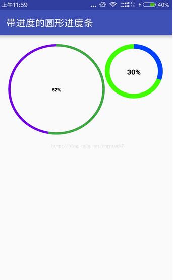
<?xml version="1.0" encoding="utf-8"?> <RelativeLayout xmlns:android="http://schemas.android.com/apk/res/android" xmlns:custom="http://schemas.android.com/apk/res-auto" android:layout_width="match_parent" android:layout_height="match_parent" android:padding="20dp" > <view.CustomTitleView android:layout_width="200dp" android:layout_height="400dp" custom:mSpeed="50" custom:mFirstColor="#7300e6" custom:mSecondColor="#39ac39" custom:mCircleWidth="10px" custom:textSize="20px" android:id="@+id/one" /> <view.CustomTitleView android:layout_toEndOf="@id/one" android:layout_width="200dp" android:layout_height="400dp" custom:mSpeed="100" custom:mFirstColor="#0040ff" custom:mSecondColor="#40ff00" custom:mCircleWidth="20px" custom:textSize="30px" /> </RelativeLayout>
效果预览
看完上述内容,你们对android开发中使用view实现自定义一个进度条功能有进一步的了解吗?如果还想了解更多知识或者相关内容,请关注亿速云行业资讯频道,感谢大家的支持。
免责声明:本站发布的内容(图片、视频和文字)以原创、转载和分享为主,文章观点不代表本网站立场,如果涉及侵权请联系站长邮箱:is@yisu.com进行举报,并提供相关证据,一经查实,将立刻删除涉嫌侵权内容。


