这篇文章给大家分享的是有关利用css实现鼠标悬停效果的方法的内容。小编觉得挺实用的,因此分享给大家做个参考。一起跟随小编过来看看吧。

我们先来看下效果:
html代码:
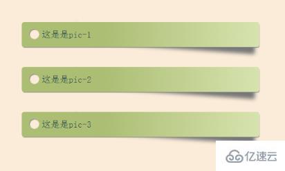
        <div class="box shadow">
            这是是pic-1
            <div class="circle"></div>
        </div>
        <div class="box shadow">
            这是是pic-2
            <div class="circle"></div>
        </div>
        <div class="box shadow">
            这是是pic-3
            <div class="circle"></div>
        </div>
css代码:
<style type="text/css">
html {
    box-sizing: border-box;
    font: 18px PT Mono;
    background: antiquewhite;
}

*,
*::before,
*::after {
    box-sizing: inherit;
}

body {
    display: flex;
    align-items: center;
    justify-content: center;
    flex-direction: column;
    width: 100%;
    height: 100vh;
}

.box {
    width: 25%;
    min-width: 250px;
    display: block;
    height: 50px;
    position: relative;
    border-radius: 5px;
    background: linear-gradient(to right, #abbd73 35%, #d6e2ad 100%);
    margin-bottom: 40px;
    padding: 15px 25px 0 40px;
    color: darkslategray;
    box-shadow: 1px 2px 1px -1px #777;
    transition: background 200ms ease-in-out;
}

.shadow {
    position: relative;
}

.shadow:before {
    z-index: -1;
    position: absolute;
    content: "";
    bottom: 13px;
    right: 7px;
    width: 75%;
    top: 0;
    box-shadow: 0 15px 10px #777;
    -webkit-transform: rotate(4deg);
    transform: rotate(4deg);
    transition: all 150ms ease-in-out;
}

.box:hover {
    background: linear-gradient(to right, #abbd73 0%, #abbd73 100%);
}

.shadow:hover::before {
    -webkit-transform: rotate(0deg);
    transform: rotate(0deg);
    bottom: 20px;
    z-index: -10;
}

.circle {
    position: absolute;
    top: 14px;
    left: 15px;
    border-radius: 50%;
    box-shadow: inset 1px 1px 1px 0px rgba(0, 0, 0, 0.5), inset 0 0 0 25px antiquewhite;
    width: 20px;
    height: 20px;
    display: inline-block;
}

</style>
感谢各位的阅读!关于利用css实现鼠标悬停效果的方法就分享到这里了,希望以上内容可以对大家有一定的帮助,让大家可以学到更多知识。如果觉得文章不错,可以把它分享出去让更多的人看到吧!
免责声明:本站发布的内容(图片、视频和文字)以原创、转载和分享为主,文章观点不代表本网站立场,如果涉及侵权请联系站长邮箱:is@yisu.com进行举报,并提供相关证据,一经查实,将立刻删除涉嫌侵权内容。


