这篇文章给大家介绍使用vue插件怎么样实现一个MessageBox功能,内容非常详细,感兴趣的小伙伴们可以参考借鉴,希望对大家能有所帮助。
1、实现toast插件封装(类似简易版的elementUi的message)
先书写一个toast组件
<template>
  <div ref="toastRef" class="toastMessageBox">{{ message }}</div>
</template>

<script lang="ts">
import { Component, Vue, Watch } from 'vue-property-decorator';
@Component({})
export default class toast extends Vue {
  message: string = '';
  type: string = '';

  mounted() {
    let ele: HTMLElement = <HTMLElement>this.$refs.toastRef;
    if (this.type === 'success') {
      ele.style.backgroundColor = '#f0f9eb';
      ele.style.borderColor = '#e1f3d8';
      ele.style.color = '#67c23a';
    } else if (this.type === 'error') {
      ele.style.backgroundColor = '#fef0f0';
      ele.style.borderColor = '#fde2e2';
      ele.style.color = '#f56c6c';
    }
  }

  showToast() {
    let ele: HTMLElement = <HTMLElement>this.$refs.toastRef;
    ele.style.top = '20px';
    ele.style.opacity = '1';
  }

  hideToast() {
    let ele: HTMLElement = <HTMLElement>this.$refs.toastRef;
    ele.style.top = '-100px';
    ele.style.opacity = '0';
  }
}
</script>

<style scoped lang="scss">
.toastMessageBox {
  position: fixed;
  min-width: 380px;
  left: 50%;
  z-index: 999;
  -webkit-transform: translateX(-50%);
  transform: translateX(-50%);
  color: #fff;
  padding: 15px 15px 15px 20px;
  font-size: 16px;
  border-radius: 4px;
  opacity: 0;
  top: -100px;
  transition: opacity 0.3s, top 0.4s;
  color: #909399;
  background-color: #edf2fc;
  border: 1px solid #ebeef5;
}
</style>然后书写对应的toast.ts
import Vue from 'vue';
// toast组件
import toastComponent from '@/components/toast/index.vue'

// 返回一个 扩展实例构造器
const ToastConstructor = Vue.extend(toastComponent)

// 定义弹出组件的函数 接收2个参数, 要显示的文本 和 显示时间
function showToast(data: { message: any, type: string, duration?: number }) {

  // 实例化一个 toast.vue
  const toastDom: any = new ToastConstructor({
    el: document.createElement('div'),
    data() {
      return {
        message: data.message,
        type: data.type,
      }
    }
  });

  // 把 实例化的 toast.vue 添加到 body 里
  document.body.appendChild(toastDom.$el);
  setTimeout(() => { toastDom.showToast(); })

  // 过了 duration 时间后隐藏
  let duration = data.duration ? data.duration : 2000
  setTimeout(() => {
    toastDom.hideToast();
    setTimeout(() => {
      document.body.removeChild(toastDom.$el)
    }, 500)
  }, duration)
}
// 注册为全局组件的函数
function registryToast() {
  // 将组件注册到 vue 的 原型链里去,
  // 这样就可以在所有 vue 的实例里面使用 this.$toast()
  Vue.prototype.$toast = showToast
}
export default registryToast;然后在main.ts中注册
// 自定义toast插件
import toastMessage from '@/utils/toast.ts';
Vue.use(toastMessage)然后就可以在全局地方使用
this.$toast({message:"成功",type:'success'})效果如下:

2、实现$confirm插件封装(类似简易版的elementUi的messageBox)
主要用于操作的二次确定
还是一样,首先书写confirm组件
这里按钮点击事件我设置了一个callback回调,用于方便后面的操作交互
<template>
  <div class="confirm-wrapper" @click="confirmClick($event)">
    <div class="confirm-box" ref="confirmBox">
      <p class="confirm-title">
        {{ title }}
      </p>
      <p class="content-text">
        {{ contentText }}
      </p>
      <div class="footer-button">
        <ck-button size="mini" @click="close">取消</ck-button>
        <ck-button size="mini" class="define-button" type="primary" @click="define">确定</ck-button>
      </div>
    </div>
  </div>
</template>

<script lang="ts">
import { Component, Vue, Watch } from 'vue-property-decorator';
@Component({})
export default class confirm extends Vue {
  title: string = '提示';
  contentText: string = '';
  callback: any = null;

  confirmClick(e: any) {
    let confirmBox = this.$refs.confirmBox;
    if (e.target.contains(confirmBox)) {
      (<HTMLElement>this.$el.parentNode).removeChild(this.$el);
    }
  }

  define() {
    (<HTMLElement>this.$el.parentNode).removeChild(this.$el);
    this.callback('confirm');
  }

  close() {
    (<HTMLElement>this.$el.parentNode).removeChild(this.$el);
    this.callback('cancel');
  }
}
</script>

<style scoped lang="scss">
.confirm-wrapper {
  position: fixed;
  top: 0;
  bottom: 0;
  right: 0;
  left: 0;
  background: rgba(0, 0, 0, 0.5);
  display: flex;
  justify-content: center;
  align-items: center;
  .confirm-box {
    width: 420px;
    padding-bottom: 10px;
    vertical-align: middle;
    background-color: #fff;
    border-radius: 4px;
    border: 1px solid #ebeef5;
    font-size: 18px;
    box-shadow: 0 2px 12px 0 rgba(0, 0, 0, 0.1);
    text-align: left;
    overflow: hidden;
    backface-visibility: hidden;
    .confirm-title {
      padding: 15px 15px 10px;
      font-size: 18px;
    }
    .content-text {
      padding: 10px 15px;
      color: #606266;
      font-size: 14px;
    }
    .footer-button {
      padding-top: 24px;
      display: flex;
      justify-content: flex-end;
      padding-right: 24px;
      .define-button {
        margin-left: 16px;
      }
    }
  }
}
</style>对应的书写confirm.ts
这里使用Promise来为用户点击确定或者取消做对应的交互触发
import Vue from 'vue';
import confirm from '@/components/confirm/index.vue';
const confirmConstructor = Vue.extend(confirm);

const showConfirm = (contentText: string) => {
  return new Promise((reslove, reject) => {
    const confirmDom: any = new confirmConstructor({
      el: document.createElement('template'),
      data() {
        return {
          contentText,
        }
      },
    })
    confirmDom.callback = (action: string) => {
      if (action === 'confirm') {
        reslove()
      } else if (action === 'cancel') {
        reject()
      }
    }
    document.body.appendChild(confirmDom.$el);
  })
}

function registryConfirm() {
  // 将组件注册到 vue 的 原型链里去,
  // 这样就可以在所有 vue 的实例里面使用 this.$toast()
  Vue.prototype.$confirm = showConfirm
}
export default registryConfirm;接下来在main.ts中
import registryConfirm from '@/utils/confirm.ts';
Vue.use(registryConfirm)然后就可以在全局使用
this.$confirm('是否确认删除')
  .then(() => {
    this.$toast({
      message: '删除成功',
      type: 'success',
    });
  })
.catch(() => {});效果如下
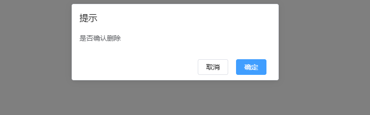
这时,点击确定按钮就会触发 .then里的事件,点击取消则触发 .catch里的事件
typescript对应的声明文件
typescript书写自定义插件对应的声明文件,避免编辑报错
import Vue from "vue";
declare module "vue/types/vue" {
  interface Vue {
    $toast: any,
    $confirm: any
  }
}关于使用vue插件怎么样实现一个MessageBox功能就分享到这里了,希望以上内容可以对大家有一定的帮助,可以学到更多知识。如果觉得文章不错,可以把它分享出去让更多的人看到。
亿速云「云服务器」,即开即用、新一代英特尔至强铂金CPU、三副本存储NVMe SSD云盘,价格低至29元/月。点击查看>>
免责声明:本站发布的内容(图片、视频和文字)以原创、转载和分享为主,文章观点不代表本网站立场,如果涉及侵权请联系站长邮箱:is@yisu.com进行举报,并提供相关证据,一经查实,将立刻删除涉嫌侵权内容。


 计算
计算
 安全
安全 数据库
数据库 网络和加速
网络和加速 企业服务
企业服务


