今天就跟大家聊聊有关使用element-ui怎么封装一个Table模板组件,可能很多人都不太了解,为了让大家更加了解,小编给大家总结了以下内容,希望大家根据这篇文章可以有所收获。
大家在做后台管理系统的时候,写的最多的可能就是表格页面了,一般分三部分:搜索功能区、表格内容区和分页器区。一般这些功能都是使用第三方组件库实现,比如说element-ui,或者vuetify。这两个组件库都各有各的优点,但就table组件来说,我还是比较喜欢vuetify的实现,不用手写一个个column,只要传入headers的配置数组就行,甚至分页器都内置在了table组件里,用起来十分方便。有兴趣可以看看:vuetify data table。
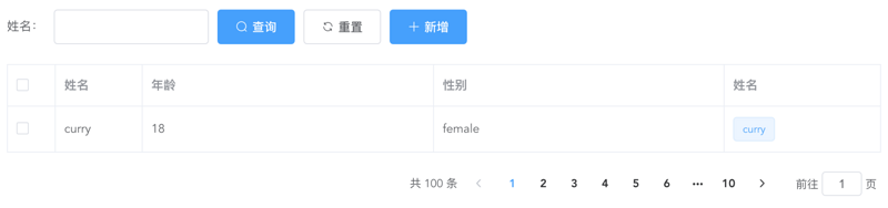
上面是一个经典的用element-ui开发的table页面,而且实际工作中如果每个table页面都写一遍,重复代码太多了,所以不妨写一个table模板组件,减少重复代码。我的思路是这样的:
提供searchBar插槽,可以自定义搜索输入框,搜索、重置按钮必有,新增按钮通过props控制显隐。这里对应的代码如下:
genSearchBar() {
  if (this.noSearchBar || !this.$scopedSlots.searchBar) return '';
  return (
    <el-form class="seatch-form" inline={true} label-width="100">
      {this.$scopedSlots.searchBar()}
      <el-button
        class="filter-item"
        icon="el-icon-search"
        type="primary"
        onClick={this.handleSearchBtnClick}
      >
        查询
      </el-button>
      <el-button
        class="filter-item"
        icon="el-icon-refresh"
        onClick={this.handleResetBtnClick}
      >
        重置
      </el-button>
      <el-button
        class="filter-item"
        icon="el-icon-plus"
        type="primary"
        v-show={this.showAddBtn}
        onClick={this.handleAddBtnClick}
      >
        新增
      </el-button>
    </el-form>
  );
}通过传入headers自动生成columns,参数如下:
{
  label: '性别',
  prop: 'sex',
  width: '180',
  filter: 'sexFilter'
}
可对应如下代码:
<el-table-column
         prop="sex"
         label="性别"
         width="180">
  <template slot-scope="scope">{{scope.row.sex | sexFilter}}</template>
</el-table-column>
注意,只支持全局filter。
如果你想自定义column,也提供tableColumn插槽,支持自定义column,可以如下配置:
{
  prop: 'action'
}
<el-table-column prop="action" label="操作" width="180"> <template slot-scope="scope"> <el-button>编辑</el-button> <el-button>删除</el-button> </template> </el-table-column>
这样,就会按传入的prop匹配对应的column,十分方便。
实现代码如下:
genTableSlot(h) {
  let customeColumns = this.$scopedSlots.tableColumn
    ? this.$scopedSlots.tableColumn()
    : [];
  return this.headers.map((item) => {
    // 根据item.prop判断是否使用传入的插槽内容
    let foundItem = customeColumns.find(
      (ele) =>
        ele.componentOptions &&
        ele.componentOptions.propsData.prop === item.prop
    );
    return foundItem
      ? foundItem
      : h('el-table-column', {
         props: {
           ...item,
         },
         scopedSlots: {
           default: (props) => {
             // 根据传入的全局filter处理column数据
             let filter = this.$options.filters[
               item.filter
             ];
             let itemValue = props.row[item.prop];
             return h(
               'span',
               filter ? filter(itemValue) : itemValue
             );
           },
         },
       });
  });
}
genTable(h) {
return h(
'el-table',
{
ref: 'tableRef',
props: {
...this.$attrs,
data: this.data,
},
on: {
'selection-change': (val) => {
this.$emit('selection-change', val);
},
},
},
[...this.genTableSlot(h)]
);
}如无特殊需求,分页器功能一致,所以直接内置。
实现代码如下:
genPagination() {
return (
<div class="pagination-wrap">
<el-pagination
layout="total,prev,pager,next,jumper"
current-page={this.current}
page-size={this.pageSize}
total={this.total}
{...{
on: { 'current-change': this.handleCurrentChange },
}}
></el-pagination>
</div>
);
}最后附完整代码和demo:
<script>
export default {
name: 'TableTemplate',
props: {
data: {
type: Array,
default: () => [],
required: true,
},
headers: {
type: Array,
default: () => [],
required: true,
},
current: {
type: Number,
default: 1,
},
pageSize: {
type: Number,
default: 10,
},
total: {
type: Number,
default: 0,
},
noSearchBar: Boolean,
showAddBtn: Boolean,
},
mounted() {
this.$nextTick(() => {
this.$emit('search');
});
},
methods: {
genSearchBar() {
if (this.noSearchBar || !this.$scopedSlots.searchBar) return '';
return (
<el-form class="seatch-form" inline={true} label-width="100">
{this.$scopedSlots.searchBar()}
<el-button
class="filter-item"
icon="el-icon-search"
type="primary"
onClick={this.handleSearchBtnClick}
>
查询
</el-button>
<el-button
class="filter-item"
icon="el-icon-refresh"
onClick={this.handleResetBtnClick}
>
重置
</el-button>
<el-button
class="filter-item"
icon="el-icon-plus"
type="primary"
v-show={this.showAddBtn}
onClick={this.handleAddBtnClick}
>
新增
</el-button>
</el-form>
);
},
genTableSlot(h) {
let customeColumns = this.$scopedSlots.tableColumn
? this.$scopedSlots.tableColumn()
: [];
return this.headers.map((item) => {
// 根据item.prop判断是否使用传入的插槽内容
let foundItem = customeColumns.find(
(ele) =>
ele.componentOptions &&
ele.componentOptions.propsData.prop === item.prop
);
return foundItem
? foundItem
: h('el-table-column', {
props: {
...item,
},
scopedSlots: {
default: (props) => {
let filter = this.$options.filters[
item.filter
];
let itemValue = props.row[item.prop];
return h(
'span',
filter ? filter(itemValue) : itemValue
);
},
},
});
});
},
genTable(h) {
  return h(
    'el-table',
    {
      ref: 'tableRef',
      props: {
        ...this.$attrs,
        data: this.data,
      },
      on: {
        'selection-change': (val) => {
          this.$emit('selection-change', val);
        },
      },
    },
    [...this.genTableSlot(h)]
  );
},
genPagination() {
  return (
    <div class="pagination-wrap">
      <el-pagination
        layout="total,prev,pager,next,jumper"
        current-page={this.current}
        page-size={this.pageSize}
        total={this.total}
        {...{
          on: { 'current-change': this.handleCurrentChange },
        }}
      ></el-pagination>
    </div>
  );
},
resetPagination() {
this.$emit('update:current', 1);
},
handleCurrentChange(val) {
this.$emit('update:current', val);
this.$emit('search');
},
handleSearchBtnClick() {
this.$emit('search');
},
handleResetBtnClick() {
this.resetPagination();
this.$emit('reset');
},
handleAddBtnClick() {
this.$emit('add');
},
getTableRef() {
return this.$refs.tableRef;
},
},
render(h) {
return (
<div>
{this.genSearchBar()}
{this.genTable(h)}
{this.genPagination()}
</div>
);
},
};
</script>
<style scoped>
.seatch-form {
text-align: left;
}
.pagination-wrap {
margin-top: 20px;
text-align: right;
}
</style>Demo:
<template>
  <div>
    <table-template
      border
      :headers="headers"
      :data="tableData"
      :current.sync="current"
      :total="total"
      ref="tableTemplate"
      showAddBtn
      @search="handleSearch"
      @reset="handleReset"
      @add="handleAdd"
      @selection-change="handleSelectionChange"
    >
      <template #searchBar>
        <el-form-item label="姓名:" prop="title">
          <el-input class="filter-item" v-model="searchForm.title" ></el-input>
        </el-form-item>
      </template>
      <template #tableColumn>
        <el-table-column
          prop="selection"
          type="selection"
          width="55"
        ></el-table-column>
        <el-table-column prop="test" label="姓名" width="180">
          <template slot-scope="scope">
            <el-popover trigger="hover" placement="top">
              <p>姓名:{{ scope.row.name }}</p>
              <p>住址:{{ scope.row.address }}</p>
              <div slot="reference" class="name-wrapper">
                <el-tag size="medium">{{scope.row.name}}</el-tag>
              </div>
            </el-popover>
          </template>
        </el-table-column>
      </template>
    </table-template>
  </div>
</template>

<script>
import TableTemplate from './TableTemplate';
export default {
  name: 'Demo',
  components: {
    TableTemplate,
  },
  data() {
    return {
      current: 1,
      total: 100,
      headers: [
        {
          prop: 'selection',
        },
        {
          label: '姓名',
          prop: 'name',
          width: '100',
        },
        {
          label: '年龄',
          prop: 'year',
        },
        {
          label: '性别',
          prop: 'sex',
          width: 'sexFilter',
        },
        {
          prop: 'test',
        },
      ],
      tableData: [
        {
          name: 'curry',
          year: 18,
          sex: 'female',
          address: '天安门',
        },
      ],
      searchForm: {
        title: '',
      },
    };
  },
  methods: {
    handleSearch() {
      console.log(this.current);
    },
    handleReset() {
      this.searchForm = {
        title: '',
      };
    },
    handleAdd() {
      console.log('添加');
    },
    handleSelectionChange(val) {
      console.log(val);
    },
    getTableRef() {
      console.log(this.$refs.tableTemplate.getTableRef());
    },
  },
};
</script>
看完上述内容,你们对使用element-ui怎么封装一个Table模板组件有进一步的了解吗?如果还想了解更多知识或者相关内容,请关注亿速云行业资讯频道,感谢大家的支持。
免责声明:本站发布的内容(图片、视频和文字)以原创、转载和分享为主,文章观点不代表本网站立场,如果涉及侵权请联系站长邮箱:is@yisu.com进行举报,并提供相关证据,一经查实,将立刻删除涉嫌侵权内容。


