本篇内容主要讲解“10种CSS3实现的loading动画的方式介绍”,感兴趣的朋友不妨来看看。本文介绍的方法操作简单快捷,实用性强。下面就让小编来带大家学习“10种CSS3实现的loading动画的方式介绍”吧!
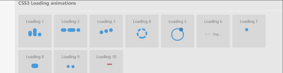
效果
html
<body>
  <div class="content">
    <h4>CSS3 Loading animations</h4>
    <div class="load-wrapp">
      <div class="load-1">
        <p>Loading 1</p>
        <div class="line"></div>
        <div class="line"></div>
        <div class="line"></div>
      </div>
    </div>
    <div class="load-wrapp">
      <div class="load-2">
        <p>Loading 2</p>
        <div class="line"></div>
        <div class="line"></div>
        <div class="line"></div>
      </div>
    </div>
    <div class="load-wrapp">
      <div class="load-3">
        <p>Loading 3</p>
        <div class="line"></div>
        <div class="line"></div>
        <div class="line"></div>
      </div>
    </div>
    <div class="load-wrapp">
      <!-- Loading 4 don't work on firefox because of the border-radius and the "dashed" style. -->
      <div class="load-4">
        <p>Loading 4</p>
        <div class="ring-1"></div>
      </div>
    </div>
    <div class="load-wrapp">
      <div class="load-5">
        <p>Loading 5</p>
        <div class="ring-2">
          <div class="ball-holder">
            <div class="ball"></div>
          </div>
        </div>
      </div>
    </div>
    <div class="load-wrapp">
      <div class="load-6">
        <p>Loading 6</p>
        <div class="letter-holder">
          <div class="l-1 letter">L</div>
          <div class="l-2 letter">o</div>
          <div class="l-3 letter">a</div>
          <div class="l-4 letter">d</div>
          <div class="l-5 letter">i</div>
          <div class="l-6 letter">n</div>
          <div class="l-7 letter">g</div>
          <div class="l-8 letter">.</div>
          <div class="l-9 letter">.</div>
          <div class="l-10 letter">.</div>
        </div>
      </div>
    </div>
    <div class="load-wrapp">
      <div class="load-7">
        <p>Loading 7</p>
        <div class="square-holder">
          <div class="square"></div>
        </div>
      </div>
    </div>
    <div class="load-wrapp">
      <div class="load-8">
        <p>Loading 8</p>
        <div class="line"></div>
      </div>
    </div>
    <div class="load-wrapp">
      <div class="load-9">
        <p>Loading 9</p>
        <div class="spinner">
          <div class="bubble-1"></div>
          <div class="bubble-2"></div>
        </div>
      </div>
    </div>
    <div class="load-wrapp">
      <div class="load-10">
        <p>Loading 10</p>
        <div class="bar"></div>
      </div>
    </div>
  </div>
  <div class="clear"></div>
</body>css3
/* -----------------------------------------
  =Default css to make the demo more pretty
-------------------------------------------- */

body {
  margin: 0 auto;
  padding: 20px;
  max-width: 1200px;
  overflow-y: scroll;
  font-family: "Open Sans", sans-serif;
  font-weight: 400;
  color: #777;
  background-color: #f7f7f7;
  -webkit-font-smoothing: antialiased;
  -webkit-text-size-adjust: 100%;
  -ms-text-size-adjust: 100%;
}

.content {
  padding: 15px;
  overflow: hidden;
  background-color: #e7e7e7;
  background-color: rgba(0, 0, 0, 0.06);
}

h2 {
  padding-bottom: 15px;
  border-bottom: 1px solid #d8d8d8;
  font-weight: 600;
}

h2 span {
  font-family: monospace, serif;
}

h4 {
  padding-bottom: 20px;
  box-shadow: 0 1px 0 rgba(0, 0, 0, 0.1), 0 2px 0 rgba(255, 255, 255, 0.9);
}

p {
  margin: 0;
  padding: 10px 0;
  color: #777;
}

.clear {
  clear: both;
}

/* -----------------------------------------
  =CSS3 Loading animations
-------------------------------------------- */

/* =Elements style
---------------------- */
.load-wrapp {
  float: left;
  width: 100px;
  height: 100px;
  margin: 0 10px 10px 0;
  padding: 20px 20px 20px;
  border-radius: 5px;
  text-align: center;
  background-color: #d8d8d8;
}

.load-wrapp p {
  padding: 0 0 20px;
}
.load-wrapp:last-child {
  margin-right: 0;
}

.line {
  display: inline-block;
  width: 15px;
  height: 15px;
  border-radius: 15px;
  background-color: #4b9cdb;
}

.ring-1 {
  width: 10px;
  height: 10px;
  margin: 0 auto;
  padding: 10px;
  border: 7px dashed #4b9cdb;
  border-radius: 100%;
}

.ring-2 {
  position: relative;
  width: 45px;
  height: 45px;
  margin: 0 auto;
  border: 4px solid #4b9cdb;
  border-radius: 100%;
}

.ball-holder {
  position: absolute;
  width: 12px;
  height: 45px;
  left: 17px;
  top: 0px;
}

.ball {
  position: absolute;
  top: -11px;
  left: 0;
  width: 16px;
  height: 16px;
  border-radius: 100%;
  background: #4282b3;
}

.letter-holder {
  padding: 16px;
}

.letter {
  float: left;
  font-size: 14px;
  color: #777;
}

.square {
  width: 12px;
  height: 12px;
  border-radius: 4px;
  background-color: #4b9cdb;
}

.spinner {
  position: relative;
  width: 45px;
  height: 45px;
  margin: 0 auto;
}

.bubble-1,
.bubble-2 {
  position: absolute;
  top: 0;
  width: 25px;
  height: 25px;
  border-radius: 100%;
  background-color: #4b9cdb;
}

.bubble-2 {
  top: auto;
  bottom: 0;
}

.bar {
  float: left;
  width: 15px;
  height: 6px;
  border-radius: 2px;
  background-color: #4b9cdb;
}

/* =Animate the stuff
------------------------ */
.load-1 .line:nth-last-child(1) {
  animation: loadingA 1.5s 1s infinite;
}
.load-1 .line:nth-last-child(2) {
  animation: loadingA 1.5s 0.5s infinite;
}
.load-1 .line:nth-last-child(3) {
  animation: loadingA 1.5s 0s infinite;
}

.load-2 .line:nth-last-child(1) {
  animation: loadingB 1.5s 1s infinite;
}
.load-2 .line:nth-last-child(2) {
  animation: loadingB 1.5s 0.5s infinite;
}
.load-2 .line:nth-last-child(3) {
  animation: loadingB 1.5s 0s infinite;
}

.load-3 .line:nth-last-child(1) {
  animation: loadingC 0.6s 0.1s linear infinite;
}
.load-3 .line:nth-last-child(2) {
  animation: loadingC 0.6s 0.2s linear infinite;
}
.load-3 .line:nth-last-child(3) {
  animation: loadingC 0.6s 0.3s linear infinite;
}

.load-4 .ring-1 {
  animation: loadingD 1.5s 0.3s cubic-bezier(0.17, 0.37, 0.43, 0.67) infinite;
}

.load-5 .ball-holder {
  animation: loadingE 1.3s linear infinite;
}

.load-6 .letter {
  animation-name: loadingF;
  animation-duration: 1.6s;
  animation-iteration-count: infinite;
  animation-direction: linear;
}

.l-1 {
  animation-delay: 0.48s;
}
.l-2 {
  animation-delay: 0.6s;
}
.l-3 {
  animation-delay: 0.72s;
}
.l-4 {
  animation-delay: 0.84s;
}
.l-5 {
  animation-delay: 0.96s;
}
.l-6 {
  animation-delay: 1.08s;
}
.l-7 {
  animation-delay: 1.2s;
}
.l-8 {
  animation-delay: 1.32s;
}
.l-9 {
  animation-delay: 1.44s;
}
.l-10 {
  animation-delay: 1.56s;
}

.load-7 .square {
  animation: loadingG 1.5s cubic-bezier(0.17, 0.37, 0.43, 0.67) infinite;
}

.load-8 .line {
  animation: loadingH 1.5s cubic-bezier(0.17, 0.37, 0.43, 0.67) infinite;
}

.load-9 .spinner {
  animation: loadingI 2s linear infinite;
}
.load-9 .bubble-1,
.load-9 .bubble-2 {
  animation: bounce 2s ease-in-out infinite;
}
.load-9 .bubble-2 {
  animation-delay: -1s;
}

.load-10 .bar {
  animation: loadingJ 2s cubic-bezier(0.17, 0.37, 0.43, 0.67) infinite;
}

@keyframes loadingA {
  0 {
    height: 15px;
  }
  50% {
    height: 35px;
  }
  100% {
    height: 15px;
  }
}

@keyframes loadingB {
  0 {
    width: 15px;
  }
  50% {
    width: 35px;
  }
  100% {
    width: 15px;
  }
}

@keyframes loadingC {
  0 {
    transform: translate(0, 0);
  }
  50% {
    transform: translate(0, 15px);
  }
  100% {
    transform: translate(0, 0);
  }
}

@keyframes loadingD {
  0 {
    transform: rotate(0deg);
  }
  50% {
    transform: rotate(180deg);
  }
  100% {
    transform: rotate(360deg);
  }
}

@keyframes loadingE {
  0 {
    transform: rotate(0deg);
  }
  100% {
    transform: rotate(360deg);
  }
}

@keyframes loadingF {
  0% {
    opacity: 0;
  }
  100% {
    opacity: 1;
  }
}

@keyframes loadingG {
  0% {
    transform: translate(0, 0) rotate(0deg);
  }
  50% {
    transform: translate(70px, 0) rotate(360deg);
  }
  100% {
    transform: translate(0, 0) rotate(0deg);
  }
}

@keyframes loadingH {
  0% {
    width: 15px;
  }
  50% {
    width: 35px;
    padding: 4px;
  }
  100% {
    width: 15px;
  }
}

@keyframes loadingI {
  100% {
    transform: rotate(360deg);
  }
}

@keyframes bounce {
  0%,
  100% {
    transform: scale(0);
  }
  50% {
    transform: scale(1);
  }
}

@keyframes loadingJ {
  0%,
  100% {
    transform: translate(0, 0);
  }

  50% {
    transform: translate(80px, 0);
    background-color: #f5634a;
    width: 25px;
  }
}到此,相信大家对“10种CSS3实现的loading动画的方式介绍”有了更深的了解,不妨来实际操作一番吧!这里是亿速云网站,更多相关内容可以进入相关频道进行查询,关注我们,继续学习!
亿速云「云服务器」,即开即用、新一代英特尔至强铂金CPU、三副本存储NVMe SSD云盘,价格低至29元/月。点击查看>>
免责声明:本站发布的内容(图片、视频和文字)以原创、转载和分享为主,文章观点不代表本网站立场,如果涉及侵权请联系站长邮箱:is@yisu.com进行举报,并提供相关证据,一经查实,将立刻删除涉嫌侵权内容。
原文链接:https://www.jb51.net/css/752447.html


 计算
计算
 安全
安全 数据库
数据库 网络和加速
网络和加速 企业服务
企业服务


