使用CSS怎么实现一个三角形和饼图?针对这个问题,这篇文章详细介绍了相对应的分析和解答,希望可以帮助更多想解决这个问题的小伙伴找到更简单易行的方法。
.triangle{width:0;height:0;border-width:50px;border-style:solid;border-color:red blue green yellow;}
.triangle_top{width:0;height: 0;border-width:50px;border-style:solid;border-color:red transparent transparent transparent;}
.triangle_right{width:0;height: 0;border-width:50px;border-style:solid;border-color:transparent blue transparent transparent;}
.triangle_bottom{width:0;height: 0;border-width:50px;border-style:solid;border-color:transparent transparent green transparent;}
.triangle_left{width:0;height: 0;border-width:50px;border-style:solid;border-color:transparent transparent transparent yellow;}
要点
transparent
拓展扇形
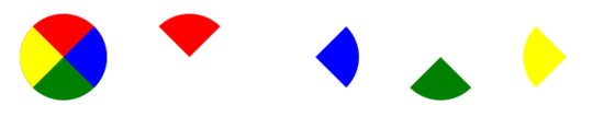
border-radius: 50px
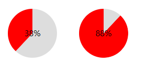
饼图思路
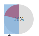
先建一个圆,然后分左右两块。
左右两块里面在包含一个半圆,然后对其做旋转处理,来匹配对应的百分比,溢出隐藏处理
注意
因为是左右两块,所以要注意溢出隐藏,以达到最终效果
注意旋转的中心点
如果中心区域掏空的话,注意层级问题
如果百分比<=50%,可以不要右边那块
百分比跟旋转角度的对应换算(百分比/100*360)
例子
<style>
.pie38{width: 100px;height: 100px;border-radius: 50px;margin:20px;background-color: #ddd;position: relative;display: inline-block;overflow: hidden}
.pie38 .pie_content{line-height: 100px;text-align: center;position: absolute;width: 100px;height: 100px;z-index: 8}
.pie38 .pie_left{position: absolute;top:0;left:0;width: 50px;height: 100px;overflow: hidden;}
.pie38 .pie_left:after{content: '';height: 100px;width:50px;border-right:50px solid red;position:absolute;top:0;left:0;transform: rotate(-137deg);}
</style>
<div class="pie38">
 <div class="pie_content">38%</div>
 <div class="pie_left"></div>
</div>

<style>
.pie88{width: 100px;height: 100px;border-radius: 50px;margin:20px;background-color: #ddd;position: relative;display: inline-block;overflow: hidden;}
.pie88 .pie_content{line-height: 100px;text-align: center;position: absolute;width: 100px;height: 100px;z-index: 8}
.pie88 .pie_left{position: absolute;top:0;left:0;width: 50px;height: 100px;overflow: hidden;background-color: red}
.pie88 .pie_right{position: absolute;top:0;right:0;width: 50px;height: 100px;overflow: hidden;}
.pie88 .pie_right:after{content: '';height: 100px;width:50px;border-left:50px solid red;position:absolute;right:0;top:0;border-radius: 50px;transform: rotate(-137deg);}
</style>

<div class="pie88">
 <div class="pie_content">88%</div>
 <div class="pie_left"></div>
 <div class="pie_right"></div>
</div>1.行内样式,最直接最简单的一种,直接对HTML标签使用style=""。2.内嵌样式,就是将CSS代码写在之间,并且用
进行声明。3.外部样式,其中链接样式是使用频率最高,最实用的样式,只需要在之间加上
关于使用CSS怎么实现一个三角形和饼图问题的解答就分享到这里了,希望以上内容可以对大家有一定的帮助,如果你还有很多疑惑没有解开,可以关注亿速云行业资讯频道了解更多相关知识。
免责声明:本站发布的内容(图片、视频和文字)以原创、转载和分享为主,文章观点不代表本网站立场,如果涉及侵权请联系站长邮箱:is@yisu.com进行举报,并提供相关证据,一经查实,将立刻删除涉嫌侵权内容。


