本文小编为大家详细介绍“div+css样式怎么实现带小三角的tooltips效果”,内容详细,步骤清晰,细节处理妥当,希望这篇“div+css样式怎么实现带小三角的tooltips效果”文章能帮助大家解决疑惑,下面跟着小编的思路慢慢深入,一起来学习新知识吧。
代码如下:
<!DOCTYPE html>
<html>
    <head>
        <meta charset="utf-8" />
        <title></title>
        <style type="text/css">
            .tooltips {
                position: relative;
                width: 300px;
                height: 80px;
                line-height: 60px;
                background: #D7E7FC;
                border-radius: 4px;
            }
            .arrow {
                position: absolute;
                color: #D7E7FC;
                width: 0px;
                height: 0px;
                line-height: 0px;
                border-width: 20px 15px 0;
                border-style: solid dashed dashed dashed;
                border-left-color: transparent;
                border-right-color: transparent;
                bottom: -20px;
                right: 50%;
            }
            .tooltips {
                position: relative;
                width: 300px;
                height: 80px;
                line-height: 60px;
                background: #D7E7FC;
                border: 1px solid #A5C4EC;
                border-radius: 4px;
            }
            .arrow {
                position: absolute;
                width: 0px;
                height: 0px;
                line-height: 0px;
                border-width: 20px 15px 0;
                border-style: solid dashed dashed dashed;
                border-left-color: transparent;
                border-right-color: transparent;
            }
            .arrow-border {
                color: #A5C4EC;
                bottom: -20px;
                right: 50%;
            }
            .arrow-bg {
                color: #D7E7FC;
                bottom: -19px;
                right: 50%;
            }
        </style>
    </head>
    <body>
        <!--先定义一个相对定位的盒子div:-->
        <div class="tooltips">
            <!--给div盒子添加一个三角型图标-->
            <div class="arrow "></div>
            <!--给“小三角穿上松紧带”需要使用两个三角形叠加的方式-->
            <!--首先我们定义两个三角形的div,一个背景色和盒子的边框颜色相同,一个背景色和盒子的背景色一致:-->
            <div class="arrow arrow-border"></div>
            <div class="arrow arrow-bg"></div>
            <!--注意:.arrow-bg和.arrow-border的bottom位置相差为1px(可根据边框宽度调整)两个div的顺序不可颠倒。-->
        </div>
    </body>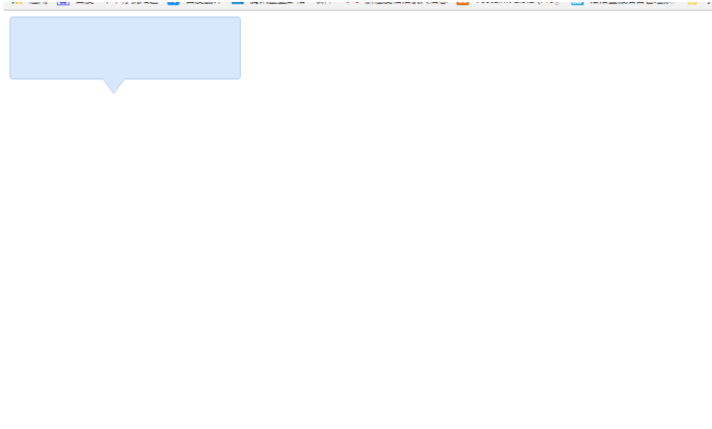
</html>效果展示图
读到这里,这篇“div+css样式怎么实现带小三角的tooltips效果”文章已经介绍完毕,想要掌握这篇文章的知识点还需要大家自己动手实践使用过才能领会,如果想了解更多相关内容的文章,欢迎关注亿速云行业资讯频道。
亿速云「云服务器」,即开即用、新一代英特尔至强铂金CPU、三副本存储NVMe SSD云盘,价格低至29元/月。点击查看>>
免责声明:本站发布的内容(图片、视频和文字)以原创、转载和分享为主,文章观点不代表本网站立场,如果涉及侵权请联系站长邮箱:is@yisu.com进行举报,并提供相关证据,一经查实,将立刻删除涉嫌侵权内容。
原文链接:https://my.oschina.net/u/4581260/blog/4364516


 计算
计算
 安全
安全 数据库
数据库 网络和加速
网络和加速 企业服务
企业服务


