这篇文章给大家介绍django中怎么使用Highcharts.js实现可视化数据,内容非常详细,感兴趣的小伙伴们可以参考借鉴,希望对大家能有所帮助。
新建project和app
django-admin startproject highchartscd highchartspython manage.py startapp clusterbar
在clusterbar/models.py文件里添加代码
class PopulationByRegion(models.Model): region = models.CharField(max_length=50) pp1800 = models.IntegerField() pp1900 = models.IntegerField() pp2012 = models.IntegerField()highcharts/urls.py文件代码
from django.contrib import adminfrom django.urls import pathfrom django.urls import includeurlpatterns = [ path('admin/', admin.site.urls), path('clusterbar/',include('clusterbar.urls')),]在clusterbar文件夹下新建urls.py文件,写入代码
from django.urls import pathfrom . import viewsurlpatterns = [ path('popbyregion/',views.popbyregion,name="popbyregion"),]在clusterbar的views.py文件中写入代码
from django.shortcuts import renderfrom .models import PopulationByRegion# Create your views here.def popbyregion(request): df = PopulationByRegion.objects.all() region = [] pp1800 = [] pp1900 = [] pp2012 = [] for info in df: region.append(info.region) pp1800.append(info.pp1800) pp1900.append(info.pp1900) pp2012.append(info.pp2012) context = {'region':region,'pp1800':pp1800,'pp1900':pp1900,'pp2012':pp2012} return render(request,'popbyregion.html',context=context)在highcharts文件夹下新建templates文件夹,在templates文件夹下新建popbyregion.html文件 并写入代码
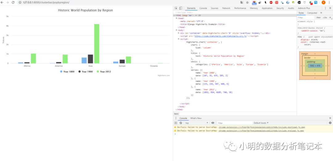
<!DOCTYPE html><html lang="en"><head> <meta charset="UTF-8"> <title>Django Highcharts Example</title></head><body> <div id="container"></div> <script src="https://code.highcharts.com/highcharts.src.js"></script> <script> Highcharts.chart('container', { chart: { type: 'column' }, title: { text: 'Historic World Population by Region' }, xAxis: { categories: {{ region | safe }} }, series: [{ name: 'Year 1800', data: {{ pp1800 }} }, { name: 'Year 1900', data: {{ pp1900 }} }, { name: 'Year 2012', data: {{ pp2012 }} }] }); </script></body></html>注册app
添加模板路径
python manage.py makemigrationspython manage migrate
python manage.py shellimport csvfrom clusterbar.models import PopulationByRegionwith open('example.csv') as csvfile: reader = csv.DictReader(csvfile) for row in reader: p = PopulationByRegion(region=rwo['continent'], pp1800=int(row["year_1800"]), pp1900=int(row['year_1900']), pp2012=int(row['year_2012'])) p.save()quit()python manage.py createsuperuser
依次输入用户名、邮箱密码 注册数据 在clusterbar文件夹下的admin.py中添加代码
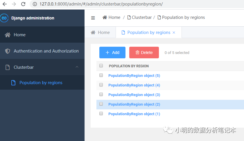
from django.contrib import adminfrom .models import PopulationByRegion# Register your models here.admin.site.register(PopulationByRegion)启动服务器可以看到数据已经添加过来了
https://github.com/sea-team/simpleui#%E5%BC%80%E5%A7%8B%E4%BD%BF%E7%94%A8
按照以上链接进行配置 后台变成了这样
输入链接http://127.0.0.1:8000/clusterbar/popbyregion/
可以看到结果
过程中我遇到了一个报错
django.core.exceptions.ImproperlyConfigured: The included URLconf '<module 'clusterbar.urls' from 'C:\Users\mingy\Desktop\Python\Django_Practice\highcharts\clusterbar\urls.py'>' does not appear to have any patterns in it. If you see valid patterns in the file then the issue is probably caused by a circular import.
关于django中怎么使用Highcharts.js实现可视化数据就分享到这里了,希望以上内容可以对大家有一定的帮助,可以学到更多知识。如果觉得文章不错,可以把它分享出去让更多的人看到。
亿速云「云服务器」,即开即用、新一代英特尔至强铂金CPU、三副本存储NVMe SSD云盘,价格低至29元/月。点击查看>>
免责声明:本站发布的内容(图片、视频和文字)以原创、转载和分享为主,文章观点不代表本网站立场,如果涉及侵权请联系站长邮箱:is@yisu.com进行举报,并提供相关证据,一经查实,将立刻删除涉嫌侵权内容。
原文链接:https://my.oschina.net/u/4579431/blog/4347617


 计算
计算 安全
安全 数据库
数据库 网络和加速
网络和加速 企业服务
企业服务


