这篇文章主要介绍了怎么用css3绘制汤勺捞起汤圆的动画特效的相关知识,内容详细易懂,操作简单快捷,具有一定借鉴价值,相信大家阅读完这篇怎么用css3绘制汤勺捞起汤圆的动画特效文章都会有所收获,下面我们一起来看看吧。
HTML代码:
<!DOCTYPE html>
<html lang="en" >
<head>
<meta charset="UTF-8">
<title>汤勺捞起汤圆动画</title>
<link rel="stylesheet" href="css/style.css">
</head>

<body>

<div class="bowl">
  <div class="back"></div>
  <div class="spoon">
    <div class="scoop"></div>
  </div>
  <div class="contents">
    <div class="syrup"></div>
    <div class="riceball uno">
      <div class="face"></div>
    </div>
    <div class="riceball dos">
      <div class="face"></div>
    </div>
    <div class="riceball tres">
      <div class="face"></div>
    </div>
  </div>
</div>

</body>
</html>style.css代码:
html,
body {
  width: 100%;
  height: 100%;
  margin: 0;
  padding: 0;
  overflow: hidden;
}

body {
  background: #f7e5d7;
}

.riceball {
  position: absolute;
  width: 200px;
  height: 200px;
  background: #fff;
  border-radius: 50%;
  background: url("../img/1.jpg") 0 0/10em 10em, #fff;
  background-blend-mode: hard-light;
  box-shadow: inset -25px -25px 25px rgba(229, 219, 211, 0.8), 5px 5px 15px 5px rgba(216, 200, 190, 0.3);
  -webkit-clip-path: inset(-40px -30px 25% -20px);
          clip-path: inset(-40px -30px 25% -20px);
}
.riceball .face {
  position: absolute;
  top: 50%;
  left: 50%;
  -webkit-transform: translate(-50%, -50%) rotate(5deg);
          transform: translate(-50%, -50%) rotate(5deg);
  width: 30px;
  height: 20px;
  background: #000;
  border-radius: 50%;
  border-top-left-radius: 3px;
  border-top-right-radius: 3px;
}
.riceball .face::before, .riceball .face::after {
  display: block;
  content: "";
  position: absolute;
  top: -5px;
  width: 12px;
  height: 12px;
  background: #000;
  border-radius: 50%;
}
.riceball .face::before {
  left: -40px;
}
.riceball .face::after {
  right: -40px;
}
.riceball.uno {
  left: 150px;
  bottom: 65px;
  -webkit-animation: 3s rice-up infinite;
          animation: 3s rice-up infinite;
}
.riceball.uno .face {
  -webkit-transform: translate(-50%, -50%) rotate(-20deg);
          transform: translate(-50%, -50%) rotate(-20deg);
  -webkit-animation: 3s face-bob infinite;
          animation: 3s face-bob infinite;
}
.riceball.uno .face::before, .riceball.uno .face::after {
  -webkit-animation: 3s eye-bulge infinite;
          animation: 3s eye-bulge infinite;
}
.riceball.dos {
  left: 20px;
  bottom: -35px;
  -webkit-animation: 1s little-bob1 linear infinite;
          animation: 1s little-bob1 linear infinite;
}
.riceball.dos .face {
  -webkit-transform: translate(-50%, -50%) rotate(-5deg);
          transform: translate(-50%, -50%) rotate(-5deg);
}
.riceball.tres {
  bottom: 0;
  right: 30px;
  -webkit-animation: 1.2s little-bob2 linear infinite;
          animation: 1.2s little-bob2 linear infinite;
}

.syrup {
  position: absolute;
  bottom: -50px;
  width: 500px;
  height: 200px;
  border-radius: 50%;
  background: url("../img/1.jpg") 0 0/10em 10em, radial-gradient(ellipse at bottom center, #f0ad42 0%, #feda90 31%, #f0ad42 66%, #feda90 86%, #f0ad42 100%);
  background-blend-mode: hard-light;
}

.bowl {
  position: absolute;
  top: calc(50% + 100px);
  left: 50%;
  -webkit-transform: translate(-50%, -50%);
          transform: translate(-50%, -50%);
  width: 500px;
  height: 250px;
  background: url("../img/1.jpg") 0 0/15em 15em, radial-gradient(ellipse at top left, #fff 0%, #fcfcfc 35%, #f1ccbb 60%, #fdf1dd 70%, #fff 80%);
  background-blend-mode: hard-light;
  border-bottom-left-radius: 230px;
  border-bottom-right-radius: 230px;
  box-shadow: 15px 40px 80px -30px #C5AE9F;
}

.back {
  position: absolute;
  top: -100px;
  width: 500px;
  height: 200px;
  border-radius: 50%;
  background: url("../img/1.jpg") 0 0/10em 10em, radial-gradient(ellipse at bottom right, #fff 0%, #fcfcfc 35%, #f1ccbb 60%, #fdf1dd 75%, #fff 90%);
  background-blend-mode: hard-light;
}

.contents {
  position: fixed;
  bottom: 150px;
  width: 500px;
  height: 400px;
  border-bottom-left-radius: 50% 100px;
  border-bottom-right-radius: 50% 100px;
  border-top-left-radius: 0;
  border-top-right-radius: 0;
  overflow: hidden;
}

.spoon {
  position: absolute;
  top: -60%;
  left: -200px;
  -webkit-transform: rotate(25deg);
          transform: rotate(25deg);
  width: 300px;
  height: 40px;
  background: url("../img/1.jpg") 0 0/5em 10em, linear-gradient(to bottom, #fff 40%, #e2d7cb 100%);
  background-blend-mode: hard-light;
  border-top-left-radius: 20px;
  border-bottom-left-radius: 20px;
  -webkit-animation: spoon-up 3s infinite;
          animation: spoon-up 3s infinite;
}
.spoon .scoop {
  position: absolute;
  top: 50%;
  right: -200px;
  -webkit-transform: translateY(-50%);
          transform: translateY(-50%);
  width: 220px;
  height: 140px;
  border-radius: 50%;
  background: url("../img/1.jpg") 0 0/10em 10em, #fff;
  background-blend-mode: hard-light;
  box-shadow: inset -10px -5px 15px #ceb499, 10px 10px 50px -10px #C5AE9F;
}
.spoon .scoop::before {
  display: block;
  content: "";
  position: absolute;
  top: 2px;
  left: 50%;
  -webkit-transform: translateX(-50%);
          transform: translateX(-50%);
  width: 200px;
  height: 120px;
  background: url("../img/1.jpg") 0 0/10em 10em, linear-gradient(to bottom, #e2d7cb 20%, #fff 100%);
  background-blend-mode: hard-light;
  border-radius: 50%;
}

@-webkit-keyframes spoon-up {
  0% {
    top: -60%;
    left: -200px;
  }
  25% {
    top: -80%;
    -webkit-transform: rotate(15deg);
            transform: rotate(15deg);
  }
  50% {
    top: -90%;
    left: -300px;
    -webkit-transform: rotate(25deg);
            transform: rotate(25deg);
  }
  100% {
    top: -60%;
    left: -200px;
    -webkit-transform: rotate(25deg);
            transform: rotate(25deg);
  }
}

@keyframes spoon-up {
  0% {
    top: -60%;
    left: -200px;
  }
  25% {
    top: -80%;
    -webkit-transform: rotate(15deg);
            transform: rotate(15deg);
  }
  50% {
    top: -90%;
    left: -300px;
    -webkit-transform: rotate(25deg);
            transform: rotate(25deg);
  }
  100% {
    top: -60%;
    left: -200px;
    -webkit-transform: rotate(25deg);
            transform: rotate(25deg);
  }
}
@-webkit-keyframes rice-up {
  0% {
    left: 150px;
    bottom: 65px;
    -webkit-clip-path: inset(-40px -30px 25% -20px);
            clip-path: inset(-40px -30px 25% -20px);
  }
  25% {
    bottom: 160px;
    -webkit-clip-path: inset(-40px -30px 0 -20px);
            clip-path: inset(-40px -30px 0 -20px);
  }
  50% {
    left: 20px;
    bottom: 140px;
    -webkit-clip-path: inset(-40px -30px 0 -20px);
            clip-path: inset(-40px -30px 0 -20px);
  }
  55% {
    -webkit-clip-path: inset(-40px -30px 0 -20px);
            clip-path: inset(-40px -30px 0 -20px);
  }
  100% {
    left: 150px;
    bottom: 65px;
    -webkit-clip-path: inset(-40px -30px 25% -20px);
            clip-path: inset(-40px -30px 25% -20px);
  }
}
@keyframes rice-up {
  0% {
    left: 150px;
    bottom: 65px;
    -webkit-clip-path: inset(-40px -30px 25% -20px);
            clip-path: inset(-40px -30px 25% -20px);
  }
  25% {
    bottom: 160px;
    -webkit-clip-path: inset(-40px -30px 0 -20px);
            clip-path: inset(-40px -30px 0 -20px);
  }
  50% {
    left: 20px;
    bottom: 140px;
    -webkit-clip-path: inset(-40px -30px 0 -20px);
            clip-path: inset(-40px -30px 0 -20px);
  }
  55% {
    -webkit-clip-path: inset(-40px -30px 0 -20px);
            clip-path: inset(-40px -30px 0 -20px);
  }
  100% {
    left: 150px;
    bottom: 65px;
    -webkit-clip-path: inset(-40px -30px 25% -20px);
            clip-path: inset(-40px -30px 25% -20px);
  }
}
@-webkit-keyframes face-bob {
  0% {
    -webkit-transform: translate(-50%, -50%) rotate(10deg);
            transform: translate(-50%, -50%) rotate(10deg);
  }
  50% {
    height: 10px;
    -webkit-transform: translate(-50%, -50%) rotate(-10deg);
            transform: translate(-50%, -50%) rotate(-10deg);
  }
  100% {
    -webkit-transform: translate(-50%, -50%) rotate(10deg);
            transform: translate(-50%, -50%) rotate(10deg);
  }
}
@keyframes face-bob {
  0% {
    -webkit-transform: translate(-50%, -50%) rotate(10deg);
            transform: translate(-50%, -50%) rotate(10deg);
  }
  50% {
    height: 10px;
    -webkit-transform: translate(-50%, -50%) rotate(-10deg);
            transform: translate(-50%, -50%) rotate(-10deg);
  }
  100% {
    -webkit-transform: translate(-50%, -50%) rotate(10deg);
            transform: translate(-50%, -50%) rotate(10deg);
  }
}
@-webkit-keyframes eye-bulge {
  0% {
    width: 12px;
    height: 12px;
  }
  50% {
    width: 18px;
    height: 18px;
  }
  100% {
    width: 12px;
    height: 12px;
  }
}
@keyframes eye-bulge {
  0% {
    width: 12px;
    height: 12px;
  }
  50% {
    width: 18px;
    height: 18px;
  }
  100% {
    width: 12px;
    height: 12px;
  }
}
@-webkit-keyframes little-bob1 {
  0% {
    bottom: -35px;
    -webkit-clip-path: inset(-40px -30px 25% -20px);
            clip-path: inset(-40px -30px 25% -20px);
  }
  50% {
    bottom: -33px;
    -webkit-clip-path: inset(-40px -30px 23% -20px);
            clip-path: inset(-40px -30px 23% -20px);
  }
  100% {
    bottom: -35px;
    -webkit-clip-path: inset(-40px -30px 25% -20px);
            clip-path: inset(-40px -30px 25% -20px);
  }
}
@keyframes little-bob1 {
  0% {
    bottom: -35px;
    -webkit-clip-path: inset(-40px -30px 25% -20px);
            clip-path: inset(-40px -30px 25% -20px);
  }
  50% {
    bottom: -33px;
    -webkit-clip-path: inset(-40px -30px 23% -20px);
            clip-path: inset(-40px -30px 23% -20px);
  }
  100% {
    bottom: -35px;
    -webkit-clip-path: inset(-40px -30px 25% -20px);
            clip-path: inset(-40px -30px 25% -20px);
  }
}
@-webkit-keyframes little-bob2 {
  0% {
    bottom: 0;
    -webkit-clip-path: inset(-40px -30px 25% -20px);
            clip-path: inset(-40px -30px 25% -20px);
  }
  50% {
    bottom: -2px;
    -webkit-clip-path: inset(-40px -30px 26% -20px);
            clip-path: inset(-40px -30px 26% -20px);
  }
  100% {
    bottom: 0;
    -webkit-clip-path: inset(-40px -30px 25% -20px);
            clip-path: inset(-40px -30px 25% -20px);
  }
}
@keyframes little-bob2 {
  0% {
    bottom: 0;
    -webkit-clip-path: inset(-40px -30px 25% -20px);
            clip-path: inset(-40px -30px 25% -20px);
  }
  50% {
    bottom: -2px;
    -webkit-clip-path: inset(-40px -30px 26% -20px);
            clip-path: inset(-40px -30px 26% -20px);
  }
  100% {
    bottom: 0;
    -webkit-clip-path: inset(-40px -30px 25% -20px);
            clip-path: inset(-40px -30px 25% -20px);
  }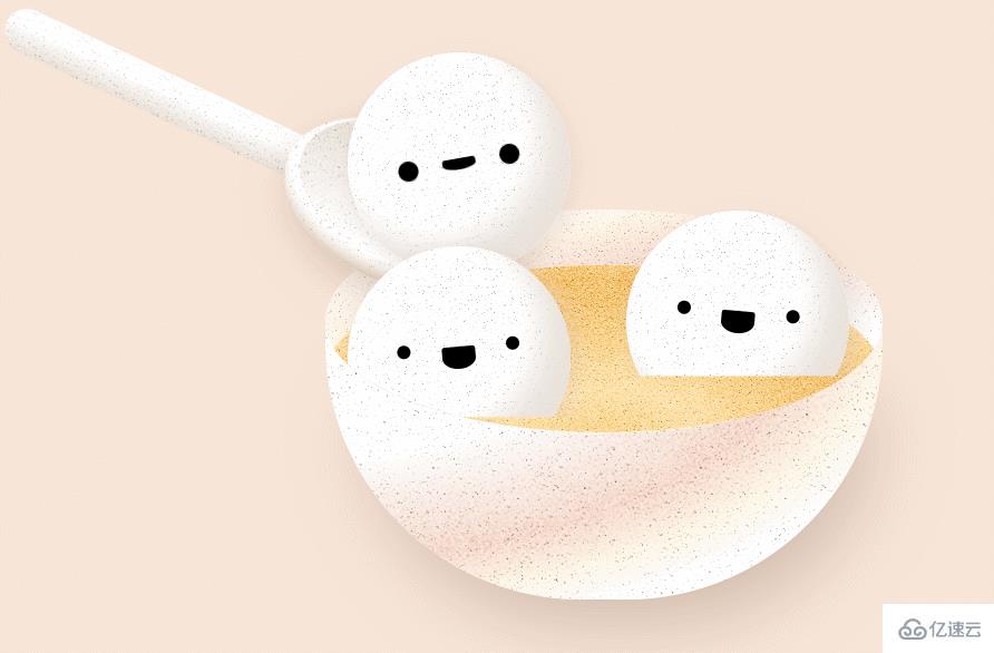
}运行效果:
关于“怎么用css3绘制汤勺捞起汤圆的动画特效”这篇文章的内容就介绍到这里,感谢各位的阅读!相信大家对“怎么用css3绘制汤勺捞起汤圆的动画特效”知识都有一定的了解,大家如果还想学习更多知识,欢迎关注亿速云行业资讯频道。
亿速云「云服务器」,即开即用、新一代英特尔至强铂金CPU、三副本存储NVMe SSD云盘,价格低至29元/月。点击查看>>
免责声明:本站发布的内容(图片、视频和文字)以原创、转载和分享为主,文章观点不代表本网站立场,如果涉及侵权请联系站长邮箱:is@yisu.com进行举报,并提供相关证据,一经查实,将立刻删除涉嫌侵权内容。


 计算
计算
 安全
安全 数据库
数据库 网络和加速
网络和加速 企业服务
企业服务


