这篇文章给大家分享的是有关Python如何制作可视化报表的内容。小编觉得挺实用的,因此分享给大家做个参考,一起跟随小编过来看看吧。
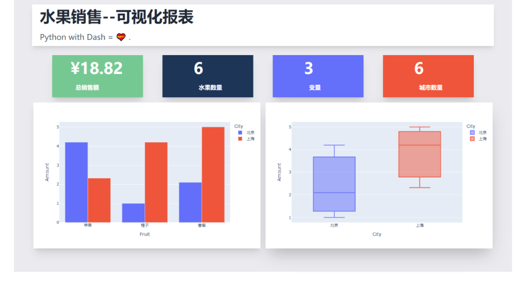
可视化报表效果如下,水果销售情况一览~
Dash是基于Plotly搭建的Dashbord框架,支持Python、R和Julia。使用Dash,你可以创建自定义响应式仪表板。
相关文档
说明:https://dash.plotly.com/introduction
案例:https://dash.gallery/Portal/
Tailwindcss则是一个实用程序优先的CSS框架,用于快速构建自定义界面。

“这种框架只适用于那种只会实现页面布局美化元素而不关心实现业务逻辑的前端”。
看看别人对它的评价,对于无交互的图表,完全足够了。
相关文档
说明:https://www.tailwindcss.cn/docs
下面就给大家讲解下如何通过Dash+Tailwindcss搭建可视化报表~
首先安装相关的Python库,然后导入。
import dash
import pandas as pd
import plotly.express as px
from dash import dcc, html使用到了Pandas、Plotly、dash这三个Python库。
我们需要把Tailwindcss的CDN作为external_script,并将其传递给我们的应用程序实例,这样我们才可以成功使用Tailwindcss。
# 导入tailwindcss的CDN
external_script = ["https://tailwindcss.com/", {"src": "https://cdn.tailwindcss.com"}]

# 创建Dash实例
app = dash.Dash(
    __name__,
    external_scripts=external_script,
)
app.scripts.config.serve_locally = True使用Pandas创建水果销售数据,随便虚构了一个。
# 创建数据
df = pd.DataFrame(
    {
        "Fruit": ["苹果", "橙子", "香蕉", "苹果", "橙子", "香蕉"],
        "Amount": [4.2, 1.0, 2.1, 2.32, 4.20, 5.0],
        "City": ["北京", "北京", "北京", "上海", "上海", "上海"],
    }
)
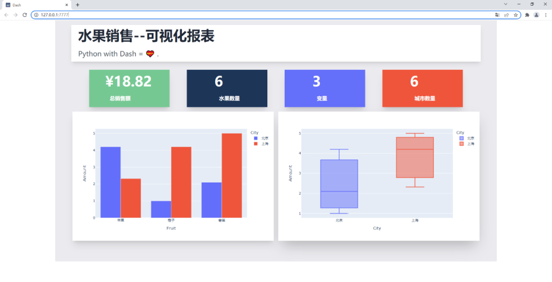
print(df)结果如下,3列6行,包含水果、销售额、城市列。

处理一下相关的数据,水果单数、销售总额、城市单数、变量数。
# 水果单数
fruit_count = df.Fruit.count()
# 销售总额
total_amt = df.Amount.sum()
# 城市单数
city_count = df.City.count()
# 变量数
variables = df.shape[1]创建图表实例,一个柱状图、一个箱型图。
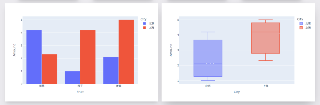
# 柱状图1, 不同水果不同城市的销售额
fig = px.bar(df, x="Fruit", y="Amount", color="City", barmode="group")

# 箱型图1, 不同城市的销售额分布情况
fig1 = px.box(df, x="City", y="Amount", color="City")效果如下。
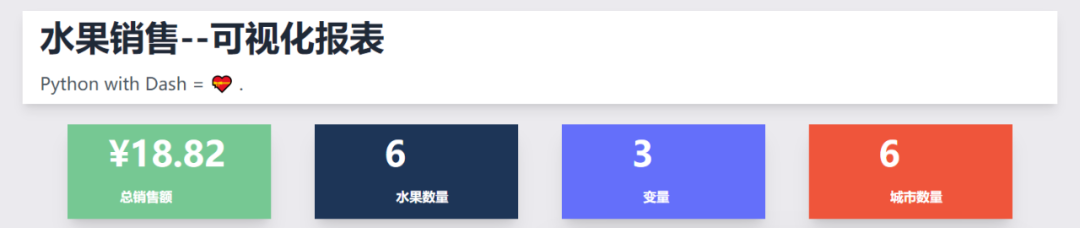
剩下就是文字模块啦,文字+CSS样式。
其中排版布局美化,通过Tailwindcss来实现。
app.layout = html.Div(
    html.Div(
        children=[
            html.Div(
                children=[
                    html.H1(children="水果销售--可视化报表", className=" py-3 text-5xl font-bold text-gray-800"),
                    html.Div(
                        children="""Python with Dash = ???? .""",
                        className="text-left prose prose-lg text-2xl  py-3 text-gray-600",
                    ),
                ],
                className="w-full mx-14 px-16 shadow-lg bg-white -mt-14 px-6 container my-3 ",
            ),
            html.Div(
                html.Div(
                    children=[
                        html.Div(
                            children=[
                                f"¥{total_amt}",
                                html.Br(),
                                html.Span("总销售额", className="text-lg font-bold ml-4"),
                            ],
                            className=" shadow-xl py-4 px-14 text-5xl bg-[#76c893] text-white  font-bold text-gray-800",
                        ),
                        html.Div(
                            children=[
                                fruit_count,
                                html.Br(),
                                html.Span("水果数量", className="text-lg font-bold ml-4"),
                            ],
                            className=" shadow-xl py-4 px-24 text-5xl bg-[#1d3557] text-white  font-bold text-gray-800",
                        ),
                        html.Div(
                            children=[
                                variables,
                                html.Br(),
                                html.Span("变量", className="inline-flex items-center text-lg font-bold ml-4"),
                            ],
                            className=" shadow-xl py-4 px-24 text-5xl bg-[#646ffa] text-white  font-bold text-gray-800",
                        ),
                        html.Div(
                            children=[
                                city_count,
                                html.Br(),
                                html.Span("城市数量", className="text-lg font-bold ml-4"),
                            ],
                            className="w-full shadow-xl py-4 px-24 text-5xl bg-[#ef553b] text-white  font-bold text-gray-800",
                        ),
                    ],
                    className="my-4 w-full grid grid-flow-rows grid-cols-1 lg:grid-cols-4 gap-y-4 lg:gap-[60px]",
                ),
                className="flex max-w-full justify-between items-center ",
            ),
            html.Div(
                children=[
                    html.Div(
                        children=[
                            dcc.Graph(id="example-graph", figure=fig),
                        ],
                        className="shadow-xl w-full border-3 rounded-sm",
                    ),
                    html.Div(
                        children=[
                            dcc.Graph(id="example-graph2", figure=fig1),
                        ],
                        className="w-full shadow-2xl rounded-sm",
                    ),
                ],
                className="grid grid-cols-1 lg:grid-cols-2 gap-4",
            ),
        ],
        className="bg-[#ebeaee]  flex py-14 flex-col items-center justify-center ",
    ),
    className="bg-[#ebeaee] container mx-auto px-14 py-4",
)效果如下。
最后启动程序代码。
if __name__ == '__main__':
    # debug模式, 端口7777
    app.run_server(debug=True, threaded=True, port=7777)
    # 正常模式, 网页右下角的调试按钮将不会出现
# app.run_server(port=7777)这样就能在本地看到可视化大屏页面,浏览器打开如下地址。
http://127.0.0.1:7777
感谢各位的阅读!关于“Python如何制作可视化报表”这篇文章就分享到这里了,希望以上内容可以对大家有一定的帮助,让大家可以学到更多知识,如果觉得文章不错,可以把它分享出去让更多的人看到吧!
亿速云「云服务器」,即开即用、新一代英特尔至强铂金CPU、三副本存储NVMe SSD云盘,价格低至29元/月。点击查看>>
免责声明:本站发布的内容(图片、视频和文字)以原创、转载和分享为主,文章观点不代表本网站立场,如果涉及侵权请联系站长邮箱:is@yisu.com进行举报,并提供相关证据,一经查实,将立刻删除涉嫌侵权内容。


 计算
计算 安全
安全 数据库
数据库 网络和加速
网络和加速 企业服务
企业服务


