这篇文章将为大家详细讲解有关怎么使用CSS实现眼冒金星的动画效果,小编觉得挺实用的,因此分享给大家做个参考,希望大家阅读完这篇文章后可以有所收获。
https://github.com/comehope/front-end-daily-challenges
定义 dom,容器中包含 9 个子元素:
<div class='container'>
    <span></span>
    <span></span>
    <span></span>
    <span></span>
    <span></span>
    <span></span>
    <span></span>
    <span></span>
    <span></span>
</div>居中显示:
body {
    margin: 0;
    height: 100vh;
    display: flex;
    align-items: center;
    justify-content: center;
    background-color: black;
}设置容器中子元素的布局方式,形成一个 3 * 3 的网格,其中 --columns 是网格每一边上的子元素数量:
.container {
    display: grid;
    --columns: 3;
    grid-template-columns: repeat(var(--columns), 1fr);
}定义子元素样式:
.container span {
    width: 25px;
    height: 25px;
    color: lime;
    background-color: currentColor;
}增加子元素的动画效果,总动画时长是 5 秒,其中第 1 秒(0% ~ 20%)有动画,其余 4 秒(20% ~ 100%)静止:
.container span {
    transform: scale(0);
    animation: spin 5s linear infinite;
}

@keyframes spin {
    0% {
        transform: rotate(0deg) scale(1);
    }

    5%, 15% {
        transform: rotate(90deg) scale(0);
        background: white;
    }

    17.5% {
        transform: rotate(180deg) scale(1);
        background-color: currentColor;
    }

    20%, 100% {
        transform: rotate(90deg) scale(0);
    }
}设置动画延时,使各子元素的动画随机延时 4 秒之内的任意时间:
.container span {
    animation-delay: calc(var(--delay) * 1s);
}

.container span:nth-child(1) { --delay: 0.8 }
.container span:nth-child(2) { --delay: 0.2 }
.container span:nth-child(3) { --delay: 1.9 }
.container span:nth-child(4) { --delay: 3.9 }
.container span:nth-child(5) { --delay: 2.8 }
.container span:nth-child(6) { --delay: 3.5 }
.container span:nth-child(7) { --delay: 1.5 }
.container span:nth-child(8) { --delay: 2.3 }
.container span:nth-child(9) { --delay: 1.7 }至此,静态效果完成,接下来批量处理 dom 元素。
引入 d3 库:
<script src="https://d3js.org/d3.v5.min.js"></script>删除掉 css 文件中的 --columns 变量声明,用 d3 为变量赋值:
const COLUMNS = 3;

d3.select('.container')
.style('--columns', COLUMNS);删除掉 html 文件中的 <span> 子元素,用 d3 动态生成:
d3.select('.container')
    .style('--columns', COLUMNS)
    .selectAll('span')
    .data(d3.range(COLUMNS * COLUMNS))
    .enter()
.append('span');删除掉 css 文件中的 --delay 变量声明,用 d3 为变量生成随机数:
d3.select('.container')
    .style('--columns', COLUMNS)
    .selectAll('span')
    .data(d3.range(COLUMNS * COLUMNS))
    .enter()
    .append('span')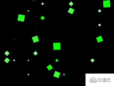
.style('--delay', () => Math.random() * 4);最后,把边长改为 15,生成更多的子元素,加强视觉效果:
const COLUMNS = 15;关于怎么使用CSS实现眼冒金星的动画效果就分享到这里了,希望以上内容可以对大家有一定的帮助,可以学到更多知识。如果觉得文章不错,可以把它分享出去让更多的人看到。
亿速云「云服务器」,即开即用、新一代英特尔至强铂金CPU、三副本存储NVMe SSD云盘,价格低至29元/月。点击查看>>
免责声明:本站发布的内容(图片、视频和文字)以原创、转载和分享为主,文章观点不代表本网站立场,如果涉及侵权请联系站长邮箱:is@yisu.com进行举报,并提供相关证据,一经查实,将立刻删除涉嫌侵权内容。


 计算
计算
 安全
安全 数据库
数据库 网络和加速
网络和加速 企业服务
企业服务


