这篇文章主要介绍CSS怎么实现多层嵌套结构最外层旋转其它层不旋转效果,文中介绍的非常详细,具有一定的参考价值,感兴趣的小伙伴们一定要看完!
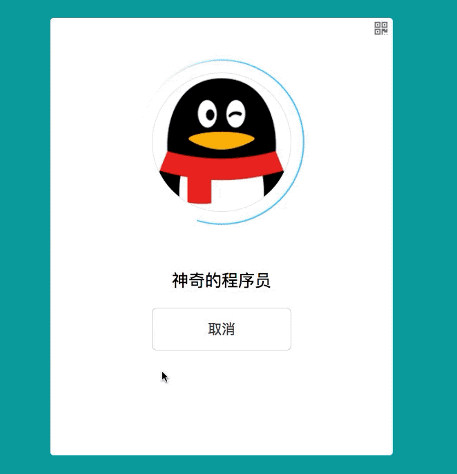
有这样一个场景:一个圆形容器,最外层容器的背景为圆弧,现在要将最外层的圆弧进行旋转,保证里面的容器里面的内容不进行旋转,接下来将跟大家分享一种解决方案,先看下最终实现的效果:
实现思路
最外层div设置边框倒角百分之50,溢出隐藏
设置最外层背景为圆弧的背景图
定义外层旋转动画,旋转度数为正数
定义内层旋转动画,旋转度数为负数
启动动画,开始旋转
外层为正数旋转,内层为负数旋转,刚好抵消,理想效果实现
实现过程
dom结构部分:布局外层div和内层div
load-panel为外层div, headPortrait-img-panel 为内层div, loadWhirl 为外层旋转动画, avatarRotation 为内层旋转动画。
<!--头像区域-->
<div class="headPortrait-panel">
    <!--加载层-->
    <div class="load-panel loadWhirl">
        <!--头像显示层-->
        <div class="headPortrait-img-panel avatarRotation">
            <img src="../assets/img/login/LoginWindow_BigDefaultHeadImage@2x.png"/>
        </div>
    </div>
</div>css部分:对样式进行布局,实现旋转动画逻辑。
  /*头像区域*/
  .headPortrait-panel{
    width: 100%;
    height: 200px;
    display: flex;
    justify-content: center;
    align-items: center;
    margin-top: 50px;

    /*加载层*/
    .load-panel{
      width: 240px;
      height: 240px;
      border-radius: 50%;
      display: flex;
      justify-content: center;
      align-items: center;
      background: url("../img/login/loading-circle@2x.png");

      img{
        width: 100%;
        height: 100%;
      }

      // 头像旋转动画
      .avatarRotation{
        animation: internalAvatar 3s linear;
        // 动画无限循环
        animation-iteration-count:infinite;
      }

      /*头像显示层*/
      .headPortrait-img-panel{
        width: 200px;
        height: 200px;
        border-radius: 50%;
        overflow: hidden;
        border: solid 1px #ebeced;

        img{
          width: 100%;
          height: 100%;
        }
      }
    }

    // 外部旋转动画
    .loadWhirl{
      animation: externalHalo 3s linear;
      // 动画无限循环
      animation-iteration-count:infinite;
    }
  }

  // 定义外部光环旋转动画
  @keyframes externalHalo {
    0%{
      transform: rotate(0deg);
    }
    25%{
      transform: rotate(90deg);
    }
    50%{
      transform: rotate(180deg);
    }
    100%{
      transform: rotate(360deg);
    }
  }

  // 定义内部头像旋转动画
  @keyframes internalAvatar {
    0%{
      transform: rotate(0deg);
    }
    25%{
      transform: rotate(-90deg);
    }
    50%{
      transform: rotate(-180deg);
    }
    100%{
      transform: rotate(-360deg);
    }
}以上是“CSS怎么实现多层嵌套结构最外层旋转其它层不旋转效果”这篇文章的所有内容,感谢各位的阅读!希望分享的内容对大家有帮助,更多相关知识,欢迎关注亿速云行业资讯频道!
亿速云「云服务器」,即开即用、新一代英特尔至强铂金CPU、三副本存储NVMe SSD云盘,价格低至29元/月。点击查看>>
免责声明:本站发布的内容(图片、视频和文字)以原创、转载和分享为主,文章观点不代表本网站立场,如果涉及侵权请联系站长邮箱:is@yisu.com进行举报,并提供相关证据,一经查实,将立刻删除涉嫌侵权内容。
原文链接:https://www.jb51.net/css/712331.html


 计算
计算
 安全
安全 数据库
数据库 网络和加速
网络和加速 企业服务
企业服务


