这篇文章给大家分享的是有关css如何制作超萌吃豆豆加载动画效果的内容。小编觉得挺实用的,因此分享给大家做个参考,一起跟随小编过来看看吧。
豆豆加载效果
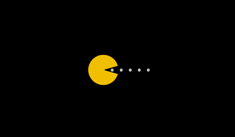
point_down:html代码:
<div class="demo">
 <div class="pacman"></div>
<div class="dot"></div>point_down:css代码:
<style>
@-webkit-keyframes up {
  0%, 100% {    transform: rotate(0);
  }
  50% {
    transform: rotate(-30deg);
  }
}
@-moz-keyframes up {
  0%, 100% {
    transform: rotate(0);
  }
  50% {
    transform: rotate(-30deg);
  }
}
@-o-keyframes up {
  0%, 100% {
    transform: rotate(0);
  }
  50% {
    transform: rotate(-30deg);
  }
}
@keyframes up {
  0%, 100% {
    transform: rotate(0);
  }
  50% {
    transform: rotate(-30deg);
  }
}
@-webkit-keyframes down {
  0%, 100% {
    transform: rotate(0);
  }
  50% {
    transform: rotate(30deg);
  }
}
@-moz-keyframes down {
  0%, 100% {
    transform: rotate(0);
  }
  50% {
    transform: rotate(30deg);
  }
}
@-o-keyframes down {
  0%, 100% {
    transform: rotate(0);
  }
  50% {
    transform: rotate(30deg);
  }
}
@keyframes down {
  0%, 100% {
    transform: rotate(0);
  }
  50% {
    transform: rotate(30deg);
  }
}
@-webkit-keyframes r-to-l {
  100% {
    margin-left: -1px;
  }
}
@-moz-keyframes r-to-l {
  100% {
    margin-left: -1px;
  }
}
@-o-keyframes r-to-l {
  100% {
    margin-left: -1px;
  }
}
@keyframes r-to-l {
  100% {
    margin-left: -1px;
  }
}
body {
  background: #000;
  overflow: hidden;
  margin: 0;
}
body .pacman:before, body .pacman:after {
  content: '';
  position: absolute;
  background: #FFC107;
  width: 100px;
  height: 50px;
  left: 50%;
  top: 50%;
  margin-left: -50px;
  margin-top: -50px;
  border-radius: 50px 50px 0 0;
  -webkit-animation: up 0.4s infinite;
  -moz-animation: up 0.4s infinite;
  -o-animation: up 0.4s infinite;
  animation: up 0.4s infinite;
}
body .pacman:after {
  margin-top: -1px;
  border-radius: 0 0 50px 50px;
  -webkit-animation: down 0.4s infinite;
  -moz-animation: down 0.4s infinite;
  -o-animation: down 0.4s infinite;
  animation: down 0.4s infinite;
}
body .dot {
  position: absolute;
  left: 50%;
  top: 50%;
  width: 10px;
  height: 10px;
  margin-top: -5px;
  margin-left: 30px;
  border-radius: 50%;
  background: #ccc;
  z-index: -1;
  box-shadow: 30px 0 0 #ccc, 60px 0 0 #ccc, 90px 0 0 #ccc, 120px 0 0 #ccc, 150px 0 0 #ccc;
  -webkit-animation: r-to-l 0.4s infinite;
  -moz-animation: r-to-l 0.4s infinite;
  -o-animation: r-to-l 0.4s infinite;
  animation: r-to-l 0.4s infinite;
}
</style>感谢各位的阅读!关于“css如何制作超萌吃豆豆加载动画效果”这篇文章就分享到这里了,希望以上内容可以对大家有一定的帮助,让大家可以学到更多知识,如果觉得文章不错,可以把它分享出去让更多的人看到吧!
免责声明:本站发布的内容(图片、视频和文字)以原创、转载和分享为主,文章观点不代表本网站立场,如果涉及侵权请联系站长邮箱:is@yisu.com进行举报,并提供相关证据,一经查实,将立刻删除涉嫌侵权内容。


 计算
计算
 安全
安全 数据库
数据库 网络和加速
网络和加速 企业服务
企业服务


