这篇文章主要为大家展示了“html中移动端1px的示例分析”,内容简而易懂,条理清晰,希望能够帮助大家解决疑惑,下面让小编带领大家一起研究并学习一下“html中移动端1px的示例分析”这篇文章吧。
问题
为什么有 1px 这个问题?
实现 1px 有哪些方法?这些方法分别有哪些优缺点?
开源项目中使用的哪些解决方案?
如何在项目中处理 1px 的相关问题?
由来
基本概念
首先,我们要了解两个概念,一个是 像素(pixel) 可以简写为 px ,另外一个是 设备像素比(DPR)
像素 :指在由一个数字序列表示的图像中的一个最小单元,单位是 px,不可再次分割了。
设备像素比(DPR): 设备像素比 = 设备像素 / 设备独立像素。
下面我来简单解释下几个概念
CSS 像素 (虚拟像素):指的是 CSS 样式代码中使用的逻辑像素,在 CSS 规范中,长度单位可以分为两类,绝对单位以及相对单位。px 是一个相对单位,相对的是设备像素。
设备像素 (物理像素):指设备能控制显示的最小物理单位,意指显示器上一个个的点。从屏幕在工厂生产出的那天起,它上面设备像素点就固定不变了,和屏幕尺寸大小有关。
设备独立像素 (逻辑像素):可以认为是计算机坐标系统中得一个点,这个点代表一个可以由程序使用的虚拟像素(比如: CSS 像素),这个点是没有固定大小的,越小越清晰,然后由相关系统转换为物理像素。 也就是说,当逻辑像素是 1pt 时,在 DPR 为 2 的 设备上显示为 2px 的物理像素
参考数据
各种类型的 iphone 手机屏幕设备的参数
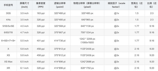
注:这里的缩放因子呢,就是 DRP 的值
设计稿对比数据
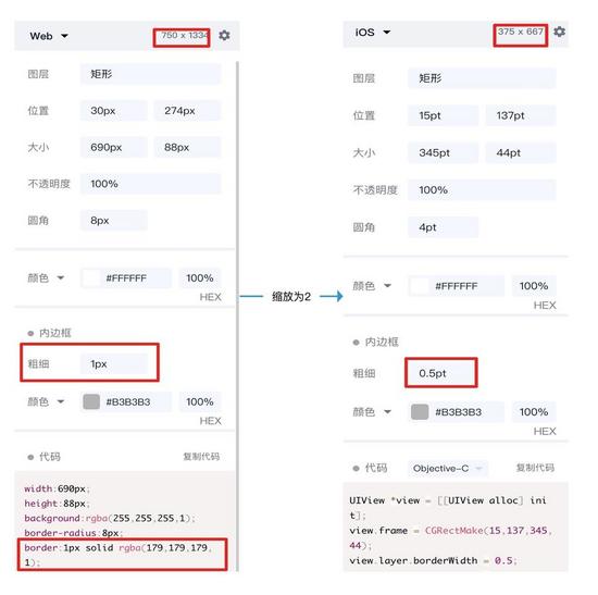
会有人好奇,为什么设计稿上显示是 750x1334 呢,这是因为设计稿是显示的 物理像素
而我们 css 中的像素是 逻辑像素 应该为 375x 667,在编写代码时要将自定义宽度设置成 375px
那么此时设计稿上的 1px 宽度实际代表的 css 参数应该是 0.5px 对应物理像素 1px,那么怎么实现这个物理像素为 1px 呢
实践
归根结底有两种方案,一种是利用 css 中的 transfrom:scaleY(0.5) ,另一种是设置 媒体查询根据不同 DPR 缩放
解决方案一
原理
利用 css 的 伪元素 ::after + transfrom 进行缩放
为什么用伪元素?因为伪元素 ::after 或 ::before 是独立于当前元素,可以单独对其缩放而不影响元素本身的缩放
伪元素大多数浏览器默认单引号也可以使用,和伪类一样形式,而且单引号兼容性(ie)更好些
实现
<div class="cell border-1px"> cell <div>

<style>
.cell {
    width: 100px;
    height: 100px;
}
<!--全部边框-->
.border-1px:after {
    content: '';
    position: absolute;
    box-sizing: border-box;
    top: 0;
    left: 0;
    width: 200%;
    height: 200%;
    border: 1px solid #000;
    border-radius: 4px;
    -webkit-transform: scale(0.5);
    transform: scale(0.5);
    -webkit-transform-origin: top left;
}

<!--单边框,以上边框为例-->
.border-1px-top:before {
    content: "";
    position: absolute;
    top: 0;
    left: 0;
    right: 0;
    border-top: 1px solid red;
    transform: scaleY(.5);
    transform-origin: left top;
}
</style>解决方案二(升级方案一)
原理
使用 less 对公共代码(方案一)封装,同时增加媒体查询分别对不同 DPR 的设备,进行不同的缩放
.border(
    @borderWidth: 1px;
    @borderStyle: solid;
    @borderColor: @lignt-gray-color;
    @borderRadius: 0) {
    position: relative;
    &:before {
        content: '';
        position: absolute;
        width: 98%;
        height: 98%;
        top: 0;
        left: 0;
        transform-origin: left top;
        -webkit-transform-origin: left top;
        box-sizing: border-box;
        pointer-events: none;
    }
    @media (-webkit-min-device-pixel-ratio: 2) {
        &:before {
            width: 200%;
            height: 200%;
            -webkit-transform: scale(.5);
        }
    }
    @media (-webkit-min-device-pixel-ratio: 2.5) {
        &:before {
            width: 250%;
            height: 250%;
            -webkit-transform: scale(.4);
        }
    }
    @media (-webkit-min-device-pixel-ratio: 2.75) {
        &:before {
            width: 275%;
            height: 275%;
            -webkit-transform: scale(1 / 2.75);
        }
    }
    @media (-webkit-min-device-pixel-ratio: 3) {
        &:before {
            width: 300%;
            height: 300%;
            transform: scale(1 / 3);
            -webkit-transform: scale(1 / 3);
        }
    }
    .border-radius(@borderRadius);
    &:before {
        border-width: @borderWidth;
        border-style: @borderStyle;
        border-color: @borderColor;
    }
}

.border-all(
	@borderWidth: 1px;
	@borderStyle: solid;
	@borderColor: @lignt-gray-color;
	@borderRadius: 0) {
    .border(@borderWidth; @borderStyle; @borderColor; @borderRadius);
}其他方案:
使用图片:兼容性最好,灵活行最差,不能改变颜色、长度
使用 viewport 和 rem , js 动态改变 viewport 中 scale 缩放,缺点在于不适用于已有的项目,例如:使用 vh 和 vw 布局的
<meta name="viewport" id="WebViewport" content="initial-scale=1, maximum-scale=1, minimum-scale=1, user-scalable=no">使用 css 渐变 linear-gradient 或者 box-shadow
上述 3 种方案均有致命缺陷暂不推荐使用
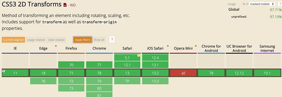
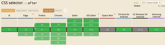
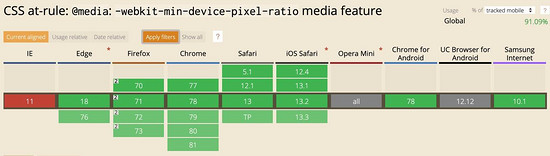
兼容性
最后看一下兼容性如何,主要是伪元素、 transform:scale 和 min-device-pixel-ratio 这几个关键词的兼容性
开源库的解决方案
vant 组件库
跳去 github 查看相关代码
使用 less 写的
.hairline-common() {
  position: absolute;
  box-sizing: border-box;
  content: ' ';
  pointer-events: none;
}

.hairline(@color: @border-color) {
  .hairline-common();

  top: -50%;
  right: -50%;
  bottom: -50%;
  left: -50%;
  border: 0 solid @color;
  transform: scale(0.5);
}也是采用第一种解决方案
ant-design-mobile 组件库
跳去 github 查看相关代码
.scale-hairline-common(@color, @top, @right, @bottom, @left) {
  content: '';
  position: absolute;
  background-color: @color;
  display: block;
  z-index: 1;
  top: @top;
  right: @right;
  bottom: @bottom;
  left: @left;
}

.hairline(@direction, @color: @border-color-base) when (@direction = 'top') {
  border-top: 1PX solid @color;

  html:not([data-scale]) & {
    @media (min-resolution: 2dppx) {
      border-top: none;

      &::before {
        .scale-hairline-common(@color, 0, auto, auto, 0);
        width: 100%;
        height: 1PX;
        transform-origin: 50% 50%;
        transform: scaleY(0.5);

        @media (min-resolution: 3dppx) {
          transform: scaleY(0.33);
        }
      }
    }
  }
}

.hairline(@direction, @color: @border-color-base) when (@direction = 'right') {
  border-right: 1PX solid @color;

  html:not([data-scale]) & {
    @media (min-resolution: 2dppx) {
      border-right: none;

      &::after {
        .scale-hairline-common(@color, 0, 0, auto, auto);
        width: 1PX;
        height: 100%;
        background: @color;
        transform-origin: 100% 50%;
        transform: scaleX(0.5);

        @media (min-resolution: 3dppx) {
          transform: scaleX(0.33);
        }
      }
    }
  }
}
.hairline(@direction, @color: @border-color-base) when (@direction = 'bottom') {
  border-bottom: 1PX solid @color;
  html:not([data-scale]) & {
    @media (min-resolution: 2dppx) {
      border-bottom: none;
      &::after {
        .scale-hairline-common(@color, auto, auto, 0, 0);
        width: 100%;
        height: 1PX;
        transform-origin: 50% 100%;
        transform: scaleY(0.5);
        @media (min-resolution: 3dppx) {
          transform: scaleY(0.33);
        }
      }
    }
  }
}

.hairline(@direction, @color: @border-color-base) when (@direction = 'left') {
  border-left: 1PX solid @color;

  html:not([data-scale]) & {
    @media (min-resolution: 2dppx) {
      border-left: none;

      &::before {
        .scale-hairline-common(@color, 0, auto, auto, 0);
        width: 1PX;
        height: 100%;
        transform-origin: 100% 50%;
        transform: scaleX(0.5);

        @media (min-resolution: 3dppx) {
          transform: scaleX(0.33);
        }
      }
    }
  }
}

.hairline(@direction, @color: @border-color-base, @radius: 0) when (@direction = 'all') {
  border: 1PX solid @color;
  border-radius: @radius;

  html:not([data-scale]) & {
    @media (min-resolution: 2dppx) {
      position: relative;
      border: none;

      &::before {
        content: '';
        position: absolute;
        left: 0;
        top: 0;
        width: 200%;
        height: 200%;
        border: 1PX solid @color;
        border-radius: @radius * 2;
        transform-origin: 0 0;
        transform: scale(0.5);
        box-sizing: border-box;
        pointer-events: none;

        // @media (min-resolution: 3dppx) {
        //   width: 300%;
        //   height: 300%;
        //   border-radius: @radius * 3;
        //   transform: scale(0.33);
        // }
      }
    }
  }
}这个值得研究下,比 vant 和 第一种解决方案有点不同,主要在于处理了 DPR 为 2 和为 3 的两种情况,相比来说更加完善。
这里 PX 大写,为了防止插件将 px 转成 rem 等单位。
以上是“html中移动端1px的示例分析”这篇文章的所有内容,感谢各位的阅读!相信大家都有了一定的了解,希望分享的内容对大家有所帮助,如果还想学习更多知识,欢迎关注亿速云行业资讯频道!
亿速云「云服务器」,即开即用、新一代英特尔至强铂金CPU、三副本存储NVMe SSD云盘,价格低至29元/月。点击查看>>
免责声明:本站发布的内容(图片、视频和文字)以原创、转载和分享为主,文章观点不代表本网站立场,如果涉及侵权请联系站长邮箱:is@yisu.com进行举报,并提供相关证据,一经查实,将立刻删除涉嫌侵权内容。
原文链接:https://www.jb51.net/html5/706449.html


 计算
计算
 安全
安全 数据库
数据库 网络和加速
网络和加速 企业服务
企业服务


