这篇文章主要介绍“R数据可视化怎么实现NBA球员薪水排行榜”,在日常操作中,相信很多人在R数据可视化怎么实现NBA球员薪水排行榜问题上存在疑惑,小编查阅了各式资料,整理出简单好用的操作方法,希望对大家解答”R数据可视化怎么实现NBA球员薪水排行榜”的疑惑有所帮助!接下来,请跟着小编一起来学习吧!
import mathimport requestsfrom bs4 import BeautifulSoupheaders = {"User-Agent":'Mozilla/5.0 (Windows NT 10.0; WOW64) AppleWebKit/537.36 (KHTML, like Gecko) Chrome/81.0.4044.138 Safari/537.36'}fw = open('NBA_salary_3.txt','w')fw.write('%s\t%s\t%s\t%s\t%s\t%s\n'%("year","rk","player","position","team","salary"))years = list(range(2000,2021))for year in years: URL = "http://www.espn.com/nba/salaries/_/year/" + str(year) print(URL) page = requests.get(URL,headers=headers) soup = BeautifulSoup(page.content,'html.parser') df = soup.find_all('tr') j = 0 for aa in df: j = j + 1 if j == 1: continue elif j > 1 and j < 12: all_td = aa.find_all('td') rk = all_td[0].get_text() player_position = all_td[1].get_text() #print(player_position) player = player_position.split(",")[0] position = player_position.split(",")[1] team = all_td[2].get_text() salary = all_td[3].get_text().replace("$","").replace(",","") fw.write('%s\t%s\t%s\t%s\t%s\t%s\n'%(str(year),rk,player,position,team,salary)) else: break fw.close()library(ggplot2)ggplot(df1,aes(x=rk,y=salary))+ geom_col(aes(fill=player))+ geom_label(aes(label=paste0(salary,"万"),hjust=1))+ theme_bw()+ scale_x_continuous(breaks = 1:10,labels = df1$player)+ coord_flip()+labs(x="",y="")+ theme(legend.position = "none")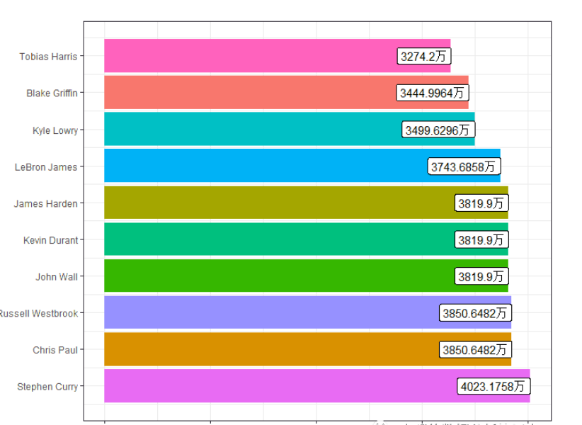
使用的工具是R语言的gganimate包
用到的代码是
df<-read.csv("NBA_salary_3.txt",header=T,sep="\t",stringsAsFactors = F)df$salary<-df$salary/10000head(df)library(tidyquant)x1<-palette_dark()colors<-matrix(x1)[,1][1:10]colors<-sample(colors,69,replace = T)colorslibrary(ggplot2)staticplot = ggplot(df, aes(rk, group = player, fill = as.factor(player), color = as.factor(player))) + geom_tile(aes(y = salary/2, height = salary, width = 0.9), alpha = 0.8, color = NA) + geom_text(aes(y = 0, label = paste(player, " ")), vjust = 0.2, hjust = 1,color="black") + geom_text(aes(y=salary,label = salary, hjust=0),color="black") + scale_fill_manual(values = colors)+ coord_flip(clip = "off", expand = FALSE) + scale_y_continuous(labels = scales::comma) + scale_x_reverse() + guides(color = FALSE, fill = FALSE) + theme(axis.line=element_blank(), axis.text.x=element_blank(), axis.text.y=element_blank(), axis.ticks=element_blank(), axis.title.x=element_blank(), axis.title.y=element_blank(), legend.position="none", panel.background=element_blank(), panel.border=element_blank(), panel.grid.major=element_blank(), panel.grid.minor=element_blank(), panel.grid.major.x = element_line( size=.1, color="grey" ), panel.grid.minor.x = element_line( size=.1, color="grey" ), plot.title=element_text(size=25, hjust=0.5, face="bold", colour="grey", vjust=-1), plot.subtitle=element_text(size=18, hjust=0.5, face="italic", color="grey"), plot.caption =element_text(size=8, hjust=0.5, face="italic", color="grey"), plot.background=element_blank(), plot.margin = margin(2,2, 2, 4, "cm"))staticplotlibrary(gganimate)help(package="gganimate")anim = staticplot + transition_states(year, transition_length = 4, state_length = 1) + view_follow(fixed_x = TRUE) + labs(title = 'NBA player Salary : {closest_state}', subtitle = "Top 10 Players", caption = "Data Source: http://www.espn.com/nba/salaries")animate(anim, 300, fps = 10, duration = 20, width = 1200, height = 1000, renderer = ffmpeg_renderer()) -> for_mp4anim_save("animation_6.mp4", animation = for_mp4 )到此,关于“R数据可视化怎么实现NBA球员薪水排行榜”的学习就结束了,希望能够解决大家的疑惑。理论与实践的搭配能更好的帮助大家学习,快去试试吧!若想继续学习更多相关知识,请继续关注亿速云网站,小编会继续努力为大家带来更多实用的文章!
亿速云「云服务器」,即开即用、新一代英特尔至强铂金CPU、三副本存储NVMe SSD云盘,价格低至29元/月。点击查看>>
免责声明:本站发布的内容(图片、视频和文字)以原创、转载和分享为主,文章观点不代表本网站立场,如果涉及侵权请联系站长邮箱:is@yisu.com进行举报,并提供相关证据,一经查实,将立刻删除涉嫌侵权内容。
原文链接:https://my.oschina.net/u/4579431/blog/4347436


 计算
计算 安全
安全 数据库
数据库 网络和加速
网络和加速 企业服务
企业服务


