python matplotlib是如何画图的,很多新手对此不是很清楚,为了帮助大家解决这个难题,下面小编将为大家详细讲解,有这方面需求的人可以来学习下,希望你能有所收获。
matplotlib是一种优秀的python数据可视化第三方库
使用matpltlib库画图时,先将它引入,加载里面的pyplot,并命名为plt,然后使用plot函数画图
import matplotlib.pyplot as plt #plt是引入模块的别名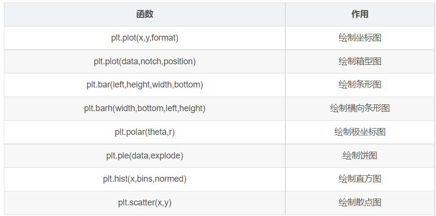
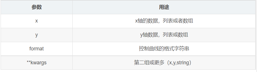
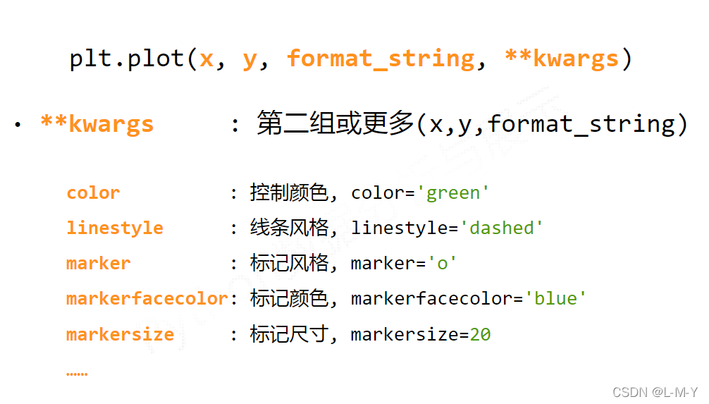
plot函数参数:plot([x],y,[format],**kwargs)
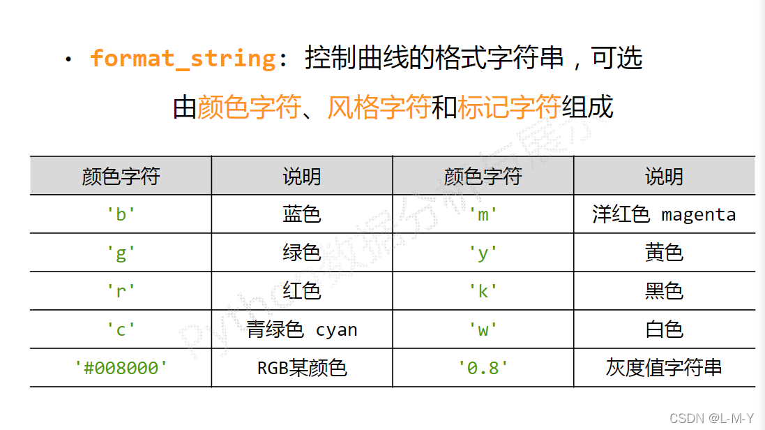
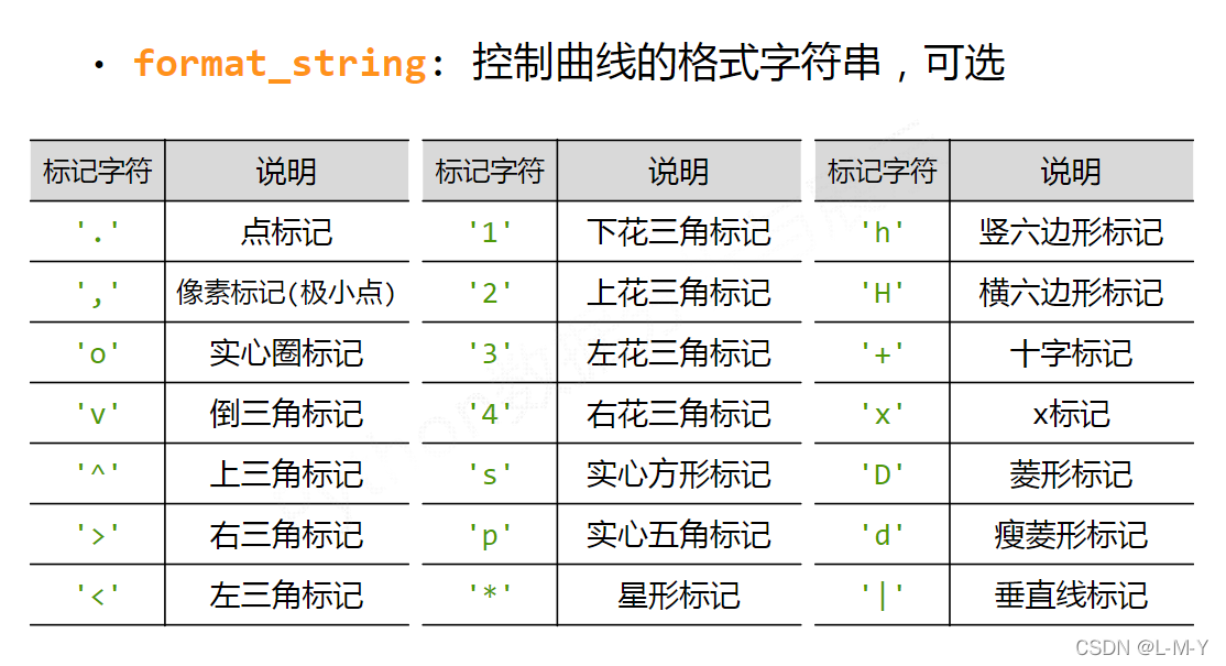
各类语法太多啦,偷几张MOOC的图放上来~

from matplotlib import pyplot as plt
#生成数据
#横坐标数据从2017到2022,第三个参数可控制步长,可写可不写
x = range(2017, 2022)
#y对应纵坐标的值
y1 = [49, 48, 45, 52, 50]
y2 = [60, 62, 61, 65, 63]
#生成图形
plt.title("LMY and her mother's weight")
plt.xlabel('year')
plt.ylabel('kg')
plt.plot(x, y1, color='green', label='LMY')
plt.plot(x, y2, color='purple', label='mother')
plt.grid(alpha=0.5)
plt.legend(loc='upper right')
#显示图形
plt.show()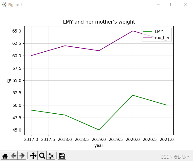
from matplotlib import pyplot as plt
import numpy as np

# 生成数据
# 横坐标数据从2017到2022,第三个参数可控制步长,可写可不写
x = range(2017, 2022)
# y对应纵坐标的值
y1 = [49, 48, 45, 52, 50]
y2 = [60, 62, 61, 65, 63]
# 生成图形
plt.title("LMY and her mother's weight")
plt.xlabel('year')
plt.ylabel('kg')
# 点的大小
area = np.pi*4**2
plt.scatter(x, y1, s=area, c='yellow', alpha=1)
plt.scatter(x, y2, s=area, c='blue', alpha=1)
plt.legend()
plt.yticks(())
plt.show()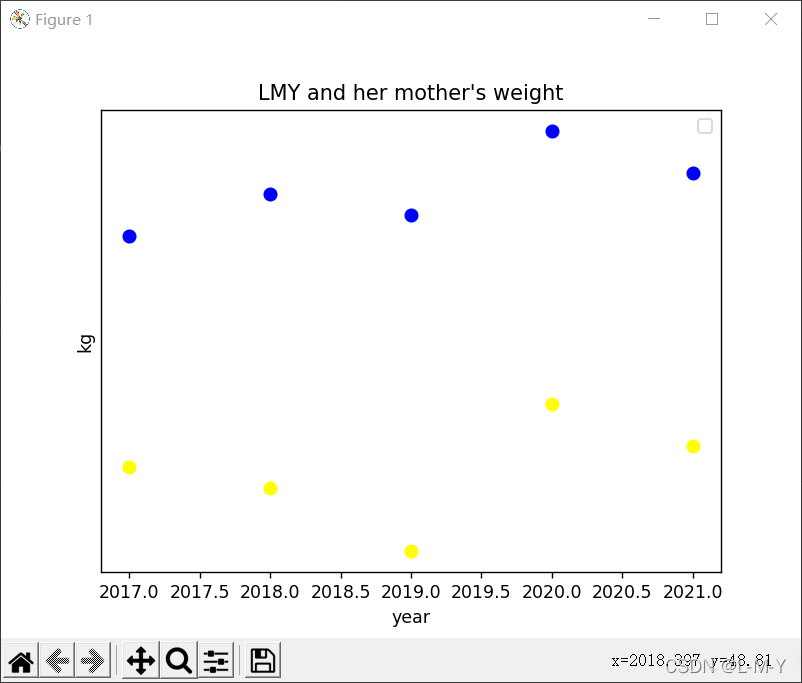
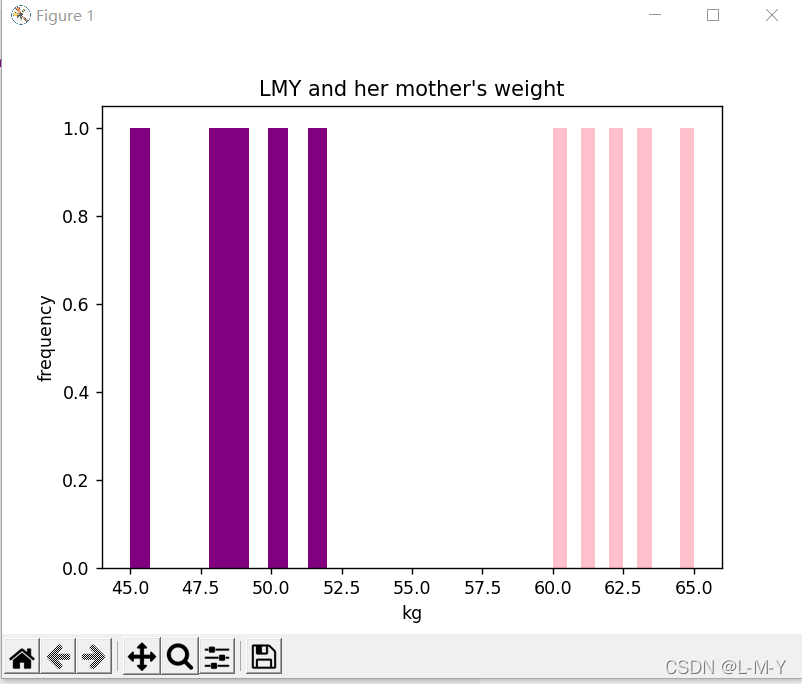
from matplotlib import pyplot as plt
import numpy as np

# 生成数据
# 横坐标数据从2017到2022,第三个参数可控制步长,可写可不写
x = [2017, 2018, 2019, 2020, 2021]
# y对应纵坐标的值
y1 = [49, 48, 45, 52, 50]
y2 = [60, 62, 61, 65, 63]
# 生成图形
plt.title("LMY and her mother's weight")
plt.ylabel('frequency')
plt.xlabel('kg')
# 点的大小
plt.hist(y1, bottom=None, color='purple')
plt.hist(y2, bottom=None, color='pink')
plt.show()

# n, bins, patches = plt.hist(arr, bins=50, normed=1, facecolor='green', alpha=0.75)
'''
arr:需要计算直方图的一维数组
bins:直方图的柱数,可选项,默认为10
normed:是否将得到的直方图向量归一化,默认为0
facecolor:直方图颜色
alpha:透明度
'''
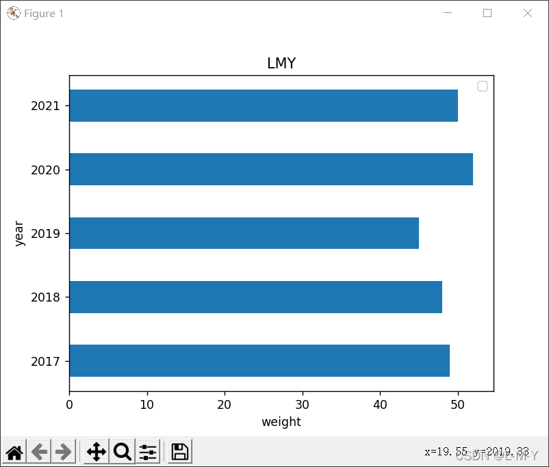
from matplotlib import pyplot as plt
import numpy as np

arr = np.arange(2017, 2022)
x = [49, 48, 45, 52, 50]  # x轴
y = [2017, 2018, 2019, 2020, 2021]
rect = plt.bar(arr, x, width=0.5)
plt.title('LMY')
plt.xlabel('weight')
plt.ylabel('year')
plt.legend()

plt.show()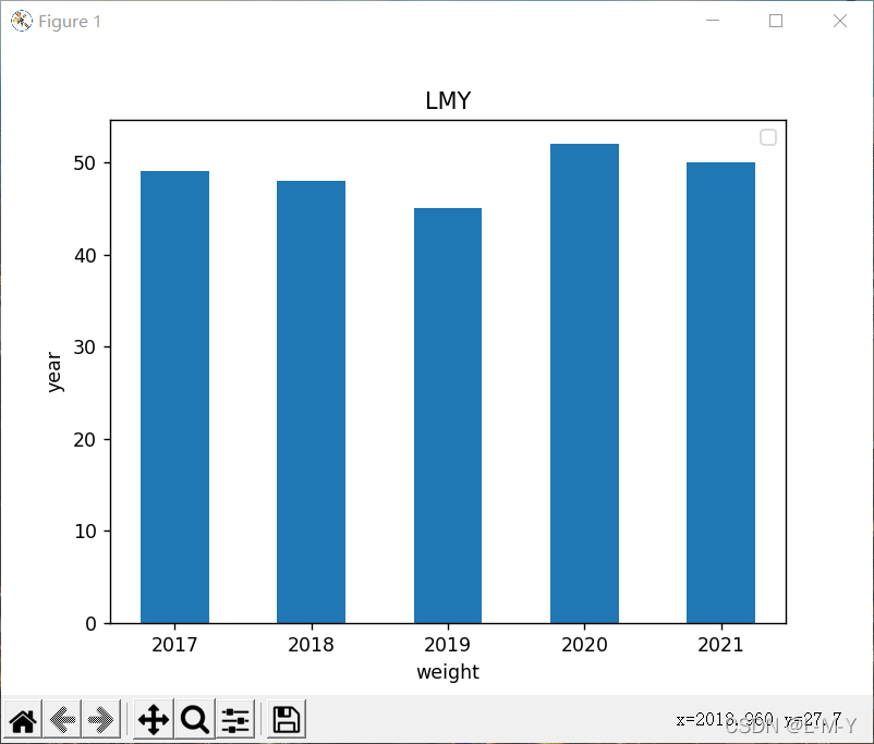
from matplotlib import pyplot as plt
import numpy as np

arr = np.arange(2017, 2022)
x1 = [49, 48, 45, 52, 50]  # x轴
x2 = [60, 62, 61, 65, 63]
y = [2017, 2018, 2019, 2020, 2021]
rects1 = plt.bar(arr, x1, 0.5, color='purple', label='LMY')
rects2 = plt.bar(arr, x2, 0.5, color='yellow', label='Mother', alpha=0.3)
plt.title("LMY and her mother's weight")
plt.xlabel('weight')
plt.ylabel('year')
plt.legend()

plt.show()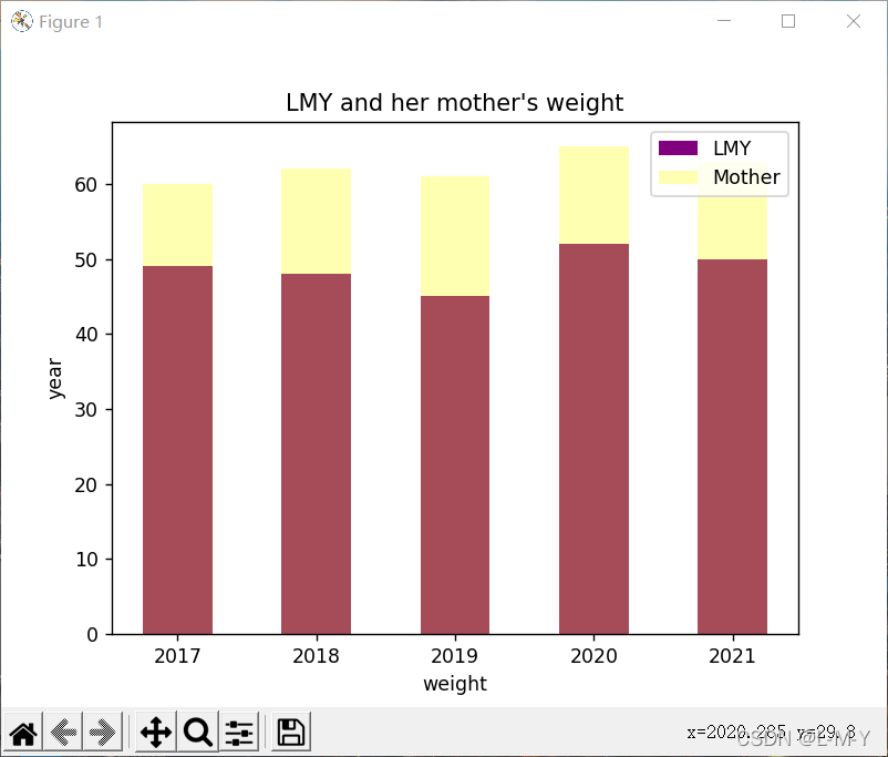
from matplotlib import patches, pyplot as plt
import numpy as np

label_list = ['49', '48', '45', '52', '50']
size = [20, 20, 20, 20, 20]
# 各部分的颜色
color = ['red', 'pink', 'blue', 'green', 'purple']
explode = [0, 0, 0.15, 0, 0]

patches, l_text, p_text = plt.pie(size, explode=explode, colors=color, labels=label_list,
                                  labeldistance=1.2, autopct="%1.2f%%", shadow=False, startangle=90, pctdistance=0.6)
plt.axis('equal')
plt.title("LMY's weight")
plt.legend(loc='upper left')
plt.show()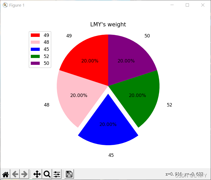
看完上述内容是否对您有帮助呢?如果还想对相关知识有进一步的了解或阅读更多相关文章,请关注亿速云行业资讯频道,感谢您对亿速云的支持。
亿速云「云服务器」,即开即用、新一代英特尔至强铂金CPU、三副本存储NVMe SSD云盘,价格低至29元/月。点击查看>>
免责声明:本站发布的内容(图片、视频和文字)以原创、转载和分享为主,文章观点不代表本网站立场,如果涉及侵权请联系站长邮箱:is@yisu.com进行举报,并提供相关证据,一经查实,将立刻删除涉嫌侵权内容。


 计算
计算 安全
安全 数据库
数据库 网络和加速
网络和加速 企业服务
企业服务


