本篇内容主要讲解“CSS3代码怎么实现点击放大动画效果”,感兴趣的朋友不妨来看看。本文介绍的方法操作简单快捷,实用性强。下面就让小编来带大家学习“CSS3代码怎么实现点击放大动画效果”吧!
代码如下
<!DOCTYPE html>
<head>
       <style type="text/css">
        @keyframes myfirst {
            0% {
                width: 50px;
                height: 50px;
                top: 10px;
                right: 10px;
            }
            75% {
                width: 60px;
                height: 60px;
                top: 5px;
                right: 5px;
            }
            100% {
                width: 50px;
                height: 50px;
                top: 10px;
                right: 10px;
            }
        }
        .warp {
            width: 400px;
            height: 300px;
            position: relative;
            background: #ccc;
        }
        .btn {
            position: absolute;
            width: 50px;
            height: 50px;
            border:solid 3px #cc3c24;
            top: 10px;
            right: 10px;
            border-radius: 8px;
            cursor: pointer;
        }
        .btn.cur{
            animation: myfirst 0.2s;
        }
        .btn.yes{
            background: #cc3c24;
        }
    </style>
</head>
<body>
<div class="warp">
    <div class="btn"></div>
</div>
<script src="http://liuxiaofan.com/demo/js/jquery-2.1.4.min.js"></script>
<script>
   var btn = $('.btn');
    btn.click(function () {
        if( $(this).is('.yes')){
            $(this).removeClass('yes');
            $(this).removeClass('cur');
        }else{
            $(this).addClass('yes');
            $(this).addClass('cur');
        }
    });
    btn.on('webkitAnimationEnd', function () {
        $(this).removeClass('cur');
    });
</script>
</body>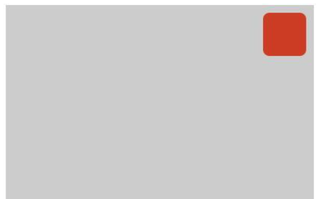
</html>效果图如下:

css的基本语法是:
1、css规则由选择器和一条或多条声明两个部分构成;
2、选择器通常是需要改变样式的HTML元素;
3、每条声明由一个属性和一个值组成;
4、属性和属性值被冒号分隔开。
到此,相信大家对“CSS3代码怎么实现点击放大动画效果”有了更深的了解,不妨来实际操作一番吧!这里是亿速云网站,更多相关内容可以进入相关频道进行查询,关注我们,继续学习!
亿速云「云服务器」,即开即用、新一代英特尔至强铂金CPU、三副本存储NVMe SSD云盘,价格低至29元/月。点击查看>>
免责声明:本站发布的内容(图片、视频和文字)以原创、转载和分享为主,文章观点不代表本网站立场,如果涉及侵权请联系站长邮箱:is@yisu.com进行举报,并提供相关证据,一经查实,将立刻删除涉嫌侵权内容。


 计算
计算
 安全
安全 数据库
数据库 网络和加速
网络和加速 企业服务
企业服务


