今天就跟大家聊聊有关bootstrap中验证提示状态的类有哪些,可能很多人都不太了解,为了让大家更加了解,小编给大家总结了以下内容,希望大家根据这篇文章可以有所收获。
在制作表单时,不免要做表单验证。同样也需要提供验证状态样式,在Bootstrap框架中同样提供这几种效果。
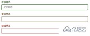
1、.has-warning:警告状态(黄色)
2、.has-error:错误状态(红色)
3、.has-success:成功状态(绿色)
使用的时候只需要在form-group容器上对应添加状态类名。
<form role="form">
<div class="form-group has-success">
  <label class="control-label" for="inputSuccess1">成功状态</label>
  <input type="text" class="form-control" id="inputSuccess1" placeholder="成功状态" >
</div>
<div class="form-group has-warning">
  <label class="control-label" for="inputWarning1">警告状态</label>
  <input type="text" class="form-control" id="inputWarning1" placeholder="警告状态">
</div>
<div class="form-group has-error">
  <label class="control-label" for="inputError1">错误状态</label>
  <input type="text" class="form-control" id="inputError1" placeholder="错误状态">
</div>
</form>效果图:
看完上述内容,你们对bootstrap中验证提示状态的类有哪些有进一步的了解吗?如果还想了解更多知识或者相关内容,请关注亿速云行业资讯频道,感谢大家的支持。
亿速云「云服务器」,即开即用、新一代英特尔至强铂金CPU、三副本存储NVMe SSD云盘,价格低至29元/月。点击查看>>
免责声明:本站发布的内容(图片、视频和文字)以原创、转载和分享为主,文章观点不代表本网站立场,如果涉及侵权请联系站长邮箱:is@yisu.com进行举报,并提供相关证据,一经查实,将立刻删除涉嫌侵权内容。


 计算
计算
 安全
安全 数据库
数据库 网络和加速
网络和加速 企业服务
企业服务


