这篇文章给大家分享的是有关Vue如何实现移动端页面切换效果的内容。小编觉得挺实用的,因此分享给大家做个参考,一起跟随小编过来看看吧。
Vue是一款友好的、多用途且高性能的JavaScript框架,使用vue可以创建可维护性和可测试性更强的代码库,Vue允许可以将一个网页分割成可复用的组件,每个组件都包含属于自己的HTML、CSS、JavaScript,以用来渲染网页中相应的地方,所以越来越多的前端开发者使用vue。
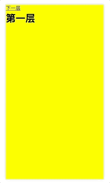
在子页面把整个页面做绝对定位,覆盖整个屏幕,子父页面将 router-view 用 transition 套起来,并加上过渡动画就可以啦。
代码:
<!DOCTYPE html>
<html lang="en">
<head>
 <meta charset="UTF-8">
 <meta name="viewport" content="width=device-width, initial-scale=1.0, maximum-scale=1.0, minimum-scale=1.0, user-scalable=no">
 <title>Document</title>
 <style>
  * { padding: 0; margin: 0; }
  html, body, #app { width: 100%; height: 100%; }
  .one { height: 100%; background-color: yellow; }
  .two { background-color: tomato; position: fixed; top: 0; bottom: 0; left: 0; right: 0; }
  .three { background-color: #ffe69f; position: fixed; top: 0; bottom: 0; left: 0; right: 0; }
  .v-enter-active, .v-leave-active { transition: all 0.3s; }
  .v-enter, .v-leave-to { transform: translateX(100%); }
 </style>
</head>
<body>
 <div id="app">
  <div class="one">
   <p>
    <router-link to="/foo">下一层</router-link>
   </p>
   <h2>第一层</h2>
  </div>
  <transition>
   <router-view></router-view>
  </transition>
 </div>

 <script src="https://unpkg.com/vue/dist/vue.js"></script>
 <script src="https://unpkg.com/vue-router/dist/vue-router.js"></script>
 <script>
  const Foo = {
   template: `
    <div class="whole-page two">
     <router-link to="/foo/bar">下一层</router-link>
     <router-link to="/">返回</router-link>
     <h2>第二层</h2>
     <transition>
      <router-view></router-view>
     </transition>
    </div>
   `
  }
  const Bar = {
   template: `
    <div class="whole-page three">
     <router-link to="/foo">返回</router-link>
     <h2>第三层</h2>
     <transition>
      <router-view></router-view>
     </transition>
    </div>
   `
  }
  const routes = [
   { path: '/foo', component: Foo, children: [ { path: 'bar', component: Bar } ] }
  ]
  const router = new VueRouter({ routes })
  const app = new Vue({ router }).$mount('#app')
 </script>
</body>
</html>效果:
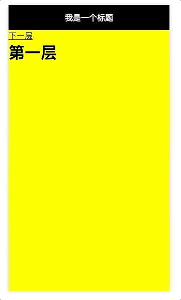
有一个问题需要注意一下,
我们知道,在应用transform属性的时候,fixed定位会变成absolute。
这里,页面转换的时候,就变成了相对translation定位。所以如果子页面中有绝对定位的话,移动的过程中页面会变形。
简单举个栗子,
<!DOCTYPE html>
<html lang="en">
<head>
 <meta charset="UTF-8">
 <meta name="viewport" content="width=device-width, initial-scale=1.0, maximum-scale=1.0, minimum-scale=1.0, user-scalable=no">
 <title>Document</title>
 <style>
* { padding: 0; margin: 0; }
html, body, #app { width: 100%; height: 100%; }
#app { padding-top: 50px; }
.one { height: 100%; background-color: yellow;}
.two { background-color: tomato; position: fixed; top: 100px; bottom: 0; left: 0; right: 0; }.v-enter-active, .v-leave-active { transition: all 0.3s; }
.v-enter, .v-leave-to { transform: translateX(100%); }
header { height: 50px; background-color: #000; width: 100%; position: fixed; top: 0; color: #fff; line-height: 50px; text-align: center; }
.two header { top: 50px; background-color: #666; }
 </style>
</head>
<body>
 <div id="app">
  <header>我是一个标题</header>
  <div class="one">
   <p>
    <router-link to="/foo">下一层</router-link>
   </p>
   <h2>第一层</h2>
   <transition>
    <router-view></router-view>
   </transition>
  </div>
 </div>

 <script src="https://unpkg.com/vue/dist/vue.js"></script>
 <script src="https://unpkg.com/vue-router/dist/vue-router.js"></script>
 <script>
  const Foo = {
   template: `
    <div class="whole-page two">
     <router-link to="/">返回</router-link>
     <header>我也是一个标题</header>
     <h2>第二层</h2>
     <transition>
      <router-view></router-view>
     </transition>
    </div>
   `
  }
  const routes = [
   { path: '/foo', component: Foo }
  ]
  const router = new VueRouter({ routes })
  const app = new Vue({ router }).$mount('#app')
 </script>
</body>
</html>看下效果:
OKOK,反正就是这种bug嘛。
解决办法就是,就是,尽量让页面fixed定位都是0 0 0 0,然后偏移用padding实现。
大概吧……反正我是这么解决的……
比如上面那个可以把CSS改成这样解决问题。
* { padding: 0; margin: 0; }
html, body, #app { width: 100%; height: 100%; }
#app { padding-top: 50px; }
.one { height: 100%; background-color: yellow;}
.two { background-color: tomato; position: fixed; top: 0; padding-top: 100px; bottom: 0; left: 0; right: 0; }.v-enter-active, .v-leave-active { transition: all 0.3s; }
.v-enter, .v-leave-to { transform: translateX(100%); }
header { height: 50px; background-color: #000; width: 100%; position: fixed; top: 0; color: #fff; line-height: 50px; text-align: center; z-index: 100; }
.two header { top: 50px; background-color: #666; }嗯嗯 还有一个问题,还有个滑动穿透的问题
我再举个栗子,
<!DOCTYPE html>
<html lang="en">
<head>
 <meta charset="UTF-8">
 <meta name="viewport" content="width=device-width, initial-scale=1.0, maximum-scale=1.0, minimum-scale=1.0, user-scalable=no">
 <title>Document</title>
 <style>
* { padding: 0; margin: 0; }
html, body, #app { width: 100%; height: 100%; }
.one { min-height: 100%; background-color: yellow;}
.two { background-color: tomato; position: fixed; top: 0; bottom: 0; left: 0; right: 0; }
.three { background-color: #ffe69f; position: fixed; top: 50px; bottom: 0; left: 0; right: 0; }
.v-enter-active, .v-leave-active { transition: all 0.3s; }
.v-enter, .v-leave-to { transform: translateX(100%); }
 </style>
</head>
<body>
 <div id="app">
  <div class="one">
   <p>
    <router-link to="/foo">下一层</router-link>
   </p>
   <h2>第一层</h2><h2>第一层</h2><h2>第一层</h2><h2>第一层</h2><h2>第一层</h2>
   <h2>第一层</h2><h2>第一层</h2><h2>第一层</h2><h2>第一层</h2><h2>第一层</h2>
   <h2>第一层</h2><h2>第一层</h2><h2>第一层</h2><h2>第一层</h2><h2>第一层</h2>
   <transition>
    <router-view></router-view>
   </transition>
  </div>
 </div>

 <script src="https://unpkg.com/vue/dist/vue.js"></script>
 <script src="https://unpkg.com/vue-router/dist/vue-router.js"></script>
 <script>
  const Foo = {
   template: `
    <div class="whole-page two">
     <router-link to="/">返回</router-link>
     <h2>第二层</h2>
     <transition>
      <router-view></router-view>
     </transition>
    </div>
   `
  }
  const routes = [
   { path: '/foo', component: Foo }
  ]
  const router = new VueRouter({ routes })
  const app = new Vue({ router }).$mount('#app')
 </script>
</body>
</html>看效果,第二页的高度明明就是视窗的高度,但是它有一个滚动条,实际上那是第一个页面的滚动条。
网上找了好多方法,一一试了,全部不生效。(当然很有可能是我的方法不对。

最后没办法只有找最笨的方法啦,就是通过 v-if 把父页面不显示就好了。
当然不能直接不显示,因为动画还没结束父元素就空白了呀!setTimeout 就好了……
感谢各位的阅读!关于“Vue如何实现移动端页面切换效果”这篇文章就分享到这里了,希望以上内容可以对大家有一定的帮助,让大家可以学到更多知识,如果觉得文章不错,可以把它分享出去让更多的人看到吧!
亿速云「云服务器」,即开即用、新一代英特尔至强铂金CPU、三副本存储NVMe SSD云盘,价格低至29元/月。点击查看>>
免责声明:本站发布的内容(图片、视频和文字)以原创、转载和分享为主,文章观点不代表本网站立场,如果涉及侵权请联系站长邮箱:is@yisu.com进行举报,并提供相关证据,一经查实,将立刻删除涉嫌侵权内容。


 计算
计算
 安全
安全 数据库
数据库 网络和加速
网络和加速 企业服务
企业服务


