小编给大家分享一下利用css画出一个三角形的方法,希望大家阅读完这篇文章后大所收获,下面让我们一起去探讨吧!
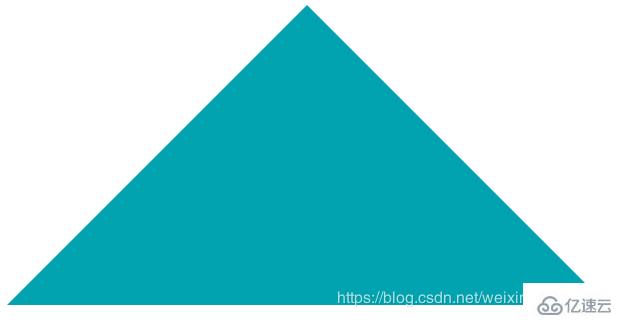
首先我们来看一下效果图:
实现代码:
<!DOCTYPE html>
<html>
<head>
    <title></title>
    <style type="text/css">
        /* css3绘制三角形 */
        .triangle{
            width: 0px;                           /*设置宽高为0,所以div的内容为空,从才能形成三角形尖角*/
            height: 0px;
            border-bottom: 200px solid #00a3af;
            border-left: 200px solid transparent;    /*transparent 表示透明*/
            border-right: 200px solid transparent;
        }
    </style>
</head>
<body>
    <div class="triangle"></div>
</body>
</html>还是不理解的小伙伴可以看下面
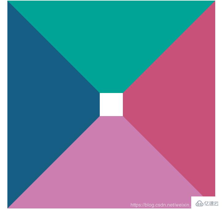
1、设置div有一定宽高,四边设置边框
.triangle{
	width: 50px;
	height: 50px;
	border-top: 200px solid #00a497;
	border-bottom: 200px solid #cc7eb1;
	border-left: 200px solid #165e83;
	border-right: 200px solid #c85179;
}上面代码设置div有一定宽高,四边设置边框时,效果如下:
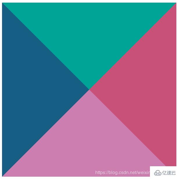
2、设置div宽高为0,四边设置边框宽度为200px
.triangle{
   width: 0px;
   height: 0px;
   border-top: 200px solid #00a497;
   border-bottom: 200px solid #cc7eb1;
   border-left: 200px solid #165e83;
   border-right: 200px solid #c85179;
}上面代码设置div宽高为0,四边边框设置不同颜色时,效果如下:
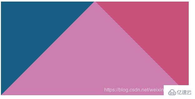
3、接下来div宽高仍为0,去掉border-top
.triangle{
   width: 0px;
   height: 0px;
   border-bottom: 200px solid #cc7eb1;
   border-left: 200px solid #165e83;
   border-right: 200px solid #c85179;
}上面代码设置div宽高为0,只设置下边框和左右边框时,效果如下:
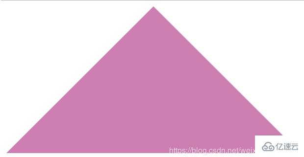
4、最后发现,只将border-bottom设置颜色,左右边框透明,既可得到三角形
.triangle{
	width: 0px;
	height: 0px;
	border-bottom: 200px solid #cc7eb1;
    border-left: 200px solid transparent;
    border-right: 200px solid transparent;
}最终效果:
看完了这篇文章,相信你对利用css画出一个三角形的方法有了一定的了解,想了解更多相关知识,欢迎关注亿速云行业资讯频道,感谢各位的阅读!
亿速云「云服务器」,即开即用、新一代英特尔至强铂金CPU、三副本存储NVMe SSD云盘,价格低至29元/月。点击查看>>
免责声明:本站发布的内容(图片、视频和文字)以原创、转载和分享为主,文章观点不代表本网站立场,如果涉及侵权请联系站长邮箱:is@yisu.com进行举报,并提供相关证据,一经查实,将立刻删除涉嫌侵权内容。


 计算
计算
 安全
安全 数据库
数据库 网络和加速
网络和加速 企业服务
企业服务


