小编给大家分享一下css如何实现可收缩的上下左右布局,相信大部分人都还不怎么了解,因此分享这篇文章给大家参考一下,希望大家阅读完这篇文章后大有收获,下面让我们一起去了解一下吧!
首先我们来看一下实现效果:
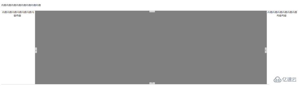
代码实现:
<!DOCTYPE html>
<html>
<head>
    <meta http-equiv="Content-Type" content="text/html;charset=utf-8"/>
    <meta http-equiv="X-UA-Compatible" content="edge"/>
    <title>布局</title>
    <link href="https://cdn.bootcdn.net/ajax/libs/font-awesome/5.13.0/css/all.min.css" rel="stylesheet">
    <style>
        * {
            margin: 0;
            padding: 0;
        }

        html, body {
            width: 100%;
            height: 100%;
        }

        .left {
            width: 220px;
            height: 100%;
        }

        .center {
            position: absolute;
            top: 0;
            left: 220px;
            right: 200px;
            bottom: 0;
            background-color: grey;
        }

        .right {
            position: absolute;
            top: 0;
            right: 0;
            width: 200px;
            height: 100%;
        }

        .top {
            width: 100%;
            height: 70px;
            line-height: 70px;
        }

        .middle {
            position: absolute;
            top: 70px;
            bottom: 40px;
            width: 100%;
            text-align: center;
        }

        .bottom {
            position: absolute;
            bottom: 0;
            width: 100%;
            line-height: 40px; /*行高与高度相等,内容垂直居中*/
            text-align: center;
        }

        .top .bl_move {
            height: 2px;
            width: 100%;
            bottom: 0;
            cursor: col-resize;
            position: relative;
            background-color: lightgray;
            z-index: 2;
            line-height: 0;
            font-size: 12px;
        }

        .top .bl_fold {
            width: 36px;
            height: 12px;
            position: absolute;
            cursor: pointer;
            z-index: 3;
            opacity: .8;
            filter: alpha(opacity=80);
            text-decoration: none;
            background: #e5e5e5;
            color: #666;
            text-align: center;
            margin-top: -0px;
            left: 50%;
            right: -12px;
            line-height: 36px;
            border-radius: 0 3.01px 3.01px 0;
        }

        .top .bl_fold i {
            position: relative;
            top: -15px;
        }

        .left .bl_move {
            width: 2px;
            height: 100%;
            cursor: col-resize;
            position: relative;
            background-color: lightgray;
            z-index: 2;
            font-size: 12px;
            float: left;
        }

        .left .bl_fold {
            width: 12px;
            height: 36px;
            position: absolute;
            cursor: pointer;
            float: left;
            z-index: 3;
            opacity: .8;
            filter: alpha(opacity=80);
            text-decoration: none;
            background: #e5e5e5;
            color: #666;
            text-align: center;
            vertical-align: middle;
            top: 50%;
            line-height: 36px;
            border-radius: 0 3.01px 3.01px 0;
        }

        .left .bl_fold i {
            position: relative;
        }

        .right .bl_move {
            width: 2px;
            height: 100%;
            cursor: col-resize;
            position: relative;
            background-color: lightgray;
            z-index: 2;
            font-size: 12px;
            float: right;
        }

        .right .bl_fold {
            width: 12px;
            height: 36px;
            position: absolute;
            cursor: pointer;
            float: left;
            z-index: 3;
            opacity: .8;
            filter: alpha(opacity=80);
            text-decoration: none;
            background: #e5e5e5;
            color: #666;
            text-align: center;
            vertical-align: middle;
            top: 50%;
            left: -12px;
            line-height: 36px;
            border-radius: 0 3.01px 3.01px 0;
        }

        .right .bl_fold i {
            position: relative;
        }

        .bottom .bl_move {
            height: 2px;
            width: 100%;
            bottom: 0;
            cursor: col-resize;
            position: relative;
            background-color: lightgray;
            z-index: 2;
            line-height: 0;
            font-size: 12px;
        }

        .bottom .bl_fold {
            width: 36px;
            height: 12px;
            position: absolute;
            cursor: pointer;
            z-index: 3;
            opacity: .8;
            filter: alpha(opacity=80);
            text-decoration: none;
            background: #e5e5e5;
            color: #666;
            text-align: center;
            margin-top: -0px;
            left: 50%;
            top: -12px;
            line-height: 36px;
            border-radius: 0 3.01px 3.01px 0;
        }

        .bottom .bl_fold i {
            position: relative;
            top: -15px;
        }
    </style>
    <script src="https://cdn.bootcdn.net/ajax/libs/jquery/1.12.4/jquery.min.js"></script>
</head>
<body>
<div class="top">
    <div class="panel-content">
        内容内容内容内容内容内容内容内容
        <i class="fa fa-sort-desc" aria-hidden="true"></i>
        <i class="fa fa-sort-desc" aria-hidden="true"></i>
    </div>
    <div class="bl_move">
        <a href="javascript:;" title="点击展开" class="bl_fold">
            <i class="fa fa-caret-top" aria-hidden="true"></i>
        </a>
    </div>
</div>
<div class="middle">
    <div class="left">
        <div class="panel-content" style="float: left;width: calc(100% - 2px)">
            内容内容内容内容内容内容内容内容
            <i class="fa fa-sort-desc" aria-hidden="true"></i>
            <i class="fa fa-sort-desc" aria-hidden="true"></i>
        </div>
        <div class="bl_move">
            <a href="javascript:;" title="点击展开" class="bl_fold">
                <i class="fa fa-caret-up" aria-hidden="true"></i>
            </a>
        </div>
    </div>
    <div class="center">
    </div>
    <div class="right">
        <div class="panel-content" style="float: right;width: calc(100% - 2px)">
            内容内容内容内容内容内容内容内容
            <i class="fa fa-sort-desc" aria-hidden="true"></i>
            <i class="fa fa-sort-desc" aria-hidden="true"></i>
        </div>
        <div class="bl_move">
            <a href="javascript:;" title="点击展开" class="bl_fold">
                <i class="fa fa-caret-right" aria-hidden="true"></i>
            </a>
        </div>
    </div>
</div>
<div class="bottom">
    <div class="bl_move">
        <a href="javascript:;" title="点击展开" class="bl_fold">
            <i class="fa fa-caret-down" aria-hidden="true"></i>
        </a>
    </div>
    <div class="panel-content" style="height: calc(100% - 2px)">
        Copyright © 2018 XXX公司版权所有
    </div>
</div>
<script>
    $(function () {
        $(".top .bl_fold").on('click', function () {
            var visible = $('.top .panel-content').is(":visible");
            if (visible) {
                $('.top .panel-content').hide();
                $(".middle").css("top", '0px');
            } else {
                $('.top .panel-content').show();
                $(".middle").css("top", '70px');
            }
        });

        $(".left .bl_fold").on('click', function () {
            var visible = $('.left .panel-content').is(":visible");
            if (visible) {
                $('.left .panel-content').hide();
                $(".center").css("left", '2px');
            } else {
                $('.left .panel-content').show();
                $(".center").css("left", '220px');
            }
        });

        $(".right .bl_fold").on('click', function () {
            var visible = $('.right .panel-content').is(":visible");
            if (visible) {
                $('.right .panel-content').hide();
                $(".center").css("right", '2px');
            } else {
                $('.right .panel-content').show();
                $(".center").css("right", '200px');
            }
        });

        $(".bottom .bl_fold").on('click', function () {
            var visible = $('.bottom .panel-content').is(":visible");
            if (visible) {
                $('.bottom .panel-content').hide();
                $(".middle").css("bottom", '2px');
            } else {
                $('.bottom .panel-content').show();
                $(".middle").css("bottom", '40px');
            }
        });
    })
</script>
</body>
</html>以上是css如何实现可收缩的上下左右布局的所有内容,感谢各位的阅读!相信大家都有了一定的了解,希望分享的内容对大家有所帮助,如果还想学习更多知识,欢迎关注亿速云行业资讯频道!
亿速云「云服务器」,即开即用、新一代英特尔至强铂金CPU、三副本存储NVMe SSD云盘,价格低至29元/月。点击查看>>
免责声明:本站发布的内容(图片、视频和文字)以原创、转载和分享为主,文章观点不代表本网站立场,如果涉及侵权请联系站长邮箱:is@yisu.com进行举报,并提供相关证据,一经查实,将立刻删除涉嫌侵权内容。


 计算
计算
 安全
安全 数据库
数据库 网络和加速
网络和加速 企业服务
企业服务


