这篇文章主要为大家展示了css一些不常见但很有用的属性操作示例,内容简而易懂,条理清晰,希望能够帮助大家解决疑惑,下面让小编带大家一起来研究并学习一下“css一些不常见但很有用的属性操作示例”这篇文章吧。
1、自定义文本选择
::selection {
  background: red;
  color: black;
}2、去掉video的controls中的下载按钮
video::-internal-media-controls-download-button {
    display:none;
}

video::-webkit-media-controls-enclosure {
    overflow:hidden;
}

video::-webkit-media-controls-panel {
    width: calc(100% + 30px);
}3、css3特性中的transform:translateZ(0)有什么作用
GPU加速,优化前端性能
4、滚动条样式修改
/* * 可以换其他选择器 */
*::-webkit-scrollbar {
    width: 2px;
  height: 2px;
}
*::-webkit-scrollbar-thumb {
  border-radius: 5px;
  box-shadow: inset 0 0 5px rgba(0, 0, 0, 0.2);
    -webkit-box-shadow: inset 0 0 5px rgba(0, 0, 0, 0.2);
  background: #00063a;
}
*::-webkit-scrollbar-track {
  box-shadow: inset 0 0 5px rgba(0, 0, 0, 0.2);
    -webkit-box-shadow: inset 0 0 5px rgba(0, 0, 0, 0.2);
    border-radius: 0;
  background: #00063a;
}5、input type number 隐藏上下按钮
input::-webkit-outer-spin-button,
input::-webkit-inner-spin-button {
    -webkit-appearance: none;
}
input[type="number"]{
    -moz-appearance: textfield;
}6、css渐变虚框
<style>
    .box {
        width: 150px;
        border: 2px dashed #fff;
        background: linear-gradient(to bottom, #34538b, #cd0000);
        background-origin: border-box;
    }
    .content {
        height: 100px;
        background-color: #fff;
    }
</style>
<div class="box">
    <div class="content"></div>
</div>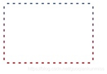
7、border渐变色圆角
<style type="text/css">
	.content {
		width: 100px;
	   	height: 100px;
	    box-sizing: border-box;
	    padding: 5px;
	    border-radius: 50%;
	    background-image: -webkit-linear-gradient(top, red 0%, blue 30%, yellow 60%, green 90%);
	    background-image: -moz-linear-gradient(top, red 0%, blue 30%, yellow 60%, green 90%);
	    background-image: linear-gradient(top, red 0%, blue 30%, yellow 60%, green 90%);
	}
	.box {
		width:100%;
	    height:100%;
	    border-radius:50%;
	    background:#fff;
	}
</style>
<div class="content">
	<div class="box"></div>
</div>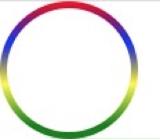
8、输入框光标变色,文字不变色
input{
    caret-color: red;
}
9、锥形渐变
.box {
    width: 300px; height: 300px;
    background: conic-gradient(from 45deg, white, black, white);
}
10、 text-decoration实现波浪线
wavy {
    display: block;
    height: .5em;
    white-space: nowrap;
    letter-spacing: 100vw;
    padding-top: .5em;
    overflow: hidden;
}
wavy::before {
    content: "\2000\2000";
    /* IE浏览器实线代替 */
    text-decoration: overline;
    /* 现代浏览器 */
    text-decoration: overline wavy;
}
11、css三角形
<style type="text/css" media="screen">
.div1{
	width: 0;
	height: 0;
	border: 100px solid;
	<!--上右下左-->
	border-color: red transparent transparent transparent;
}
</style>
<div class="div1"></div>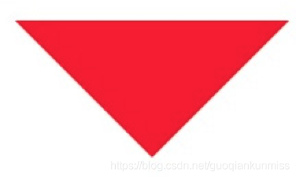
12、css背景渐变与背景图片并存
background: url(https://img.alicdn.com/imgextra/i4/1881744325/O1CN01JBktT81hotb8c6Py0_!!1881744325.png) center no-repeat,linear-gradient(to bottom,red,#3c3f40);
13、自定义浏览器滚动条
/*定义滚动条宽高及背景,宽高分别对应横竖滚动条的尺寸*/
::-webkit-scrollbar {
    width: 5px;
    height: 5px;
    background-color: rgba(245, 245, 245, 0.47);
}

/*定义滚动条的轨道,内阴影及圆角*/
::-webkit-scrollbar-track {
    -webkit-box-shadow: inset 0 0 6px rgba(0, 0, 0, .3);
    border-radius: 10px;
    background-color: #f5f5f5;
}

/*定义滑块,内阴影及圆角*/
::-webkit-scrollbar-thumb {
    /*width: 10px;*/
    height: 20px;
    border-radius: 10px;
    -webkit-box-shadow: inset 0 0 6px rgba(0, 0, 0, .3);
    background-color: rgba(85, 85, 85, 0.25);
}14、改变placeholder的字体颜色大小
input::-webkit-input-placeholder {
    /* WebKit browsers */
    font-size:14px;
    color: #333;
}
input::-moz-placeholder {
    /* Mozilla Firefox 19+ */
    font-size:14px;
    color: #333;
}
input:-ms-input-placeholder {
    /* Internet Explorer 10+ */
    font-size:14px;
    color: #333;
}以上就是关于“css一些不常见但很有用的属性操作示例”的内容,如果改文章对你有所帮助并觉得写得不错,劳请分享给你的好友一起学习新知识,若想了解更多相关知识内容,请多多关注亿速云行业资讯频道。
亿速云「云服务器」,即开即用、新一代英特尔至强铂金CPU、三副本存储NVMe SSD云盘,价格低至29元/月。点击查看>>
免责声明:本站发布的内容(图片、视频和文字)以原创、转载和分享为主,文章观点不代表本网站立场,如果涉及侵权请联系站长邮箱:is@yisu.com进行举报,并提供相关证据,一经查实,将立刻删除涉嫌侵权内容。
原文链接:https://www.jb51.net/css/747043.html


 计算
计算
 安全
安全 数据库
数据库 网络和加速
网络和加速 企业服务
企业服务


