这篇文章主要介绍了css3如何实现背景模糊,具有一定借鉴价值,感兴趣的朋友可以参考下,希望大家阅读完这篇文章之后大有收获,下面让小编带着大家一起了解一下。
一、普通背景模糊
代码:
<Style>
        html,
        body {
            width: 100%;
            height: 100%;
        }

        * {
            margin: 0;
            padding: 0;
        }

        /*背景模糊*/
        .bg {
            width: 100%;
            height: 100%;
            position: relative;
            background: url("./bg.jpg") no-repeat fixed;
            background-size: cover;
            box-sizing: border-box;
            filter: blur(2px);
            z-index: 1;
        }

        .content {
            position: absolute;
            left: 50%;
            top: 50%;
            transform: translate(-50%, -50%);
            width: 200px;
            height: 200px;
            text-align: center;
            z-index: 2;
        }
    </Style>
</head>

<body>
    <div class="bg">
        <div class="content">背景模糊</div>
    </div>
</body>效果如下所示:

这样写会使整个div的后代模糊并且还会出现白边,导致页面非常不美观,要想解决这个问题,我们可以使用伪元素,因为伪元素的模糊度不会被父元素的子代继承。
代码:
<Style>
        html,
        body {
            width: 100%;
            height: 100%;
        }

        * {
            margin: 0;
            padding: 0;
        }

        /*背景模糊*/
        .bg {
            width: 100%;
            height: 100%;
            position: relative;
            background: url("./bg.jpg") no-repeat fixed;
            background-size: cover;
            box-sizing: border-box;
            z-index: 1;
        }

        .bg:after {
            content: "";
            width: 100%;
            height: 100%;
            position: absolute;
            left: 0;
            top: 0;
            /* 从父元素继承 background 属性的设置 */
            background: inherit;
            filter: blur(2px);
            z-index: 2;
        }


        .content {
            position: absolute;
            left: 50%;
            top: 50%;
            transform: translate(-50%, -50%);
            width: 200px;
            height: 200px;
            text-align: center;
            z-index: 3;
        }
    </Style>
</head>

<body>
    <div class="bg">
        <div class="content">背景模糊</div>
    </div>
</body>效果如下所示:

二、背景局部模糊
上一个效果会了之后,局部模糊效果就比较简单了。
代码:
<Style>
        html,
        body {
            width: 100%;
            height: 100%;
        }

        * {
            margin: 0;
            padding: 0;
        }

        /*背景模糊*/
        .bg {
            width: 100%;
            height: 100%;
            position: relative;
            background: url("./bg.jpg") no-repeat fixed;
            background-size: cover;
            box-sizing: border-box;
            z-index: 1;
        }

        .content {
            position: absolute;
            left: 50%;
            top: 50%;
            transform: translate(-50%, -50%);
            width: 200px;
            height: 200px;
            background: inherit;
            z-index: 2;
        }

        .content:after {
            content: "";
            width: 100%;
            height: 100%;
            position: absolute;
            left: 0;
            top: 0;
            background: inherit;
            filter: blur(15px);
            /*为了模糊更明显,调高模糊度*/
            z-index: 3;
        }

        .content>div {
            width: 100%;
            height: 100%;
            text-align: center;
            line-height: 200px;
            position: absolute;
            left: 0;
            top: 0;
            z-index: 4;
        }
    </Style>
</head>

<body>
    <div class="bg">
        <div class="content">
            <div>背景局部模糊</div>
        </div>
    </div>
</body>效果如下图所示:

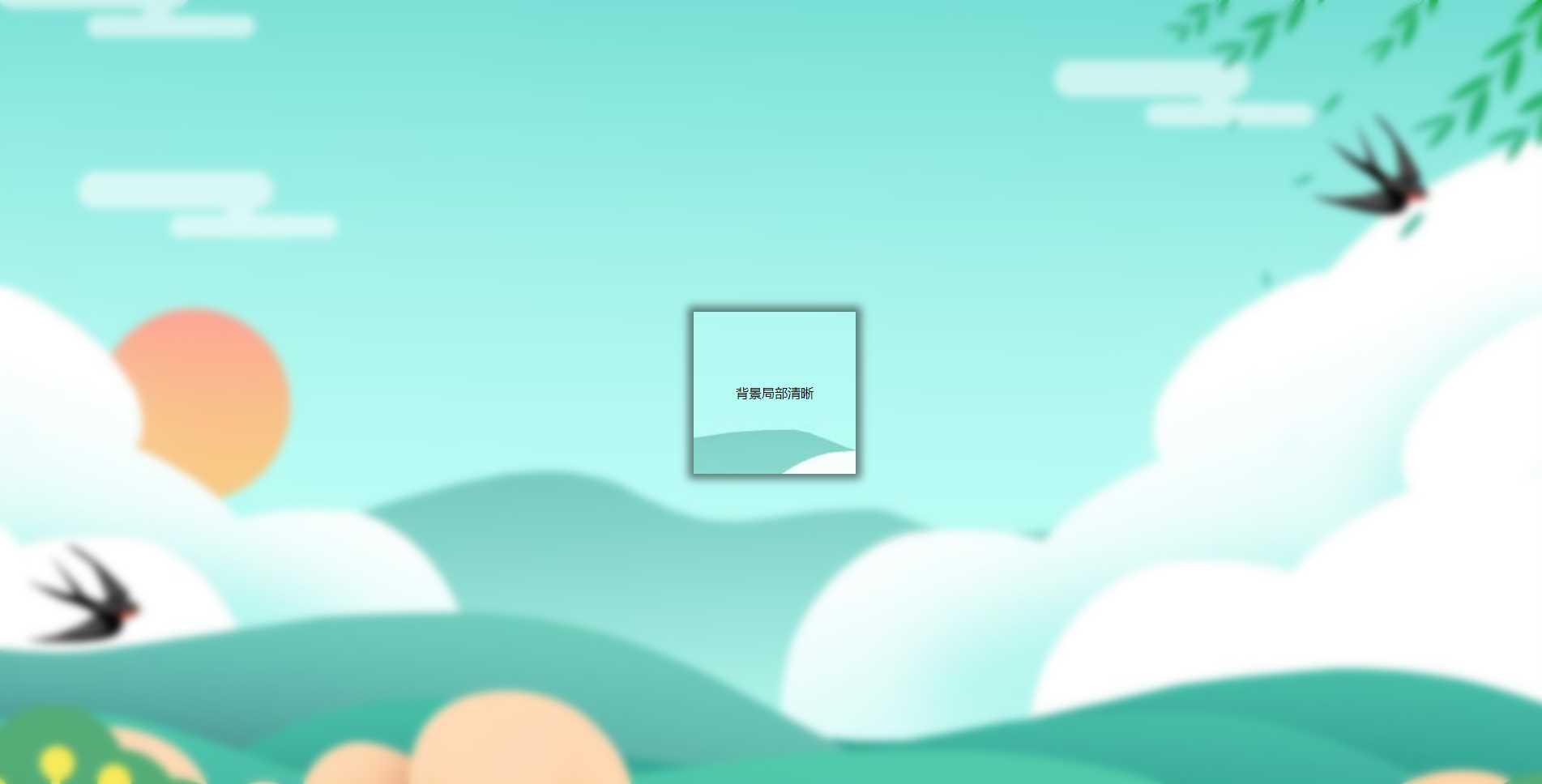
三、背景局部清晰
代码:
<Style>
        html,
        body {
            width: 100%;
            height: 100%;
        }

        * {
            margin: 0;
            padding: 0;
        }

        /*背景模糊*/
        .bg {
            width: 100%;
            height: 100%;
            position: relative;
            background: url("./bg.jpg") no-repeat fixed;
            background-size: cover;
            box-sizing: border-box;
            z-index: 1;
        }

        .bg:after {
            content: "";
            width: 100%;
            height: 100%;
            position: absolute;
            left: 0;
            top: 0;
            background: inherit;
            filter: blur(5px);
            z-index: 2;
        }

        .content {
            position: absolute;
            left: 50%;
            top: 50%;
            transform: translate(-50%, -50%);
            width: 200px;
            line-height: 200px;
            text-align: center;
            background: inherit;
            z-index: 3;
            box-shadow: 0 0 10px 6px rgba(0, 0, 0, .5);
        }
    </Style>
</head>

<body>
    <div class="bg">
        <div class="content">
            <div>背景局部清晰</div>
        </div>
    </div>
</body>效果如下图所示:
感谢你能够认真阅读完这篇文章,希望小编分享的“css3如何实现背景模糊”这篇文章对大家有帮助,同时也希望大家多多支持亿速云,关注亿速云行业资讯频道,更多相关知识等着你来学习!
免责声明:本站发布的内容(图片、视频和文字)以原创、转载和分享为主,文章观点不代表本网站立场,如果涉及侵权请联系站长邮箱:is@yisu.com进行举报,并提供相关证据,一经查实,将立刻删除涉嫌侵权内容。


 计算
计算
 安全
安全 数据库
数据库 网络和加速
网络和加速 企业服务
企业服务


