这篇文章给大家分享的是有关纯CSS怎么实现页面的尖角、小三角、不同方向尖角的内容。小编觉得挺实用的,因此分享给大家做个参考,一起跟随小编过来看看吧。
效果图:
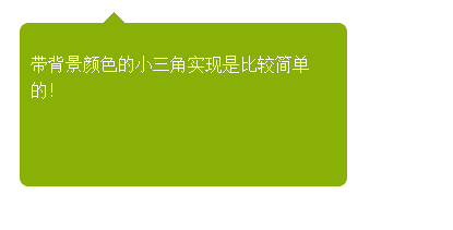
方法一的效果图:
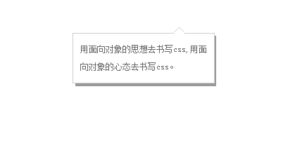
方法二的效果图:
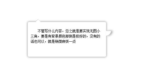
方法三的效果图:
方法1:因为有背景,所有实现起来比较方便,尖角的内部同个颜色就可以不用考虑遮挡问题
html:
<div id="first">
<p>带背景颜色的小三角实现是比较简单的!</p>
  <span id="top"></span>
</div>css
#top {

    position: absolute;
    width: 0px;
    height: 0px;
    line-height: 0px;/*为了防止ie下出现题型*/
    border-bottom: 10px solid #89b007;
    border-left: 10px solid #fff;
    border-right: 10px solid #fff;
    left: 76px;
    top: -10px;
}
#first {
    border-radius:8px;
    -moz-border-radius:8px;-ms-border-radius:8px;-o-border-radius:8px;-webkit-border-radius:8px;
    position: absolute;
    height: 150px;
    width: 300px;
    background: #89b007;
    left: 22px;
    top: 33px;
}
#first p{ padding:10px; line-height:1.5; color:#FFF;}方法2:
html
<div class="w">
  <div class="x">
    <p><a href="#">用面向对象的思想去书写css,用面向对象的心态去书写css。</a></p>
    <span class="z">◆</span> <span class="y">◆</span> </div>
</div>css
* {
margin: 0;
padding: 0;
}
a{ color:#666; text-decoration:none; line-height:25px; text-indent:24px;}
.w{ width:200px; position:absolute; background:#999; left:400px; top:200px; font-size:12px; text-align:left}/*模拟灰色阴影背景层*/
.x{ width:180px; position:relative; background:#fff;  border:1px solid #ccc; padding:10px; left:-4px; top:-4px;}/*内容div*/
.y , .z{
position: absolute;
left: 141px;
}
.y{
color: #ccc;
font-size: 19px;
top:-12px;
z-index:1;
}/*模拟小三角*/
.z{
color: #fff;
font-size: 19px;
top:-11px;  z-index:3;
}/*模拟小三角*/方法3:
<div id="content"> <span class="out"></span><span class="iner"></span> <span class="right"></span>
  <p>不管写什么内容,总之就是要实现无图小三角,要是有背景颜色那倒是极好的,没有的话也可以,就是稍微麻烦一点</p>
</div>#content {
text-indent: 2em;
box-shadow: 0px 0px 10px #999;
padding: 10px;
font-size: 12px;
line-height: 1.5;
border-radius: 5px;
height: 100px;
width: 250px;
position: relative;
margin: 200px auto;
border: 1px solid #CCC;
}
span {
position: absolute;
left: 25px;
height: 0px;
width: 0px;
}
/*上部小三角实现样式开始*/
span.out {
line-height: 0;
border-width: 10px;
border-color: transparent transparent #CCC transparent;
border-style: dashed dashed solid dashed;
top: -20px;
}
span.iner {
border-width: 10px;
border-color: #fff transparent #FFF transparent;
border-style: dashed dashed solid dashed;
top: -19px;
line-height: 0;
}
/*右部小三角实现样式开始*/
span.right {
background: #FFF;
border-width: 1px;
width: 16px;
height: 16px;
border-color: #CCC #CCC transparent transparent;
border-style: solid solid dashed dashed;
left: 270px;
top: 30px;
border-radius: 0 0 100% 0;/*这里radius的值不要选取绝对值因为在放大或者缩小的过程中会产生封不住口的现象*/
line-height: 0;
box-shadow: 5px 0 10px #aaa;
}感谢各位的阅读!关于“纯CSS怎么实现页面的尖角、小三角、不同方向尖角”这篇文章就分享到这里了,希望以上内容可以对大家有一定的帮助,让大家可以学到更多知识,如果觉得文章不错,可以把它分享出去让更多的人看到吧!
亿速云「云服务器」,即开即用、新一代英特尔至强铂金CPU、三副本存储NVMe SSD云盘,价格低至29元/月。点击查看>>
免责声明:本站发布的内容(图片、视频和文字)以原创、转载和分享为主,文章观点不代表本网站立场,如果涉及侵权请联系站长邮箱:is@yisu.com进行举报,并提供相关证据,一经查实,将立刻删除涉嫌侵权内容。
原文链接:https://www.jb51.net/css/570461.html


 计算
计算
 安全
安全 数据库
数据库 网络和加速
网络和加速 企业服务
企业服务


