这篇文章主要介绍如何使用CSS3实现折角效果,文中介绍的非常详细,具有一定的参考价值,感兴趣的小伙伴们一定要看完!
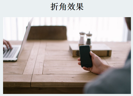
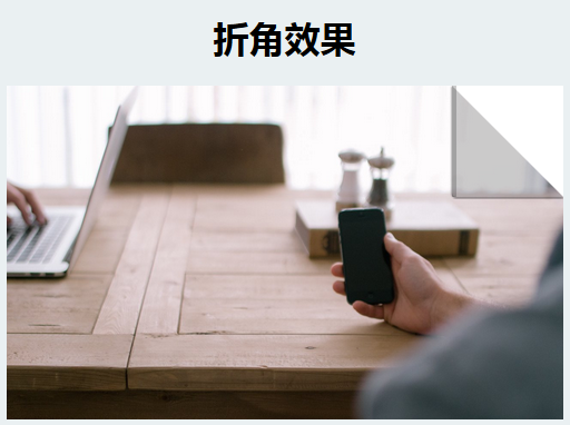
先来看看静态的效果图
实例代码
<!DOCTYPE html>
<html>
<head>
 <meta charset="UTF-8">
 <title></title>
 <style>
 body {
  background-color: #eaf0f2;
 }
  h2{text-align: center;}
  .box{width:500px;height:300px;margin:0 auto;position:relative;}
  .img-layer{position: absolute;width: 500px;height: 300px;top: 0;left: 0;overflow: hidden;}
  .img-layer img {width: 500px;cursor: pointer;}
  .img-layer:before{ content: '';
   position: absolute;
   top: 0;
   right: 0;
   width: 0;
   height: 0;
   border-style: solid;
   border-width: 0;
   border-color: rgba(0,0,0,0.2) #fff;
   border-radius: 0 0 0 4px;
   box-shadow: 0 1px 1px rgba(0,0,0,0.3), -1px 1px 1px rgba(0,0,0,0.2);
   -webkit-transition: all 0.4s ease-out;
   transition:all 0.4s ease-out;}
 .img-layer:hover:before{
   border-right-width:100px;
   border-bottom-width:100px;
 }
 </style>
</head>
<body>
 <h2>折角效果</h2>
 <div class="box">
  <div class="img-layer">
    <img src="<a href="http://p6.qhimg.com/d/inn/3f563406/table.jpg">http://p6.qhimg.com/d/inn/3f563406/table.jpg</a>" alt="">
  </div>
 </div>
</body>
</html>以上是“如何使用CSS3实现折角效果”这篇文章的所有内容,感谢各位的阅读!希望分享的内容对大家有帮助,更多相关知识,欢迎关注亿速云行业资讯频道!
亿速云「云服务器」,即开即用、新一代英特尔至强铂金CPU、三副本存储NVMe SSD云盘,价格低至29元/月。点击查看>>
免责声明:本站发布的内容(图片、视频和文字)以原创、转载和分享为主,文章观点不代表本网站立场,如果涉及侵权请联系站长邮箱:is@yisu.com进行举报,并提供相关证据,一经查实,将立刻删除涉嫌侵权内容。
原文链接:https://www.jb51.net/css/497888.html


 计算
计算
 安全
安全 数据库
数据库 网络和加速
网络和加速 企业服务
企业服务


