这篇文章主要介绍python如何实现股票历史数据可视化示例,文中介绍的非常详细,具有一定的参考价值,感兴趣的小伙伴们一定要看完!
投资有风险,选择需谨慎。 股票交易数据分析可直观股市走向,对于如何把握股票行情,快速解读股票交易数据有不可替代的作用!
import pandas as pd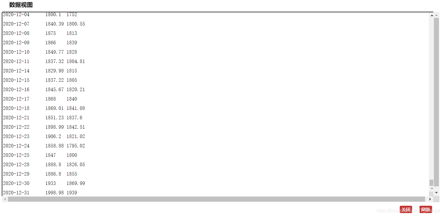
import csvdf = pd.read_csv("/home/kesci/input/maotai4154/maotai.csv")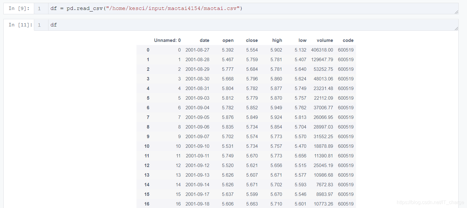
df_high_low = df[['date','high','low']]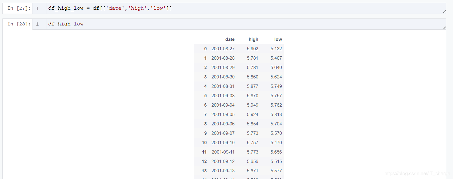
df_high_low_array = np.array(df_high_low)
df_high_low_list =df_high_low_array.tolist()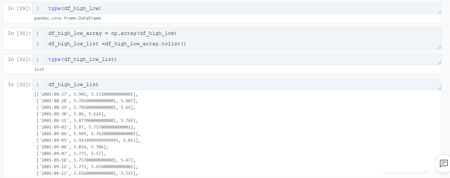
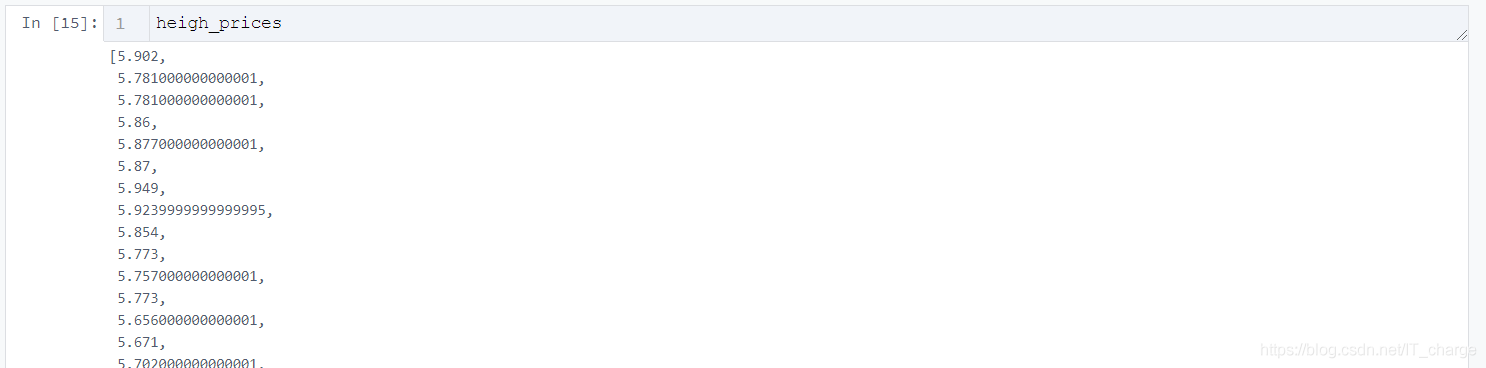
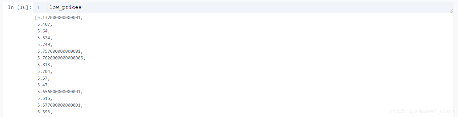
price_dates, heigh_prices, low_prices = [], [], []
for content in zip(df_high_low_list):
    price_date = content[0][0]
    heigh_price = content[0][1]
    low_price = content[0][2]
    price_dates.append(price_date)
    heigh_prices.append(heigh_price)
    low_prices.append(low_price)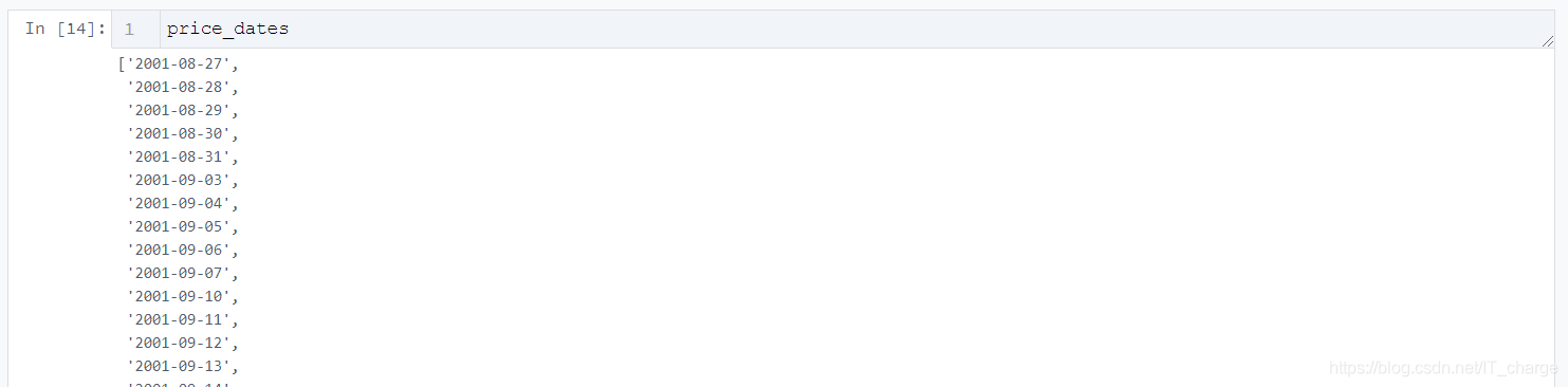
import pyecharts.options as opts
from pyecharts.charts import LineLine(init_opts=opts.InitOpts(width="1200px", height="600px")).add_yaxis(
series_name="最低价",
y_axis=low_prices,
markpoint_opts=opts.MarkPointOpts(
data=[opts.MarkPointItem(value=-2, name="周最低", x=1, y=-1.5)]
),
markline_opts=opts.MarkLineOpts(
data=[
opts.MarkLineItem(type_="average", name="平均值"),
opts.MarkLineItem(symbol="none", x="90%", y="max"),
opts.MarkLineItem(symbol="circle", type_="max", name="最高点"),
]
),
)tooltip_opts=opts.TooltipOpts(trigger="axis"),
toolbox_opts=opts.ToolboxOpts(is_show=True),
xaxis_opts=opts.AxisOpts(type_="category", boundary_gap=True).render("HTML名字填这里.html")
import pyecharts.options as opts
from pyecharts.charts import Line
(
Line(init_opts=opts.InitOpts(width="1200px", height="600px"))
.add_xaxis(xaxis_data=price_dates)
.add_yaxis(
series_name="最高价",
y_axis=heigh_prices,
markpoint_opts=opts.MarkPointOpts(
data=[
opts.MarkPointItem(type_="max", name="最大值"),
opts.MarkPointItem(type_="min", name="最小值"),
]
),
markline_opts=opts.MarkLineOpts(
data=[opts.MarkLineItem(type_="average", name="平均值")]
),
)
.add_yaxis(
        series_name="最低价",
        y_axis=low_prices,
        markpoint_opts=opts.MarkPointOpts(
            data=[opts.MarkPointItem(value=-2, name="周最低", x=1, y=-1.5)]
        ),
        markline_opts=opts.MarkLineOpts(
            data=[
                opts.MarkLineItem(type_="average", name="平均值"),
                opts.MarkLineItem(symbol="none", x="90%", y="max"),
                opts.MarkLineItem(symbol="circle", type_="max", name="最高点"),
            ]
        ),
    )
.set_global_opts(
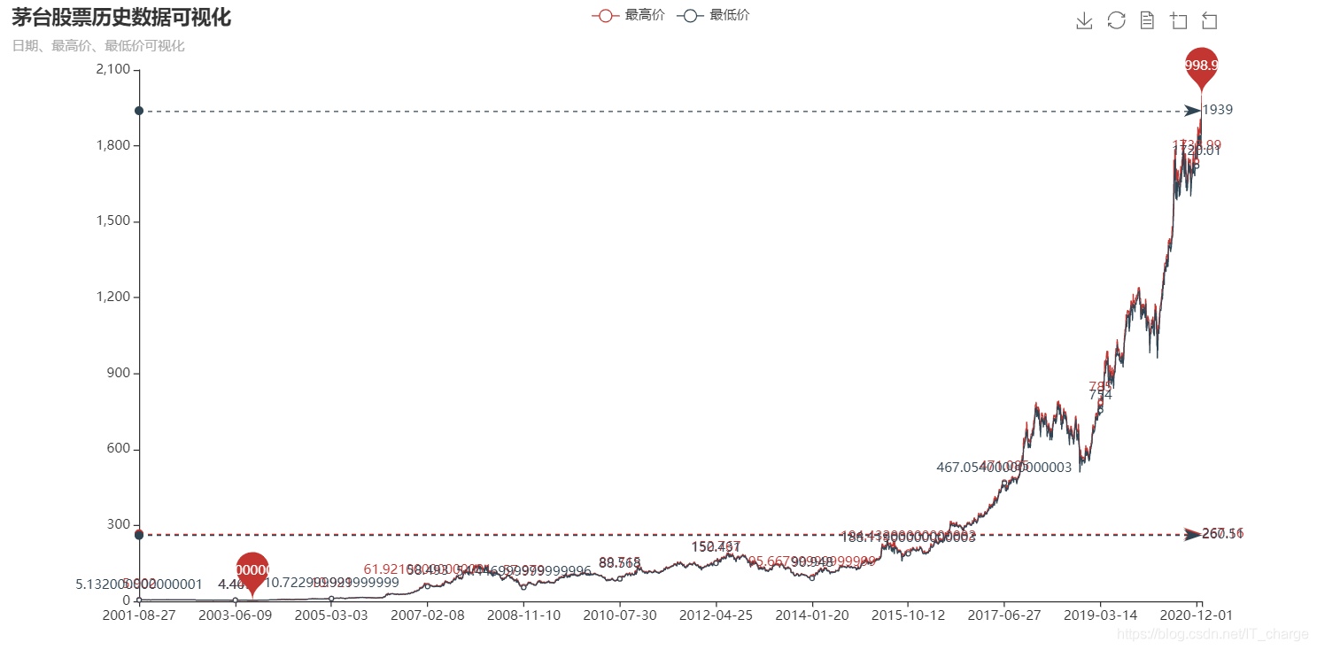
title_opts=opts.TitleOpts(title="茅台股票历史数据可视化", subtitle="日期、最高价、最低价可视化"),
tooltip_opts=opts.TooltipOpts(trigger="axis"),
toolbox_opts=opts.ToolboxOpts(is_show=True),
xaxis_opts=opts.AxisOpts(type_="category", boundary_gap=True),
)
.render("everyDayPrice_change_line_chart2.html")
)
以上是“python如何实现股票历史数据可视化示例”这篇文章的所有内容,感谢各位的阅读!希望分享的内容对大家有帮助,更多相关知识,欢迎关注亿速云行业资讯频道!
亿速云「云服务器」,即开即用、新一代英特尔至强铂金CPU、三副本存储NVMe SSD云盘,价格低至29元/月。点击查看>>
免责声明:本站发布的内容(图片、视频和文字)以原创、转载和分享为主,文章观点不代表本网站立场,如果涉及侵权请联系站长邮箱:is@yisu.com进行举报,并提供相关证据,一经查实,将立刻删除涉嫌侵权内容。


 计算
计算 安全
安全 数据库
数据库 网络和加速
网络和加速 企业服务
企业服务


