еҰӮдҪ•е®һзҺ°EchatsеӣҫиЎЁеӨ§еұҸиҮӘйҖӮеә”
жң¬зҜҮеҶ…е®№д»Ӣз»ҚдәҶвҖңеҰӮдҪ•е®һзҺ°EchatsеӣҫиЎЁеӨ§еұҸиҮӘйҖӮеә”вҖқзҡ„жңүе…ізҹҘиҜҶпјҢеңЁе®һйҷ…жЎҲдҫӢзҡ„ж“ҚдҪңиҝҮзЁӢдёӯпјҢдёҚе°‘дәәйғҪдјҡйҒҮеҲ°иҝҷж ·зҡ„еӣ°еўғпјҢжҺҘдёӢжқҘе°ұи®©е°Ҹзј–еёҰйўҶеӨ§е®¶еӯҰд№ дёҖдёӢеҰӮдҪ•еӨ„зҗҶиҝҷдәӣжғ…еҶөеҗ§пјҒеёҢжңӣеӨ§е®¶д»”з»Ҷйҳ…иҜ»пјҢиғҪеӨҹеӯҰжңүжүҖжҲҗпјҒ
е®һзҺ°
1.еҮҶеӨҮдёҖдёӘе®№еҷЁз»„件пјҢwidth = 100vw,height = 100%,дҪңдёәеӨ§еұҸеұ•зӨәзҡ„иғҢжҷҜпјҡ
 <div class="screen-adapter">
 </div>

 .screen-adapter {
  width: 100vw;
  min-height: 100%;
  max-height: 100vh;
  overflow: hidden;
  background: #0c1a3c;
}2.ж №жҚ®и®ҫи®ЎеҗҢеӯҰжҸҗдҫӣзҡ„и®ҫи®ЎеӣҫеҸҜд»Ҙи®Ўз®—еҮәжҜҸйғЁеҲҶеҢәеҹҹзҡ„зҷҫеҲҶжҜ”пјҢдҫӢеҰӮжҖ»е°әеҜёжҳҜw*hпјҢе…¶дёӯдёҖдёӘеӣҫж Үе®Ҫй«ҳжҳҜw1 * h2пјҢе®һзҺ°еёёи§„еҲҮеӣҫпјҢжӯӨж—¶з”ұ1-->2еҸҜеҫ—пјҡ
<div class="screen-adapter">
<div class="content-wrap" :>
<slot></slot>
</div>
</div>
props: {
w: { // и®ҫи®Ўеӣҫе°әеҜёе®Ҫ
type: Number,
default: 1600
},
h: { // и®ҫи®Ўеӣҫе°әеҜёй«ҳ
type: Number,
default: 900
}
},
data () {
return {
style: {
width: this.w + 'px',
height: this.h + 'px',
transform: 'scale(1) translate(-50%, -50%)' // й»ҳи®ӨдёҚзј©ж”ҫпјҢеһӮзӣҙж°ҙе№іеұ…дёӯ
}
}
}
.content-wrap {
transform-origin: 0 0;
position: absolute;
top: 50%;
left: 50%;
}3.еҹәдәҺ第дәҢжӯҘпјҢйңҖиҰҒж №жҚ®еӨ§еұҸе…·дҪ“е°әеҜёи®Ўз®—зј©ж”ҫжҜ”дҫӢпјҢд»ҘеҸҠи®ҫзҪ®зј©ж”ҫжҜ”дҫӢпјҢйңҖиҰҒжіЁж„Ҹзҡ„жҳҜпјҢз»‘е®ҡresizeдәӢ件дёҖе®ҡеҲ«еҝҳдәҶйҳІжҠ–пјҢйЎөйқўй”ҖжҜҒеҲ«еҝҳдәҶ移йҷӨзӣ‘еҗ¬дәӢ件пјҡ
mounted () {
this.setScale()
this.onresize = this.debounce(() => this.setScale(), 100)
window.addEventListener('resize', this.onresize)
},
beforeDestroy () {
window.removeEventListener('resize', this.onresize)
},
methods: {
// йҳІжҠ–
debounce (fn, t) {
const delay = t || 500
let timer
return function () {
const args = arguments
if (timer) {
clearTimeout(timer)
}
const context = this
timer = setTimeout(() => {
timer = null
fn.apply(context, args)
}, delay)
}
},
// иҺ·еҸ–зј©ж”ҫжҜ”дҫӢ
getScale () {
const w = window.innerWidth / this.w
const h = window.innerHeight / this.h
return w < h ? w : h
},
// и®ҫзҪ®зј©ж”ҫжҜ”дҫӢ
setScale () {
this.style.transform = `scale(${this.getScale()}) translate(-50%, -50%)`
}
}4.иҮіжӯӨпјҢеӨ§жҰӮз»“жһ„е·Із»Ҹеҫ—еҲ°пјҢеҸӘйңҖиҰҒе°Ҷеҗ„йғЁеҲҶеӣҫж Ү组件иҝҳеҺҹзҡ„и®ҫи®Ўеӣҫж”ҫе…Ҙд№ӢеүҚзҡ„ жҸ’ж§ҪеҚіеҸҜпјҢеҗ„йғЁеҲҶеӣҫж Ү组件зҡ„е°әеҜёжҢүз…§и®ҫи®ЎжҸҗдҫӣзҡ„зҷҫеҲҶжҜ”еҚіеҸҜпјҢжүҖжңүд»Јз ҒеӨ§иҮҙеҰӮдёӢпјҡ
// ScreenAdapter.vue
<template>
  <div class="screen-adapter">
    <div class="content-wrap" :>
      <slot></slot>
    </div>
  </div>
</template>
<script>
export default {
  props: {
    w: {
      type: Number,
      default: 1600
    },
    h: {
      type: Number,
      default: 900
    }
  },
  data () {
    return {
      style: {
        width: this.w + 'px',
        height: this.h + 'px',
        transform: 'scale(1) translate(-50%, -50%)'
      }
    }
  },
  mounted () {
    this.setScale()
    this.onresize = this.Debounce(() => this.setScale(), 100)
    window.addEventListener('resize', this.onresize)
  },
  beforeDestroy () {
    window.removeEventListener('resize', this.onresize)
  },
  methods: {
    Debounce (fn, t) {
      const delay = t || 500
      let timer
      return function () {
        const args = arguments
        if (timer) {
          clearTimeout(timer)
        }
        const context = this
        timer = setTimeout(() => {
          timer = null
          fn.apply(context, args)
        }, delay)
      }
    },
    getScale () {
      const w = window.innerWidth / this.w
      const h = window.innerHeight / this.h
      return w < h ? w : h
    },
    setScale () {
      this.style.transform = `scale(${this.getScale()}) translate(-50%, -50%)`
    }
  }
}
</script>
<style>
.screen-adapter {
  width: 100%;
  min-height: 100vh;
  max-height: 100vh;
  overflow: hidden;
  background: #0c1a3c;
}
.content-wrap {
  transform-origin: 0 0;
  position: absolute;
  top: 50%;
  left: 50%;
}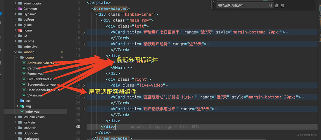
</style>йЎ№зӣ®зӣ®еҪ•з»“жһ„еҰӮдёӢ
ж•ҲжһңеӣҫеҰӮдёӢ

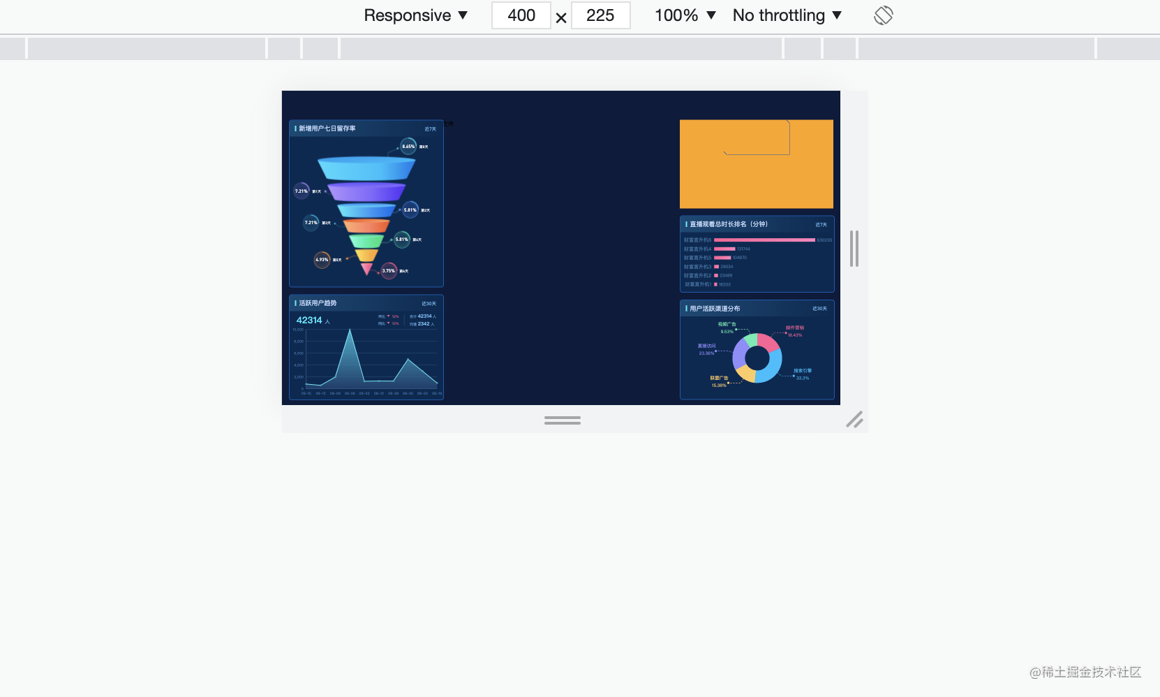
еҸҜд»ҘзңӢеҮәпјҢеӯ—дҪ“еӣҫиЎЁйғҪжҳҜзӯүжҜ”дҫӢзј©ж”ҫзҡ„
вҖңеҰӮдҪ•е®һзҺ°EchatsеӣҫиЎЁеӨ§еұҸиҮӘйҖӮеә”вҖқзҡ„еҶ…е®№е°ұд»Ӣз»ҚеҲ°иҝҷйҮҢдәҶпјҢж„ҹи°ўеӨ§е®¶зҡ„йҳ…иҜ»гҖӮеҰӮжһңжғідәҶи§ЈжӣҙеӨҡиЎҢдёҡзӣёе…ізҡ„зҹҘиҜҶеҸҜд»Ҙе…іжіЁдәҝйҖҹдә‘зҪ‘з«ҷпјҢе°Ҹзј–е°ҶдёәеӨ§е®¶иҫ“еҮәжӣҙеӨҡй«ҳиҙЁйҮҸзҡ„е®һз”Ёж–Үз« пјҒ


