这篇文章主要介绍Android Compose自定义TextField如何实现自定义的输入框,文中介绍的非常详细,具有一定的参考价值,感兴趣的小伙伴们一定要看完!
1.代码
var text by remember {
mutableStateOf("简单的TextField")
}
BasicTextField(
value = text, onValueChange = {
text = it
},
modifier = Modifier
.height(40.dp)
.width(300.dp)
.background(Color.Green)
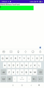
)2.效果
我们知道BasicTextField提供了基础的输入框,只包含文字输入,光标等简单功能,如果我们需要增加样式就需要自己实现decorationBox参数,来添加样式。
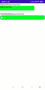
本例中我们实现一个带蓝色边框,内部填充绿色,左侧有图标的自定义BasicTextField。
1.代码
@Composable
fun DecorateTextField() {
    var text by rememberSaveable {
        mutableStateOf("init")
    }
    Box(
        Modifier
            .fillMaxWidth()
            .fillMaxHeight(),
        contentAlignment = Alignment.Center
    ) {
        BasicTextField(
            value = text,
            onValueChange = {
                text = it
            },
            textStyle = TextStyle(color = Color.White),
            cursorBrush = SolidColor(Color.Blue),
            decorationBox = { innerTextField ->//decorationBox内部负责编写输入框样式
                Row(
                    Modifier
                        .padding(2.dp)
                        .fillMaxWidth()
                        .background(Color.Blue, RoundedCornerShape(percent = 30))
                        .padding(1.dp)
                        .background(Color.Green, RoundedCornerShape(percent = 29)),
                    verticalAlignment = Alignment.CenterVertically
                ) {
                    Icon(Icons.Default.Star, tint = Color.White, contentDescription = null)
                    Spacer(Modifier.width(5.dp))
                    Box(modifier = Modifier.padding(top = 7.dp, bottom = 7.dp, end = 7.dp)) {
                        innerTextField()//自定义样式这行代码是关键,没有这一行输入文字后无法展示,光标也看不到
                    }
                }
            }
        )
    }
}
2.效果
1.代码
@Composable
fun BaiduTextField() {
var text by remember {
mutableStateOf("安安安安卓")
}
BasicTextField(value = text, onValueChange = {
text = it
}, decorationBox = { innerTextField ->
val iconModifier = Modifier.padding(start = 5.dp)
Row(
modifier = Modifier
.padding(horizontal = 5.dp, vertical = 3.dp)
.fillMaxWidth()
.height(50.dp)
.padding(start = 5.dp)
.border(width = 1.dp, color = Color.Blue, shape = RoundedCornerShape(8.dp))
) {
Box(
modifier = Modifier
.padding(start = 8.dp)
.weight(1f)
.fillMaxHeight()
,
contentAlignment = Alignment.CenterStart
) {
innerTextField()
}
Row(
modifier = Modifier.fillMaxHeight(),
verticalAlignment = Alignment.CenterVertically
) {
Icon(
painter = painterResource(id = R.drawable.cha),
"",
modifier = iconModifier.size(20.dp),
tint = Color.Gray
)
Icon(
painter = painterResource(id = R.drawable.record),
"",
modifier = iconModifier.size(20.dp),
tint = Color.Gray
)
Icon(
painter = painterResource(id = R.drawable.takepic),
"",
modifier = iconModifier.padding(end = 8.dp).size(20.dp),
tint = Color.Gray
)
Box(
modifier = Modifier
.width(120.dp)
.fillMaxHeight()
.background(
color = Color.Blue,
shape = RoundedCornerShape(topEnd = 8.dp, bottomEnd = 8.dp)
).clickable {
},
contentAlignment = Alignment.Center
) {
Text(
text = "百度一下",
color = Color.White
)
}
}
}
})
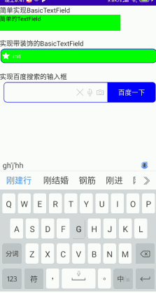
}2.效果
以上是“Android Compose自定义TextField如何实现自定义的输入框”这篇文章的所有内容,感谢各位的阅读!希望分享的内容对大家有帮助,更多相关知识,欢迎关注亿速云行业资讯频道!
免责声明:本站发布的内容(图片、视频和文字)以原创、转载和分享为主,文章观点不代表本网站立场,如果涉及侵权请联系站长邮箱:is@yisu.com进行举报,并提供相关证据,一经查实,将立刻删除涉嫌侵权内容。


