本篇文章给大家带来的内容是关于如何使用纯CSS实现抽象的水波荡漾的动画,文中示例代码介绍的非常详细,图文详解容易学习,非常适合初学者入门,感兴趣的小伙伴们可以参考一下。
https://github.com/comehope/front-end-daily-challenges
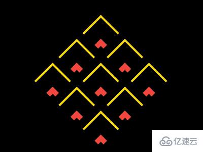
定义 dom,容器中包含 9 个元素:
<div class="container">
    <span></span>
    <span></span>
    <span></span>
    <span></span>
    <span></span>
    <span></span>
    <span></span>
    <span></span>
    <span></span>
</div>居中显示:
body {
    margin: 0;
    height: 100vh;
    display: flex;
    align-items: center;
    justify-content: center;
    background-color: black;
}定义容器尺寸:
.container {
    width: 30em;
    height: 30em;
    font-size: 10px;
}用 grid 布局把 9 个子元素排列成 3 * 3 的网格状:
.container {
    display: grid;
    grid-template-columns: repeat(3, 1fr);
}设置容器内子元素的样式,是通过伪元素来设置的:
.container span {
    position: relative;
}

.container span::before,
.container span::after
{
    content: '';
    position: absolute;
    box-sizing: border-box;
    border-style: none solid solid none;
    border-width: 1em;
    border-color: gold;
    width: 100%;
    height: 100%;
}旋转容器,让它的尖端朝上:
.container {
    transform: rotate(-135deg);
}增加子元素尺寸由小到大变化的动画:
.container span::before,
.container span::after
{
    animation:
        animate-scale 1.6s linear infinite;
}

@keyframes animate-scale {
    from {
        width: 1%;
        height: 1%;
    }

    to {
        width: 100%;
        height: 100%;
    }
}增加子元素边框色变化的动画:
.container span::before,
.container span::after
{
    animation:
        animate-border-color 1.6s linear infinite,
        animate-scale 1.6s linear infinite;
}

@keyframes animate-border-color {
    0%, 25% {
        border-color: tomato;
    }

    50%, 75% {
        border-color: gold;
    }

    100% {
        border-color: black;
    }
}增加子元素边框宽度变化的动画:
.container span::before,
.container span::after
{
    animation:
        animate-border-width 1.6s linear infinite,
        animate-border-color 1.6s linear infinite,
        animate-scale 1.6s linear infinite;
}最后,让 ::after 伪元素的动画时间慢半拍:
.container span::after {
    animation-delay: -0.8s;
}

@keyframes animate-border-width {
    0%, 100%{
        border-width: 0.1em;
    }

    25% {
        border-width: 1.5em;
    }
}大功告成!
以上就是纯CSS实现抽象水波荡漾的动画的具体操作,代码应该是足够清楚的,而且我也相信有相当的一些例子可能是我们日常工作可能会见得到的。通过这篇文章,希望你能收获更多。
亿速云「云服务器」,即开即用、新一代英特尔至强铂金CPU、三副本存储NVMe SSD云盘,价格低至29元/月。点击查看>>
免责声明:本站发布的内容(图片、视频和文字)以原创、转载和分享为主,文章观点不代表本网站立场,如果涉及侵权请联系站长邮箱:is@yisu.com进行举报,并提供相关证据,一经查实,将立刻删除涉嫌侵权内容。


 计算
计算
 安全
安全 数据库
数据库 网络和加速
网络和加速 企业服务
企业服务


