这篇文章给大家分享的是有关使用纯CSS如何实现一个转动的自行车车轮的动画效果的内容。小编觉得挺实用的,因此分享给大家做个参考。一起跟随小编过来看看吧。
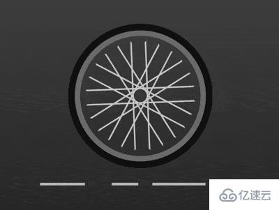
效果预览
https://github.com/comehope/front-end-daily-challenges
定义 dom,容器中包含 6 个元素:
<div class="wheel">
    <span></span>
    <span></span>
    <span></span>
    <span></span>
    <span></span>
    <span></span>
</div>居中显示:
body {
    margin: 0;
    height: 100vh;
    display: flex;
    align-items: center;
    justify-content: center;
    background-image: linear-gradient(#555, #222);
}画出轮圈:
.wheel {
    width: 9em;
    height: 9em;
    font-size: 25px;
    border: 0.4em solid #777;
    border-radius: 50%;
    box-shadow: 0 0 0 0.5em #111;
}定义辐条的样式:
.wheel {
    display: flex;
    align-items: center;
    justify-content: center;
}

.wheel span {
    position: absolute;
    width: 8em;
    height: 1em;
    border: 0.1em solid;
    border-color: #ccc transparent;
}定义变量,画出多根幅条:
.wheel span {
    transform: rotate(calc((var(--n) - 1) * 30deg));
}

.wheel span:nth-child(1) {
    --n: 1;
}

.wheel span:nth-child(2) {
    --n: 2;
}

.wheel span:nth-child(3) {
    --n: 3;
}

.wheel span:nth-child(4) {
    --n: 4;
}

.wheel span:nth-child(5) {
    --n: 5;
}

.wheel span:nth-child(6) {
    --n: 6;
}让车轮转动起来:
.wheel span {
    animation: run 4s linear infinite;
}

@keyframes run {
    to {
        transform: rotate(calc((var(--n) - 1) * 30deg + 360deg));
    }
}用伪元素画出地面上的线条:
.wheel {
    position: relative;
}

.wheel::before {
    content: '';
    position: absolute;
    width: 15em;
    height: 0.2em;
    top: 11em;
    background-image: linear-gradient(
            to right,
            silver 0, silver 4em,
            transparent 4em, transparent 5em,
            silver 5em, silver 10em,
            transparent 10em, transparent 12em,
            silver 12em, silver 14em,
            transparent 14em, transparent 15em
        );
}最后,让地面上的线条动起来,形成车轮向前走的效果:
.wheel::before {
    background-position: 15em;
    animation: run2 6s linear infinite;
}
@keyframes run2 {
    to {
        background-position: -15em;
    }
}感谢各位的阅读!关于使用纯CSS如何实现一个转动的自行车车轮的动画效果就分享到这里了,希望以上内容可以对大家有一定的帮助,让大家可以学到更多知识。如果觉得文章不错,可以把它分享出去让更多的人看到吧!
亿速云「云服务器」,即开即用、新一代英特尔至强铂金CPU、三副本存储NVMe SSD云盘,价格低至29元/月。点击查看>>
免责声明:本站发布的内容(图片、视频和文字)以原创、转载和分享为主,文章观点不代表本网站立场,如果涉及侵权请联系站长邮箱:is@yisu.com进行举报,并提供相关证据,一经查实,将立刻删除涉嫌侵权内容。


 计算
计算
 安全
安全 数据库
数据库 网络和加速
网络和加速 企业服务
企业服务


