这篇文章将为大家详细讲解有关Python散点图与折线图怎么绘制,小编觉得挺实用的,因此分享给大家做个参考,希望大家阅读完这篇文章后可以有所收获。
在数据分析的过程中,经常需要将数据可视化,目前常使用的:散点图 折线图
需要import的外部包 一个是绘图 一个是字体导入
import matplotlib.pyplot as plt
from matplotlib.font_manager import FontProperties在数据处理前需要获取数据,从TXT XML csv excel 等文本中获取需要的数据,保存到list
def GetFeatureList(full_path_file):
  file_name = full_path_file.split('\\')[-1][0:4]
  # print(file_name)
  # print(full_name)
  K0_list = []
  Area_list = []
  all_lines = []
  f = open(full_path_file,'r')
  all_lines = f.readlines()
  lines_num = len(all_lines)
  # 数据清洗
  if lines_num > 5000:
    for i in range(3,lines_num-1):
      temp_k0 = int(all_lines[i].split('\t')[1])
      if temp_k0 == 0:
        K0_list.append(ComputK0(all_lines[i]))
      else:
        K0_list.append(temp_k0)
      Area_list.append(float(all_lines[i].split('\t')[15]))
    # K0_Scatter(K0_list,Area_list,file_name)
  else:
    print('{} 该样本量少于5000'.format(file_name))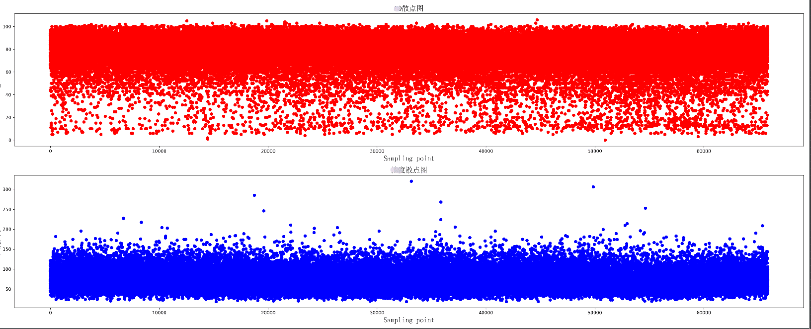
return K0_list, Area_list,file_name绘制两组数据的散点图,同时绘制两个散点图,上下分布在同一个图片中
def K0_Scatter(K0_list, area_list, pic_name):
  plt.figure(figsize=(25, 10), dpi=300)
  # 导入中文字体,及字体大小
  zhfont = FontProperties(fname='C:/Windows/Fonts/simsun.ttc', size=16)
  ax = plt.subplot(211)
  # print(K0_list)
  ax.scatter(range(len(K0_list)), K0_list, c='r', marker='o')
  plt.title(u'散点图', fontproperties=zhfont)
  plt.xlabel('Sampling point', fontproperties=zhfont)
  plt.ylabel('K0_value', fontproperties=zhfont)
  ax = plt.subplot(212)
  ax.scatter(range(len(area_list)), area_list, c='b', marker='o')
  plt.xlabel('Sampling point', fontproperties=zhfont)
  plt.ylabel(u'大小', fontproperties=zhfont)
  plt.title(u'散点图', fontproperties=zhfont)
  # imgname = 'E:\\' + pic_name + '.png'
  # plt.savefig(imgname, bbox_inches = 'tight')
plt.show()散点图显示
绘制一个折线图 每个数据增加标签
def K0_Plot(X_label, Y_label, pic_name):
  plt.figure(figsize=(25, 10), dpi=300)
  # 导入中文字体,及字体大小
  zhfont = FontProperties(fname='C:/Windows/Fonts/simsun.ttc', size=16)
  ax = plt.subplot(111)
  # print(K0_list)
  ax.plot(X_label, Y_label, c='r', marker='o')
  plt.title(pic_name, fontproperties=zhfont)
  plt.xlabel('coal_name', fontproperties=zhfont)
  plt.ylabel(pic_name, fontproperties=zhfont)
  # ax.xaxis.grid(True, which='major')
  ax.yaxis.grid(True, which='major')
  for a, b in zip(X_label, Y_label):
    str_label = a + str(b) + '%'
    plt.text(a, b, str_label, ha='center', va='bottom', fontsize=10)
  imgname = 'E:\\' + pic_name + '.png'
  plt.savefig(imgname, bbox_inches = 'tight')
  # plt.show()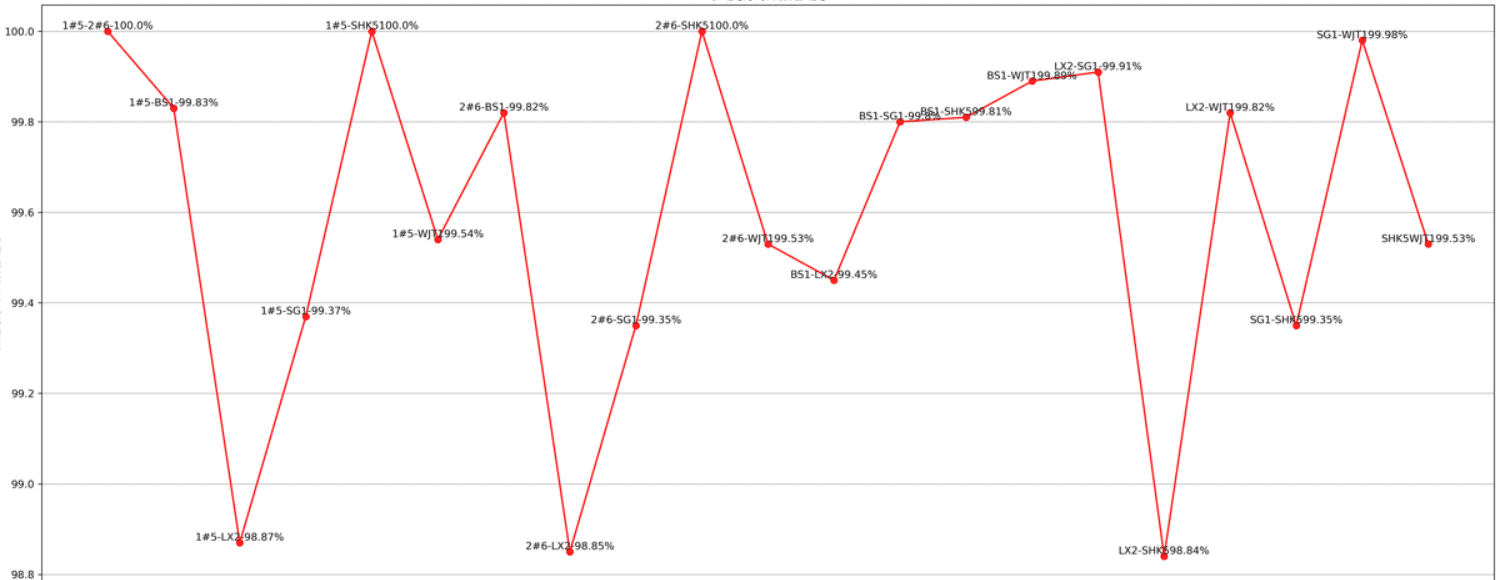
绘制多条折线图
def K0_MultPlot(dis_name, dis_lsit, pic_name):
  plt.figure(figsize=(80, 10), dpi=300)
  # 导入中文字体,及字体大小
  zhfont = FontProperties(fname='C:/Windows/Fonts/simsun.ttc', size=16)
  ax = plt.subplot(111)
  X_label = range(len(dis_lsit[1]))
  p1 = ax.plot(X_label, dis_lsit[1], c='r', marker='o',label='Euclidean Distance')
  p2 = ax.plot(X_label, dis_lsit[2], c='b', marker='o',label='Manhattan Distance')
  p3 = ax.plot(X_label, dis_lsit[4], c='y', marker='o',label='Chebyshev Distance')
  p4 = ax.plot(X_label, dis_lsit[5], c='g', marker='o',label='weighted Minkowski Distance')
  plt.legend()
  plt.title(pic_name, fontproperties=zhfont)
  plt.xlabel('coal_name', fontproperties=zhfont)
  plt.ylabel(pic_name, fontproperties=zhfont)
  # ax.xaxis.grid(True, which='major')
  ax.yaxis.grid(True, which='major')
  for a, b,c in zip(X_label, dis_lsit[5],dis_name):
    str_label = c + '_'+ str(b)
    plt.text(a, b, str_label, ha='center', va='bottom', fontsize=5)
  imgname = 'E:\\' + pic_name + '.png'
  plt.savefig(imgname,bbox_inches = 'tight')
  # plt.show()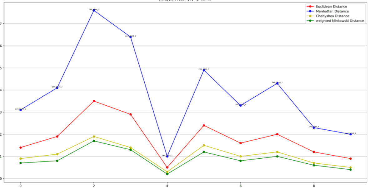
图形显示还有许多小技巧,使得可视化效果更好,比如坐标轴刻度的定制,网格化等
1、云计算,典型应用OpenStack。2、WEB前端开发,众多大型网站均为Python开发。3.人工智能应用,基于大数据分析和深度学习而发展出来的人工智能本质上已经无法离开python。4、系统运维工程项目,自动化运维的标配就是python+Django/flask。5、金融理财分析,量化交易,金融分析。6、大数据分析。
关于“Python散点图与折线图怎么绘制”这篇文章就分享到这里了,希望以上内容可以对大家有一定的帮助,使各位可以学到更多知识,如果觉得文章不错,请把它分享出去让更多的人看到。
亿速云「云服务器」,即开即用、新一代英特尔至强铂金CPU、三副本存储NVMe SSD云盘,价格低至29元/月。点击查看>>
免责声明:本站发布的内容(图片、视频和文字)以原创、转载和分享为主,文章观点不代表本网站立场,如果涉及侵权请联系站长邮箱:is@yisu.com进行举报,并提供相关证据,一经查实,将立刻删除涉嫌侵权内容。


 计算
计算 安全
安全 数据库
数据库 网络和加速
网络和加速 企业服务
企业服务


