这篇文章主要讲解了“怎么用jQuery插件FusionCharts实现2D饼状图效果”,文中的讲解内容简单清晰,易于学习与理解,下面请大家跟着小编的思路慢慢深入,一起来研究和学习“怎么用jQuery插件FusionCharts实现2D饼状图效果”吧!
1、实现源码:
<!DOCTYPE html>
<html>
<head>
<meta charset="UTF-8">
<title>FusionCharts2D饼图</title>
<script src="js/jquery-1.4.2.min.js"></script>
<script type="text/javascript" src="js/fusioncharts.js" ></script>
<style>
body,html{
width: 99%;
height: 98%;
font-family: "微软雅黑";
font-size: 12px;
}
</style>
<script>
$(document).ready(function(){
FusionCharts.ready(function () {
var ageGroupChart = new FusionCharts({
type: 'pie2d',
renderAt: 'pie2D',
width: '1350',
height: '650',
dataFormat: 'json',
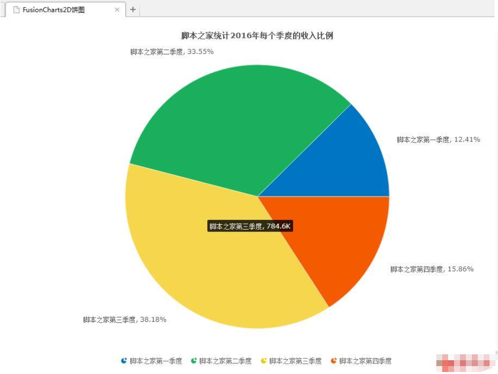
dataSource: {
"chart": {
"caption": "亿速云统计2016年每个季度的收入比例",
"subCaption": "",
"paletteColors": "#0075c2,#1aaf5d,#f2c500,#f45b00,#8e0000",
"bgColor": "#ffffff",
"showBorder": "0",
"use3DLighting": "0",
"showShadow": "0",
"enableSmartLabels": "0",
"startingAngle": "0",
"showPercentValues": "1",
"showPercentInTooltip": "0",
"decimals": "2",
"captionFontSize": "14",
"subcaptionFontSize": "14",
"subcaptionFontBold": "0",
"toolTipColor": "#ffffff",
"toolTipBorderThickness": "0",
"toolTipBgColor": "#000000",
"toolTipBgAlpha": "80",
"toolTipBorderRadius": "2",
"toolTipPadding": "5",
"showHoverEffect":"1",
"showLegend": "1",
"legendBgColor": "#ffffff",
"legendBorderAlpha": '0',
"legendShadow": '0',
"legendItemFontSize": '10',
"legendItemFontColor": '#666666'
},
"data": [
{
"label": "亿速云第一季度",
"value": "255040"
},
{
"label": "亿速云第二季度",
"value": "689545"
},
{
"label": "亿速云第三季度",
"value": "784595"
},
{
"label": "亿速云第四季度",
"value": "325848"
}
]
}
}).render();
});
});
</script>
</head>
<body>
<div id="pie2D"></div>
</body>
</html>2、实现效果图:
感谢各位的阅读,以上就是“怎么用jQuery插件FusionCharts实现2D饼状图效果”的内容了,经过本文的学习后,相信大家对怎么用jQuery插件FusionCharts实现2D饼状图效果这一问题有了更深刻的体会,具体使用情况还需要大家实践验证。这里是亿速云,小编将为大家推送更多相关知识点的文章,欢迎关注!
亿速云「云服务器」,即开即用、新一代英特尔至强铂金CPU、三副本存储NVMe SSD云盘,价格低至29元/月。点击查看>>
免责声明:本站发布的内容(图片、视频和文字)以原创、转载和分享为主,文章观点不代表本网站立场,如果涉及侵权请联系站长邮箱:is@yisu.com进行举报,并提供相关证据,一经查实,将立刻删除涉嫌侵权内容。
原文链接:http://www.anzhuo.cn/news/p_10553


 计算
计算 安全
安全 数据库
数据库 网络和加速
网络和加速 企业服务
企业服务


