这期内容当中小编将会给大家带来有关怎样使用R语言ggplot2画柱形图,文章内容丰富且以专业的角度为大家分析和叙述,阅读完这篇文章希望大家可以有所收获。
今天要模仿的图片来自于论文 Core gut microbial communities are maintained by beneficial interactions and strain variability in fish。期刊是 Nature microbiology
今天重复的图片是Figure3中的柱形图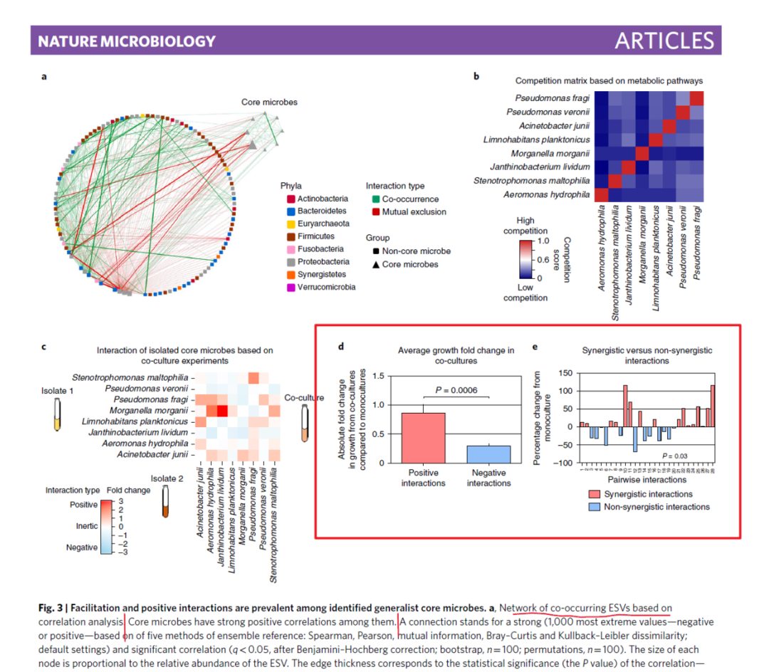
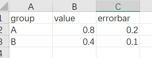
数据是三列:第一列用来做X,第二列做Y,第三列做误差条
df1<-read.csv("Figure3_d.csv",header=T)library(ggplot2)ggplot(df1,aes(x=group,y=value))+ geom_col(aes(fill=group),color="black")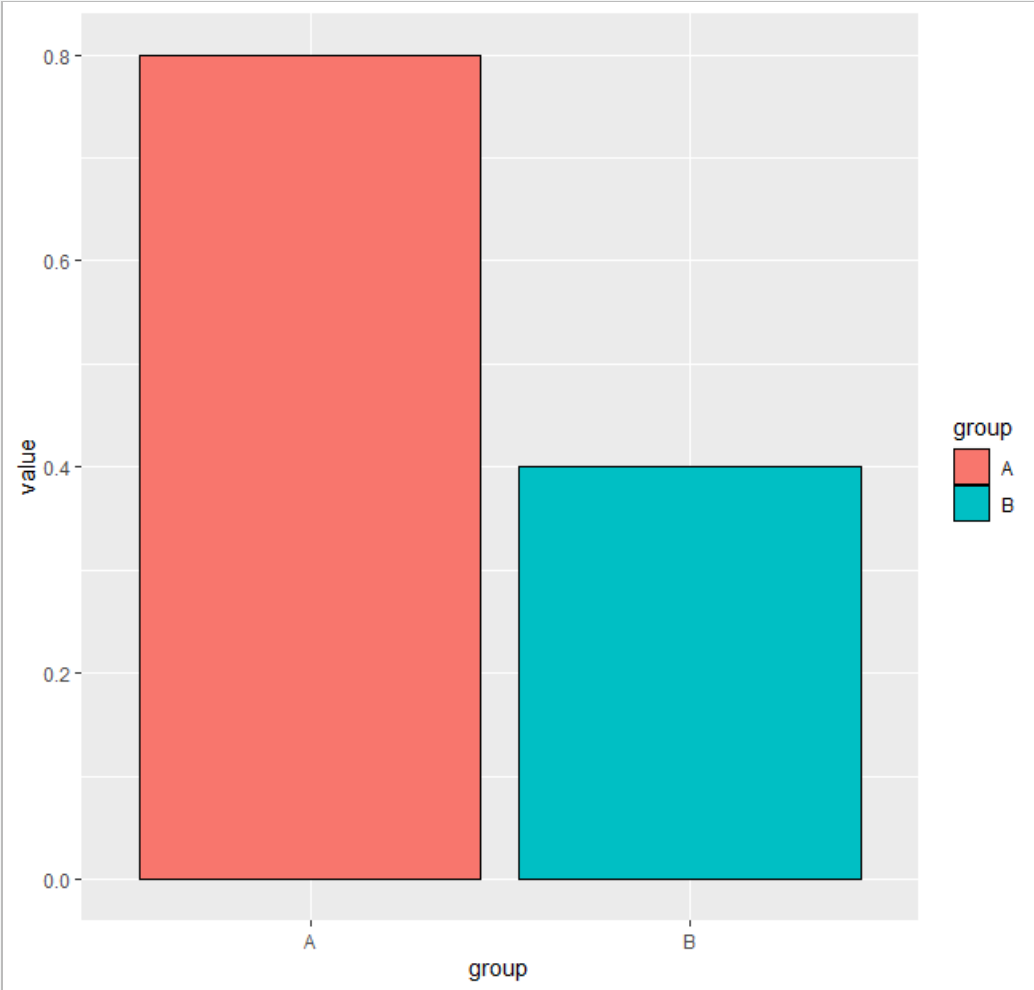
下面的代码就不详细介绍了,争取录制一期视频来介绍
ggplot(df1,aes(x=group,y=value))+ geom_hline(yintercept = 0.5,lty="dashed")+ geom_hline(yintercept = 1,lty="dashed")+ geom_col(aes(fill=group),color="black")+ theme_bw()+ theme(panel.background = element_blank(), panel.grid = element_blank(), plot.title = element_text(hjust=0.5), legend.position = "none")+ scale_y_continuous(expand = c(0,0), limits = c(0,1.5))+ scale_x_discrete(labels=c("Positive\ninteractions","Negative\ninteractions"))+ annotate("segment",x=1,y=0.8,xend=1,yend=1)+ annotate("segment",x=2,y=0.4,xend=2,yend=0.5)+ labs(x=NULL, y="Absolute fold change\nin growth from co-cultures\ncompared to monocultures", title = "Average growth fold change in\nco-cultures")+ annotate("segment",x=1.1,y=1.2,xend=1.9,yend=1.2)+ annotate("segment",x=1,y=1.15,xend=1.1,yend=1.2)+ annotate("segment",x=1.9,y=1.2,xend=2,yend=1.15)+ annotate("text",x=1.5,y=1.3,label="P=0.0006")+ scale_fill_manual(values = c("#ff8080","#90bff9"))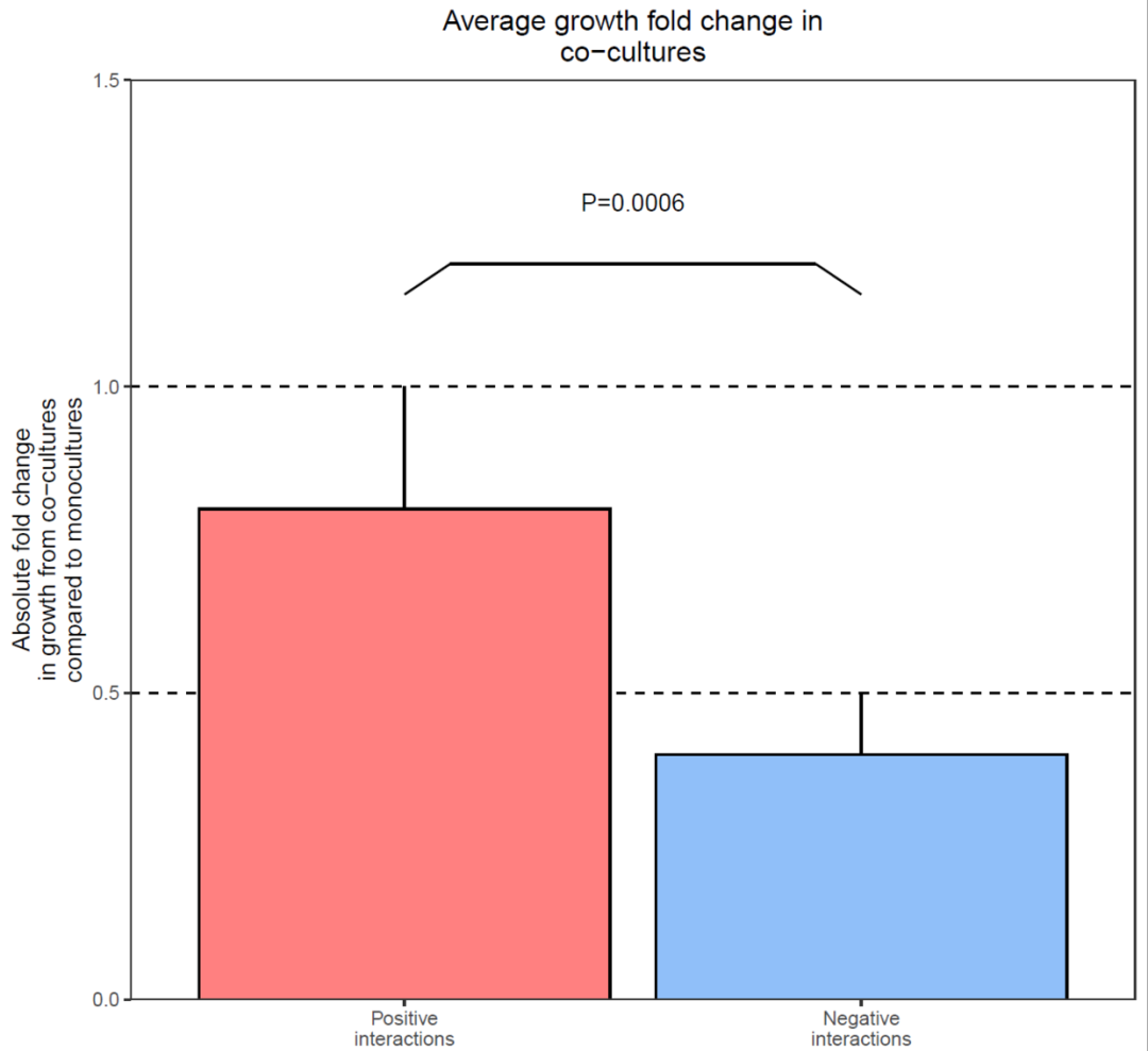
x<-1:28y<-sample(-100:150,28,replace = F)df2<-data.frame(x,y)df2$group<-ifelse(df2$y>0,"A","B")df2$x<-factor(df2$x)ggplot(df2,aes(x,y))+ geom_col(aes(fill=group),color="black")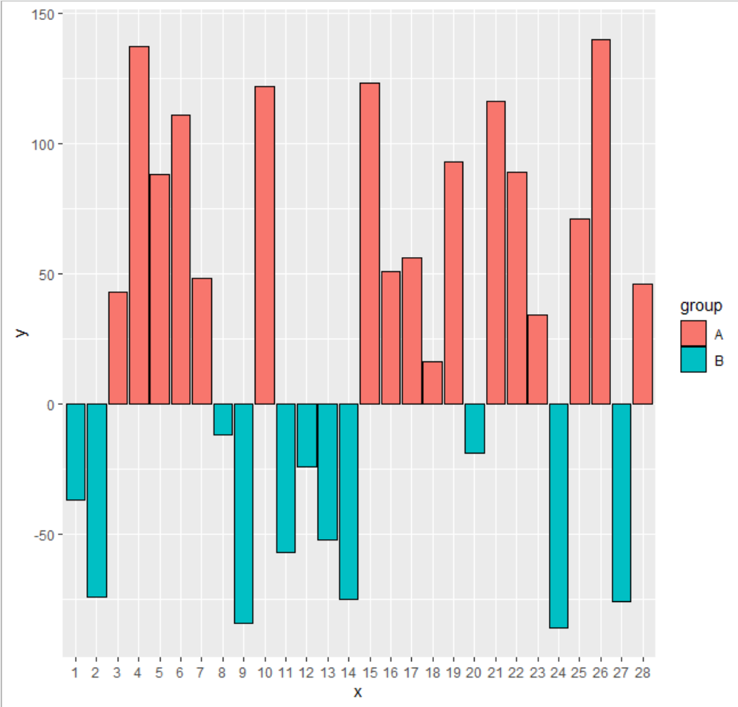
df2$group<-factor(df2$group, labels = c("Synergistic interactions", "Non-synergistic interactions"))ggplot(df2,aes(x,y))+ geom_hline(yintercept = -50,lty="dashed")+ geom_hline(yintercept = 50,lty="dashed")+ geom_hline(yintercept = 100,lty="dashed")+ geom_col(aes(fill=group),color="black")+ theme_bw()+ theme(panel.background = element_blank(), panel.grid = element_blank(), axis.text.x = element_text(angle = 90,hjust=0.5, vjust = 0.5), plot.title = element_text(hjust = 0.5), legend.position = "bottom", legend.title = element_blank())+ scale_y_continuous(expand=c(0,0), limits=c(-100,150), breaks = c(-100,-50,0,50,100,150))+ labs(x="Pairwise interactions", y="Percentage change from\nmonoculture", title = "Synergistic versus non-synergistic\ninteractions")+ scale_fill_manual(values = c("#ff8080","#90bff9"))
library(cowplot)pdf("Rplot11.pdf",width = 8,,height = 4)plot_grid(p1,p2,ncol = 2,nrow=1,labels = c("d","e"))dev.off()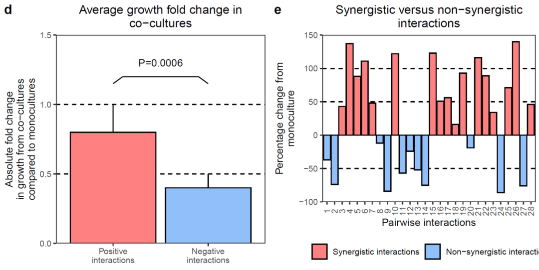
上述就是小编为大家分享的怎样使用R语言ggplot2画柱形图了,如果刚好有类似的疑惑,不妨参照上述分析进行理解。如果想知道更多相关知识,欢迎关注亿速云行业资讯频道。
亿速云「云服务器」,即开即用、新一代英特尔至强铂金CPU、三副本存储NVMe SSD云盘,价格低至29元/月。点击查看>>
免责声明:本站发布的内容(图片、视频和文字)以原创、转载和分享为主,文章观点不代表本网站立场,如果涉及侵权请联系站长邮箱:is@yisu.com进行举报,并提供相关证据,一经查实,将立刻删除涉嫌侵权内容。
原文链接:https://my.oschina.net/u/4579431/blog/4865070


 计算
计算 安全
安全 数据库
数据库 网络和加速
网络和加速 企业服务
企业服务


