这篇文章主要介绍“JavaScript图表插件highcharts怎么使用”的相关知识,小编通过实际案例向大家展示操作过程,操作方法简单快捷,实用性强,希望这篇“JavaScript图表插件highcharts怎么使用”文章能帮助大家解决问题。
Highcharts 非商业免费,商业需授权,代码开源。兼容 IE6。
Highcharts 底层为svg,方便自己定制,但图表类型有限。
不依赖分辨率。
支持事件处理器,可以为某个元素附加JS事件处理器。
最适合带有大型渲染区域的应用程序(如谷歌地图),但复杂度高会减慢渲染速度(任何过度使用DOM的应用都不快)。
不适合游戏应用。
Highcharts 是一个用纯 JavaScript 编写的一个图表库, 能够很简单便捷的在 Web 网站或是 Web 应用程序添加有交互性的图表,并且免费提供给个人学习、个人网站和非商业用途使用。
Highcharts 支持的图表类型有直线图、曲线图、区域图、柱状图、饼状图、散状点图、仪表图、气泡图、瀑布流图等多达 20 种图表,其中很多图表可以集成在同一个图形中形成混合图。
访问 highcharts.com 下载 Highcharts 包。
引入 Highcharts
Highcharts 最基本的运行只需要一个 JS 文件,即 highcharts.js,以使用 CDN 文件为例,对应的代码是:
<script src="http://cdn.highcharts.com.cn/highcharts/highcharts.js"></script>创建一个简单的图表
在绘图前我们需要为 Highcharts 准备一个 DOM 容器,并指定其大小
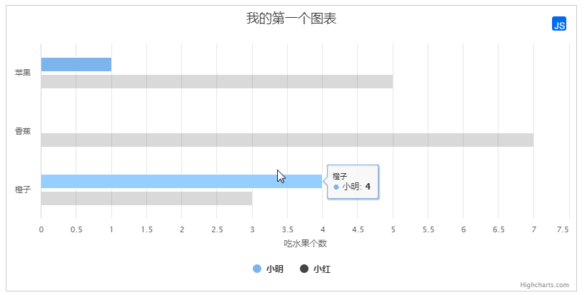
<div id="container" ></div>然后通过 Highcharts 的初始化函数 Highcharts.chart 来创建图表,该函数接受两个参数,第一个参数是 DOM 容器的 Id,第二个参数是图表配置,代码如下:
<!DOCTYPE html>
<html>
<head>
    <meta charset="utf-8">
    <title>第一个 Highcharts 图表</title>
</head>
<body>
     图表容器 DOM
    <div id="container" ></div>
     引入 highcharts.js
    <script src="http://cdn.highcharts.com.cn/highcharts/highcharts.js"></script>
    <script>
        // 图表配置
        var options = {
            chart: {
                type: 'bar'                          //指定图表的类型,默认是折线图(line)
            },
            title: {
                text: '我的第一个图表'                 // 标题
            },
            xAxis: {
                categories: ['苹果', '香蕉', '橙子']   // x 轴分类
            },
            yAxis: {
                title: {
                    text: '吃水果个数'                // y 轴标题
                }
            },
            series: [{                              // 数据列
                name: '小明',                        // 数据列名
                data: [1, 0, 4]                     // 数据
                   }, {
                name: '小红',
                data: [5, 7, 3]
            }]
        };
        // 图表初始化函数
        var chart = Highcharts.chart('container', options);
    </script>
</body>
</html>这样你的第一个图表就诞生了!
通过这个简单的例子,我们将学会如何配置基本的参数(options),然后通过一个Ajax调用远程数据以及解析数据,最后通过合适的格式展现出来
一个外部的仅包含数据的CSV文件'data.csv'(数据源)。
Categories,Apples,Pears,Oranges,Bananas
John,8,4,6,5
Jane,3,4,2,3
Joe,86,76,79,77
Janet,3,16,13,15
var options = {
     chart: {
         renderTo: 'container',
         defaultSeriesType: 'column'
     },
     title: {
         text: 'Fruit Consumption'
     },
     xAxis: {
         categories: []
     },
     yAxis: {
         title: {
             text: 'Units'
         }
     },
     series: []
 };

$.get('data.csv', function(data) {
     // Split the lines
     var lines = data.split('\n');

     // Iterate over the lines and add categories or series
     $.each(lines, function(lineNo, line) {
         var items = line.split(',');

         // header line containes categories
         if (lineNo == 0) {
             $.each(items, function(itemNo, item) {
                 if (itemNo > 0) options.xAxis.categories.push(item);
            });
         }

         // the rest of the lines contain data with their name in the first position
         else {
             var series = {
                 data: []
             };
             $.each(items, function(itemNo, item) {
                 if (itemNo == 0) {
                     series.name = item;
                 } else {
                     series.data.push(parseFloat(item));
                 }
             });

             options.series.push(series);

         }

     });

     // Create the chart
     var chart = new Highcharts.Chart(options);
});$(function(){
//声明报表对象
var chart = new Highcharts.Chart({
chart: {
//将报表对象渲染到层上
renderTo: 'container'
},
//设定报表对象的初始数据
series: [{
data: [29.9, 71.5, 106.4, 129.2, 144.0, 176.0, 135.6, 148.5, 216.4, 194.1, 95.6, 54.4]
}]
});
function getForm(){
//使用JQuery从后台获取JSON格式的数据
jQuery.getJSON('http://localhost:8080/JQueryPIC/ajax', null, function(data) {
//为图表设置值
chart.series[0].setData(data);
});
}
$(document).ready(function() {
//每隔3秒自动调用方法,实现图表的实时更新
window.setInterval(getForm,3000);
});
});建立服务器。在这个例子中,我们服务器脚本语言返回包含时间(time)以及y值(y value)的javascript数组。
var chart; // global
/**
 * Request data from the server, add it to the graph and set a timeout to request again
 */
function requestData() {
    $.ajax({
        url: 'live-server-data.php',
        success: function(point) {
            var series = chart.series[0],
                shift = series.data.length > 20; // shift if the series is longer than 20

            // add the point
            chart.series[0].addPoint(point, true, shift);

            // call it again after one second
            setTimeout(requestData, 1000);
        },
        cache: false
    });
}
$(document).ready(function() {
    chart = new Highcharts.Chart({
        chart: {
            renderTo: 'container',
            defaultSeriesType: 'spline',
            events: {
                load: requestData
            }
        },
        title: {
            text: 'Live random data'
        },
        xAxis: {
            type: 'datetime',
            tickPixelInterval: 150,
            maxZoom: 20 * 1000
        },
        yAxis: {
            minPadding: 0.2,
            maxPadding: 0.2,
            title: {
                text: 'Value',
                margin: 80
            }
        },
        series: [{
            name: 'Random data',
            data: []
        }]
    });
});标题(Title)
图表标题,包含标题和副标题(subTitle),其中副标题是非必须的。
坐标轴(Axis)
坐标轴包含x轴(xAxis)和y轴(yAxis)。通常情况下,x轴显示在图表的底部,y轴显示在图表的左侧。多个数据列可以共同使用同一个坐标轴,为了对比或区分数据,Highcharts提供了多轴的支持。
数据列(Series)
数据列即图表上一个或多个数据系列,比如曲线图中的一条曲线,柱状图中的一个柱形。
数据提示框(Tooltip)
鼠标悬停在某点上时,以框的形式提示该点的数据,比如该点的值、数据单位等。数据提示框内提示的信息完全可以通过格式化函数动态指定。
图例(Legend)
图例是图表中用不同形状、颜色、文字等 标示不同数据列,通过点击标示可以显示或隐藏该数据列。
版权标签(Credits)
显示在图表右下方的包含链接的文字,默认是Highcharts官网地址。通过指定credits.enabled=false即可不显示该信息。
导出功能(Exporting)
通过引入 exporting.js即可增加图表导出为常见文件功能。
标示线(PlotLines)
可以在图表上增加一条标示线,比如平均值线,最高值线等。
标示区(PlotBands)
可以在图表添加不同颜色的区域带,标示出明显的范围区域。
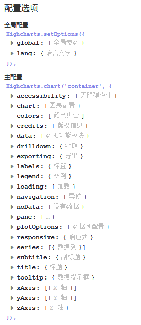
chart.events.addSeries:添加数列到图表中。
chart.events.click:整个图表的绘图区上所发生的点击事件。
chart.events.load:图表加载事件。
chart.events.redraw:图表重画事件,当点击图注显示和隐藏绘图时可以触发。
chart.events.selection:当图表曲线可选择放大时,当选择图表操作时,可以触发该事件。
chart.height:所绘制图表的高度值。
chart.inverted:图表中的x,y轴对换。
chart.polar:是否为极性图表。
chart.reflow:当窗口大小改变时,图表宽度自适应窗口大小改变。
chart.renderTo:图表加载的位置,是页面上的一个DOM对象。
chart.showAxes:在空白图表中,是否显示坐标轴。
chart.type:图表的类型,默认为line,还有bar/column/pie……
chart.width:图表绘图区的宽度,默认为自适应。
chart.zoomType:图表中数据报表的放大类型,可以以X轴放大,或是以Y轴放大,还可以以XY轴同时放大。
colors:图表中多数列时,各数列之间的颜色。是一个数组,一般不动。
credits.enabled:是否允许显示版权信息。
credits.href:版权所有的链接。
credits.text:版权信息显示文字。
exporting.buttons.exportButton.enabled:是否允许显示导出按钮。
exporting.buttons.exportButton.menuItems:导出按钮的菜单选项。
exporting.buttons.exportButton.onclick:导出按钮被点击的事件,不是内部的菜单。
exporting.buttons.printButton.enabled:是否允许打印按钮。
exporting.buttons.printButton.onclick:打印按钮的点击事件。
exporting.enabled:打印和导出按钮是否被允许。
exporting.filename:被导出文件的文件名。
exporting.type:默认导出图片的文件格式。
exporting.url:SVG图表转换并导出的接口处理地址。
exporing.width:默认导出图片的宽度。
labels:标签,可以加载到图表的任何位置,里面有items,style。
lang:语言参数配置,与导出按钮菜单有关的配置,时间名称的配置等。
legend.enabled:是否允许图注。
navigation.buttonOptions.enabled:图表中所有导航中的按钮是否可被点击。
series:是一个数组。
subtitle:配置图表的子标题。
title:配置图表的标题。
tooltip:配置图表中数据的气泡提示。
xAxis,yAxis配置设置坐标轴
allowDecimals:坐标轴上是否允许小数。
categories:是一个数组,坐标轴的分类。
plotLines:绘制主线。
tickColor:刻度颜色。
tickInterval:刻度的步进值。
labels.rotation:刻度标签旋转度数
Chart图表区选项用于设置图表区相关属性。
backgroundColor:设置图表区背景色。默认值: #FFFFFF
borderWidth:设置图表边框宽度。默认值:0
borderRadius:设置图表边框圆角角度。默认值:5
renderTo:图表放置的容器,一般在html中放置一个DIV,获取DIV的id属性值。默认值:null
defaultSeriesType:默认图表类型line, spline, area, areaspline, column, bar, pie , scatter。默认值:0
width:图表宽度,默认根据图表容器自适应宽度。默认值:null
height:图表高度,默认根据图表容器自适应高度。默认值:null
margin:设置图表与其他元素之间的间距,数组,如[0,0,0,0]。默认值:[null]
plotBackgroundColor:主图表区背景色,即X轴与Y轴围成的区域的背景色。默认值:null
plotBorderColor:主图表区边框的颜色,即X轴与Y轴围成的区域的边框颜色null
plotBorderWidth:主图表区边框的宽度。默认值:0
shadow:是否设置阴影,需要设置背景色backgroundColor。默认值:false
reflow:是否自使用图表区域高度和宽度,如果没有设置width和height时,会自适应大小。默认值:true
zoomType:拖动鼠标进行缩放,沿x轴或y轴进行缩放,可以设置为:'x','y','xy'''
events:事件回调,支持addSeries方法,click方法,load方法,selection方法等的回调函数。默认值:
Color颜色选项用于设置图表的颜色方案。
color:用于展示图表,折线/柱状/饼状等图的颜色,数组形式。默认值:array
Highcharts已经默认提供了多种颜色方案,当要显示的图形多于颜色种类时,多出的图形会自动从第一种颜色方案开始选取。自定义颜色方案的方法:
Highcharts.setOptions({
    colors: ['#058DC7', '#50B432', '#ED561B', '#DDDF00', '#24CBE5', '#64E572', '#FF9655','#FFF263', '#6AF9C4']
});Title标题选项用于设置图表的标题相关属性。
副标题提供的属性选项与标题title大致相同,可参照标题选项,值得一提的是副标题的text选项默认为'',即空的,所以默认情况下副标题不显示。
text:标题文本内容。默认值:Chart title
align:水平对齐方式。默认值:center
verticalAlign:垂直对齐方式。默认值:top
margin:标题与副标题之间或者主图表区间的间距。默认值:15
floating:是否浮动,如果为true,则标题可以偏离主图表区,可配合x,y属性使用。默认值:false
style:设置CSS样式。默认值:{color: '#3E576F',fontSize: '16px'}
var title = {
  text: '月平均气温'
};


var subtitle = {
  text: 'Source: runoob.com'
};X轴选项用于设置图表X轴相关属性。
Y轴选项与上述xAxis选项基本一致,请参照上表中的参数设置,不再单独列出。
categories:设置X轴分类名称,数组,例如:categories: ['Apples', 'Bananas', 'Oranges']。默认值:[]
title:X轴名称,支持text、enabled、align、rotation、style等属性。默认值:
labels:设置X轴各分类名称的样式style,格式formatter,角度rotation等。默认值:array
max:X轴最大值(categories为空时),如果为null,则最大值会根据X轴数据自动匹配一个最大值。默认值:null
min:X轴最小值(categories为空时),如果为null,则最小值会根据X轴数据自动匹配一个最小值。默认值:array
gridLineColor:网格(竖线)颜色。默认值:#C0C0C0
gridLineWidth:网格(竖线)宽度。默认值:1
lineColor:基线颜色。默认值:#C0D0E0
lineWidth:基线宽度。默认值:0
var xAxis = {
   categories: ['一月', '二月', '三月', '四月', '五月', '六月'
      ,'七月', '八月', '九月', '十月', '十一月', '十二月']
};


var yAxis = {
   title: {
      text: 'Temperature (\xB0C)'
   },
   plotLines: [{
      value: 0,
      width: 1,
      color: '#808080'
   }]
};数据列选项用于设置图表中要展示的数据相关的属性。
data:显示在图表中的数据列,可以为数组或者JSON格式的数据。如:data:[0, 5, 3, 5],或data: [{name: 'Point 1',y: 0}, {name: 'Point 2',y: 5}]。默认值:''
series.data.color:某一个数据的颜色。
series.data.dataLabels:序列中某一个数据的数据标签。
series.data.events类同于plotOptions.area.point.events的相关配置。
series.data.marker类同于plotOptions.area.marker的相关配置。
series.data.name:配置数据点的名称。
series.data.sliced:配置在饼图中,扇区的分离距离大小。
series.data.x:点的x值。
series.data.y:点的y值。
name:显示数据列的名称。。默认值:''
type:数据列类型,支持 area, areaspline, bar, column, line, pie, scatter or spline。默认值:lineseries.stack:堆叠的分组索引。
xAxis,yAxis:当使用多坐标轴时,指定某个数列对应哪个坐标轴。
var series =  [
   {
      name: 'Tokyo',
      data: [7.0, 6.9, 9.5, 14.5, 18.2, 21.5, 25.2,
         26.5, 23.3, 18.3, 13.9, 9.6]
   },
   {
      name: 'New York',
      data: [-0.2, 0.8, 5.7, 11.3, 17.0, 22.0, 24.8,
         24.1, 20.1, 14.1, 8.6, 2.5]
   },
   {
      name: 'Berlin',
      data: [-0.9, 0.6, 3.5, 8.4, 13.5, 17.0, 18.6,
         17.9, 14.3, 9.0, 3.9, 1.0]
   },
   {
      name: 'London',
      data: [3.9, 4.2, 5.7, 8.5, 11.9, 15.2, 17.0,
         16.6, 14.2, 10.3, 6.6, 4.8]
   }
];plotOptions用于设置图表中的数据点相关属性。plotOptions根据各种图表类型,其属性设置略微有些差异,现将常用选项列出来。
enabled:是否在数据点上直接显示数据。默认值:false
allowPointSelect:是否允许使用鼠标选中数据点。默认值:false
formatter:回调函数,格式化数据显示内容。默认值:formatter: function() {return this.y;}
plotOptions.area.allowPointSelect:是否允许数据点的点击。
plotOptions.area.color:绘图的颜色。
plotOptions.area.dataLabels.enabled:是否允许数据标签。
plotOptions.area.enableMouseTracking:是否允许数据图表中,数据点的鼠标跟踪气泡显示。
plotOptions.area.events.checkboxClick:数据图表中图注中复选框的点击事件。
plotOptions.area.events.click:数据图表中,数据点的点击事件。
plotOptions.area.events.hide:数据图表中,某一数据序列隐藏时的事件。
plotOptions.area.events.show:数据图表中,某一数据序列显示时的事件。
plotOptions.area.events.legendItemClick:数据图表中,图注中的项目被点击时的事件,直接赋值false,则不可点击。
plotOptions.area.events.mouseOut:数据点的鼠标移出事件。
plotOptions.area.events.mouseOver:数据点的鼠标经过事件。
plotOptions.area.marker.enabled:图表中绘图中是否显示点的标记符。
plotOptions.area.marker.states.hover.enabled:是否允许标记符的鼠标经过状态。
plotOptions.area.marker.states.select.enabled:是否允许标记符的选择状态。
plotOptions.area.point.events.click:图表中每一个单独的点点击事件。
plotOptions.area.point.events.mouseOut
plotOptions.area.point.events..mouseOver
plotOptions.area.point.events.remove:删除图表中的点时的事件。
plotOptions.area.point.events.select:图表中点选择事件。
plotOptions.area.point.events.unselect:图表中点取消选择时的事件。
plotOptions.area.point.events.update:图表中数据发生更新时的事件。
plotOptions.area.visible:加载时,数据序列默认是显示还是隐藏。
plotOptions.area.zIndex:在多序列的情况下,调整每一个序列的层叠顺序。
以上的point.events同样还适用于其他面积类图表(arearange、areaspline、areasplinerange),其他的柱状图(bar、column)及所有图表。
plotOptions.area.showInLegend:是否在图注中显示。
plotOptions.area.stacking:是以值堆叠,还是以百分比堆叠。
plotOptions.area.states.hover.enabled:鼠标放上的状态是否允许。
plotOptions.area.stickyTracking:鼠标粘性跟踪数据点。
plotOptions.arearange,plotOptions.areaspline,plotOptions.areasplinerange类同于plotOptions.area
plotOptions.bar.groupPadding:对于柱状图分组,每个分组之间的间隔。
plotOptions.bar.grouping:是否对数据进行分组。
plotOptions.bar.minPointLength::定义当point值为零时,点的最小长度为多少
plotOptions.bar.showInLegend:是否在图注中显示。
plotOptions.bar.stacking:是以值堆叠,还是以百分比堆叠(normal/percent)。
plotOptions.column,plotOptions.columnrange类同于plotOptions.bar
plotOptions.line的相关配置类似于plotOptions.area配置。
plotOptions.pie.ignoreHiddenPoint:在饼状图中,某一个序列经图注点击隐藏后,整个饼状图是重新以100%分配,还是只在原图基础上隐藏,呈现一个缺口。
plotOptions.pie.innerSize:绘制饼状图时,饼状图的圆心预留多大的空白。
plotOptions.pie.slicedOffset:与allowPointSelect结合使用,当点被点击时,对应的扇区剥离,这个参数即配置离开的距离。
plotOptions.pie的其他常用配置参数类同于plotOptions.area,plotOptions.scatter,plotOptions.series,plotOptions.spline的相关配置类似于plotOptions.area配置。
Tooltip用于设置当鼠标滑向数据点时显示的提示框信息。
enabled:是否显示提示框。默认值:true
backgroundColor:设置提示框的背景色。默认值:rgba(255, 255, 255, .85)
borderColor:提示框边框颜色,默认自动匹配数据列的颜色。默认值:auto
borderRadius:提示框圆角度。默认值:5
shadow:是否显示提示框阴影。默认值:true
style:设置提示框内容样式,如字体颜色等。默认值:color:'#333'
formatter:回调函数,用于格式化输出提示框的显示内容。返回的内容支持html标签如:b, strong, i, em, br, span。默认值:2
tooltip.valueDecimals:允许的小数点位数。
tooltip.percentageDecimals:允许百分比的小数点后位数。
var tooltip = {
   valueSuffix: '\xB0C'
}legend用于设置图例相关属性。
layout:显示形式,支持水平horizontal和垂直vertical。默认值:horizontal
align:对齐方式。。默认值:center
backgroundColor:图例背景色。。默认值:null
borderColor:图例边框颜色。。默认值:#909090
borderRadius:图例边框角度。默认值:5
enabled:是否显示图例。默认值:true
floating:是否可以浮动,配合x,y属性。。默认值:false
shadow:是否显示阴影。默认值:false
style:设置图例内容样式。默认值:''
var legend = {
   layout: 'vertical',
   align: 'right',
   verticalAlign: 'middle',
   borderWidth: 0
};更多详细信息请参照highcharts官网英文文档:http://api.highcharts.com/highcharts
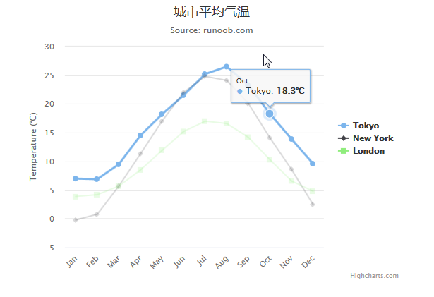
var title = {
      text: '城市平均气温'
   };
   var subtitle = {
      text: 'Source: runoob.com'
   };
   var xAxis = {
      categories: ['Jan', 'Feb', 'Mar', 'Apr', 'May', 'Jun','Jul', 'Aug', 'Sep', 'Oct', 'Nov', 'Dec']
   };
   var yAxis = {
      title: {
         text: 'Temperature (\xB0C)'
      },
      plotLines: [{
         value: 0,
         width: 1,
         color: '#808080'
      }]
   };

   var tooltip = {
      valueSuffix: '\xB0C'
   }

   var legend = {
      layout: 'vertical',
      align: 'right',
      verticalAlign: 'middle',
      borderWidth: 0
   };

   var series =  [
      {
         name: 'Tokyo',
         data: [7.0, 6.9, 9.5, 14.5, 18.2, 21.5, 25.2,  26.5, 23.3, 18.3, 13.9, 9.6]
      },
      {
         name: 'New York',
         data: [-0.2, 0.8, 5.7, 11.3, 17.0, 22.0, 24.8,   24.1, 20.1, 14.1, 8.6, 2.5]
      },
      {
         name: 'London',
         data: [3.9, 4.2, 5.7, 8.5, 11.9, 15.2, 17.0,  16.6, 14.2, 10.3, 6.6, 4.8]
      }
   ];

   var json = {};

   json.title = title;
   json.subtitle = subtitle;
   json.xAxis = xAxis;
   json.yAxis = yAxis;
   json.tooltip = tooltip;
   json.legend = legend;
   json.series = series;

   $('#container').highcharts(json);
});
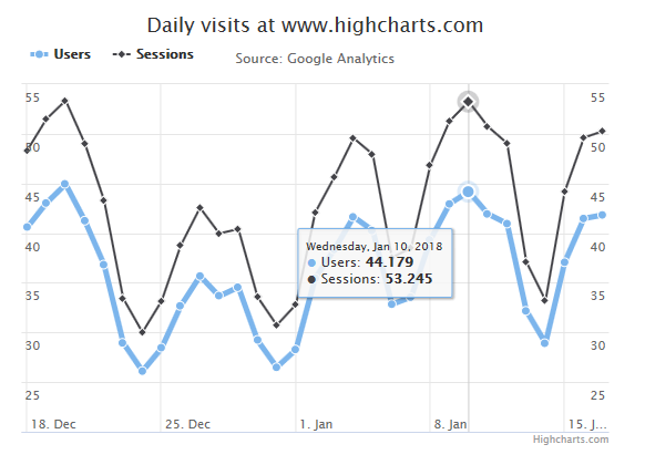
var plotOptions = {
      line: {
         dataLabels: {
            enabled: true
         },
         enableMouseTracking: false
      }
   };
var title = {
      text: 'Daily visits at www.highcharts.com'
   };
var subtitle = {
      text: 'Source: Google Analytics'
   };
var xAxis = {
      tickInterval: 7 * 24 * 3600 * 1000, // 以每周为间隔设置 X 轴:one week
      tickWidth: 0,
      gridLineWidth: 1,
      labels: {
         align: 'left',
         x: 3,
         y: -3
      }
   };

   //以每周为间隔设置 Y 轴:
   //配置两个 Y 轴:
var yAxis = [{ // 左边 Y 轴
         title: {
            text: null
         },
         labels: {
            align: 'left',
            x: 3,
            y: 16,
            format: '{value:.,0f}'
         },
         showFirstLabel: false
      },{ // 右边 Y 轴
         linkedTo: 0,
         gridLineWidth: 0,
         opposite: true,
         title: {
            text: null
         },
         labels: {
            align: 'right',
            x: -3,
            y: 16,
            format: '{value:.,0f}'
         },
         showFirstLabel: false
      }
   ];

   var tooltip = {
      shared: true,
      crosshairs: true
   }

   var legend = {
      align: 'left',
      verticalAlign: 'top',
      y: 20,
      floating: true,
      borderWidth: 0
   };

   var plotOptions = { //plotOptions用于设置图表中的数据点相关属性。
      series: {
         cursor: 'pointer',
         point: {
            events: {
               click: function (e) {
                  hs.htmlExpand(null, {
                     pageOrigin: {
                        x: e.pageX || e.clientX,
                        y: e.pageY || e.clientY
                     },
                     headingText: this.series.name,
                     maincontentText: Highcharts.dateFormat('%A, %b %e, %Y', this.x)   + ':
 ' + this.y + ' visits',
                     width: 200
                  });
               }
            }
         },
         marker: {
            lineWidth: 1
         }
      }
   }

   var series =  [{
         name: 'All visits',
         lineWidth: 4,
         marker: {
            radius: 4
         }
      }, {
         name: 'New visitors'
      }]

   var json = {};

   json.title = title;
   json.subtitle = subtitle;
   json.xAxis = xAxis;
   json.yAxis = yAxis;
   json.tooltip = tooltip;
   json.legend = legend;
   json.series = series;
   json.plotOptions = plotOptions;

   $.getJSON('http://www.highcharts.com/samples/data/jsonp.php?filename=analytics.csv&callback=?', function (csv) {
      var data = {
         csv: csv
      };
      json.data = data;
      $('#container').highcharts(json);
   });
});返回的文件内容:
callback("# ----------------------------------------\n
# highcharts.com\n# Audience Overview\n# 20171217-20180117\n
# ----------------------------------------\n
Day Index,Users,Sessions\n
12/18/17,\"40,585\",\"48,351\"\n
12/19/17,\"43,039\",\"51,499\"\n
........12/20/17,\"44,926\",\"53,359\"\n
1/17/18,\"41,840\",\"50,285\"
");
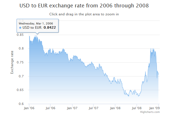
var chart = {
      zoomType: 'x'
   };
   var title = {
      text: 'USD to EUR exchange rate from 2006 through 2008'
   };
   var subtitle = {
      text: document.ontouchstart === undefined ?
                    'Click and drag in the plot area to zoom in' :
                    'Pinch the chart to zoom in'
   };
   var xAxis = {
      type: 'datetime',
      minRange: 14 * 24 * 3600000 // 14 天
   };
   var yAxis = {
      title: {
         text: 'Exchange rate'
      }
   };
   var legend = {
      enabled: false
   };
   var plotOptions = {
      area: {
         fillColor: {
            linearGradient: { x1: 0, y1: 0, x2: 0, y2: 1},
            stops: [
               [0, Highcharts.getOptions().colors[0]],
               [1, Highcharts.Color(Highcharts.getOptions().colors[0]).setOpacity(0).get('rgba')]
            ]
         },
         marker: {
            radius: 2
         },
         lineWidth: 1,
         states: {
            hover: {
               lineWidth: 1
            }
         },
         threshold: null
      }
   };
   var series= [{
      type: 'area',
      name: 'USD to EUR',
      pointInterval: 24 * 3600 * 1000,
      pointStart: Date.UTC(2006, 0, 1),
      data: [
         0.8446, 0.8445, 0.8444, 0.8451,    0.8418, 0.8264,    0.8258, 0.8232,    0.8233, 0.8258,
         0.8283, 0.8278, 0.8256, 0.8292,    0.8239, 0.8239,    0.8245, 0.8265,    0.8261, 0.8269,
         0.8273, 0.8244, 0.8244, 0.8172,    0.8139, 0.8146,    0.8164, 0.82,    0.8269, 0.8269,
         0.8269, 0.8258, 0.8247, 0.8286,    0.8289, 0.8316,    0.832, 0.8333,    0.8352, 0.8357,
         0.8355, 0.8354, 0.8403, 0.8403,    0.8406, 0.8403,    0.8396, 0.8418,    0.8409, 0.8384,
         0.8386, 0.8372, 0.839, 0.84,
         ]
      }
   ];

   var json = {};
   json.chart = chart;
   json.title = title;
   json.subtitle = subtitle;
   json.legend = legend;
   json.xAxis = xAxis;
   json.yAxis = yAxis;
   json.series = series;
   json.plotOptions = plotOptions;
   $('#container').highcharts(json);

});
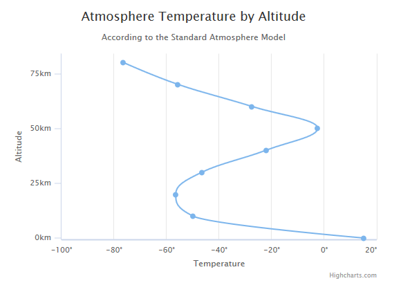
配置图表类型 type 为 spline。chart.type 默认为 "line"。
配置 X 轴翻转。inverted 设置为 true 即 X 轴翻转,默认为 false。
var chart = {
      type: 'spline',
      inverted: true
   };
   var title = {
      text: 'Atmosphere Temperature by Altitude'
   };
   var subtitle = {
      text: 'According to the Standard Atmosphere Model'
   };
   var xAxis = {
      reversed: false,
      title: {
         enabled: true,
         text: 'Altitude'
      },
      labels: {
         formatter: function () {
            return this.value + 'km';
         }
      },
      maxPadding: 0.05,
      showLastLabel: true
   };
   var yAxis = {
      title: {
         text: 'Temperature'
      },
      labels: {
         formatter: function () {
            return this.value + '\xB0';
         }
      },
      lineWidth: 2
   };
   var legend = {
      enabled: false
   };
   var tooltip = {
      headerFormat: '{series.name}
',
      pointFormat: '{point.x} km: {point.y}\xB0C'
   };
   var plotOptions = {
      spline: {
         marker: {
            enable: false
         }
      }
   };
   var series= [{
      name: 'Temperature',
      data: [[0, 15], [10, -50], [20, -56.5], [30, -46.5], [40, -22.1],
            [50, -2.5], [60, -27.7], [70, -55.7], [80, -76.5]]
   }];


   var json = {};
   json.chart = chart;
   json.title = title;
   json.subtitle = subtitle;
   json.legend = legend;
   json.tooltip = tooltip;
   json.xAxis = xAxis;
   json.yAxis = yAxis;
   json.series = series;
   json.plotOptions = plotOptions;
   $('#container').highcharts(json);

});
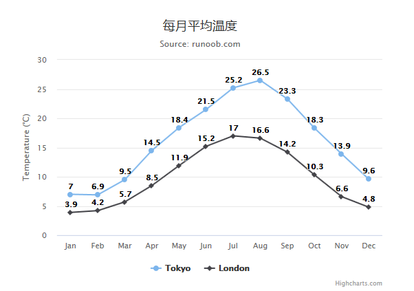
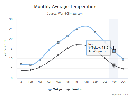
我们使用 marker.symbol 属性来配置标记。标记可以是 'square', 'diamond' 或 图片 url。标记可以添加在任何的数据点上:
var chart = {
      type: 'spline'
   };
   var title = {
      text: 'Monthly Average Temperature'
   };
   var subtitle = {
      text: 'Source: WorldClimate.com'
   };
   var xAxis = {
      categories: ['Jan', 'Feb', 'Mar', 'Apr', 'May', 'Jun',
         'Jul', 'Aug', 'Sep', 'Oct', 'Nov', 'Dec']
   };
   var yAxis = {
      title: {
         text: 'Temperature'
      },
      labels: {
         formatter: function () {
            return this.value + '\xB0';
         }
      },
      lineWidth: 2
   };
   var tooltip = {
      crosshairs: true,
      shared: true
   };
   var plotOptions = {
      spline: {
         marker: {
            radius: 4,
            lineColor: '#666666',
            lineWidth: 1
         }
      }
   };
   var series= [{
         name: 'Tokyo',
         marker: {
            symbol: 'square'
         },
         data: [7.0, 6.9, 9.5, 14.5, 18.2, 21.5, 25.2, {
            y: 26.5,
            marker: {
               symbol: 'url(http://www.highcharts.com/demo/gfx/sun.png)'
            }
         }, 23.3, 18.3, 13.9, 9.6]
      }, {
         name: 'London',
         marker: {
            symbol: 'diamond'
         },
         data: [{
            y: 3.9,
            marker: {
               symbol: 'url(http://www.highcharts.com/demo/gfx/snow.png)'
            }
         }, 4.2, 5.7, 8.5, 11.9, 15.2, 17.0, 16.6, 14.2, 10.3, 6.6, 4.8]
      }
   ];

   var json = {};
   json.chart = chart;
   json.title = title;
   json.subtitle = subtitle;
   json.tooltip = tooltip;
   json.xAxis = xAxis;
   json.yAxis = yAxis;
   json.series = series;
   json.plotOptions = plotOptions;
   $('#container').highcharts(json);

});
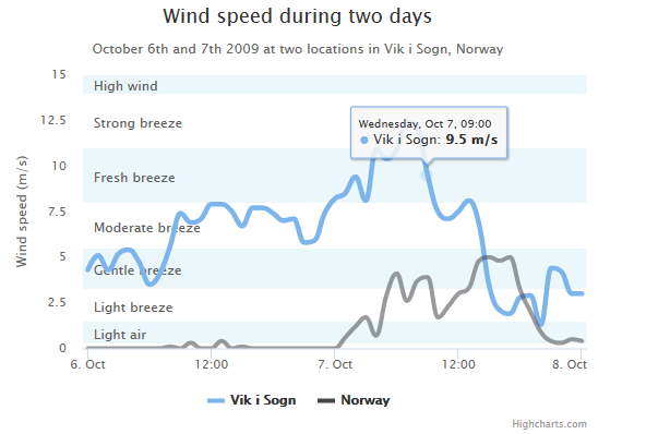
使用 yAxis.plotBands 属性来配置标示区。区间范围使用 'from' 和 'to' 属性。颜色设置使用 'color' 属性。标签样式使用 'label' 属性。
var chart = {
      type: 'spline'
   };
   var title = {
      text: 'Wind speed during two days'
   };
   var subtitle = {
      text: 'October 6th and 7th 2009 at two locations in Vik i Sogn, Norway'
   };
   var xAxis = {
      type: 'datetime',
      labels: {
         overflow: 'justify'
      }
   };
   var yAxis = {
      title: {
         text: 'Wind speed (m/s)'
      },
      min: 0,
      minorGridLineWidth: 0,
      gridLineWidth: 0,
      alternateGridColor: null,
      plotBands: [{ // Light air
         from: 0.3,
         to: 1.5,
         color: 'rgba(68, 170, 213, 0.1)',
         label: {
            text: 'Light air',
            style: {
               color: '#606060'
            }
         }
      }, { // Light breeze
         from: 1.5,
         to: 3.3,
         color: 'rgba(0, 0, 0, 0)',
         label: {
            text: 'Light breeze',
            style: {
               color: '#606060'
            }
         }
      }, { // Gentle breeze
         from: 3.3,
         to: 5.5,
         color: 'rgba(68, 170, 213, 0.1)',
         label: {
            text: 'Gentle breeze',
            style: {
               color: '#606060'
            }
         }
      }, { // Moderate breeze
         from: 5.5,
         to: 8,
         color: 'rgba(0, 0, 0, 0)',
         label: {
            text: 'Moderate breeze',
            style: {
               color: '#606060'
            }
         }
      }, { // Fresh breeze
         from: 8,
         to: 11,
         color: 'rgba(68, 170, 213, 0.1)',
         label: {
            text: 'Fresh breeze',
            style: {
               color: '#606060'
            }
         }
      }, { // Strong breeze
         from: 11,
         to: 14,
         color: 'rgba(0, 0, 0, 0)',
         label: {
            text: 'Strong breeze',
            style: {
               color: '#606060'
            }
         }
      }, { // High wind
         from: 14,
         to: 15,
         color: 'rgba(68, 170, 213, 0.1)',
         label: {
            text: 'High wind',
            style: {
               color: '#606060'
            }
         }
      }]
   };
   var tooltip = {
      valueSuffix: ' m/s'
   };
   var plotOptions = {
      spline: {
         lineWidth: 4,
         states: {
            hover: {
               lineWidth: 5
            }
         },
         marker: {
            enabled: false
         },
         pointInterval: 3600000, // one hour
         pointStart: Date.UTC(2009, 9, 6, 0, 0, 0)
      }
   };
   var series= [{
         name: 'Vik i Sogn',
         data: [4.3, 5.1, 4.3, 5.2, 5.4, 4.7, 3.5, 4.1, 5.6, 7.4, 6.9, 7.1,
         7.9, 7.9, 7.5, 6.7, 7.7, 7.7, 7.4, 7.0, 7.1, 5.8, 5.9, 7.4,
         8.2, 8.5, 9.4, 8.1, 10.9, 10.4, 10.9, 12.4, 12.1, 9.5, 7.5,
         7.1, 7.5, 8.1, 6.8, 3.4, 2.1, 1.9, 2.8, 2.9, 1.3, 4.4, 4.2,
         3.0, 3.0]
      }, {
         name: 'Norway',
         data: [0.0, 0.0, 0.0, 0.0, 0.0, 0.0, 0.0, 0.0, 0.1, 0.0, 0.3, 0.0,
         0.0, 0.4, 0.0, 0.1, 0.0, 0.0, 0.0, 0.0, 0.0, 0.0, 0.0, 0.0,
         0.0, 0.6, 1.2, 1.7, 0.7, 2.9, 4.1, 2.6, 3.7, 3.9, 1.7, 2.3,
         3.0, 3.3, 4.8, 5.0, 4.8, 5.0, 3.2, 2.0, 0.9, 0.4, 0.3, 0.5, 0.4]
   }];
   var navigation = {
      menuItemStyle: {
         fontSize: '10px'
      }
   }

   var json = {};
   json.chart = chart;
   json.title = title;
   json.subtitle = subtitle;
   json.tooltip = tooltip;
   json.xAxis = xAxis;
   json.yAxis = yAxis;
   json.series = series;
   json.plotOptions = plotOptions;
   json.navigation = navigation;
   $('#container').highcharts(json);

});
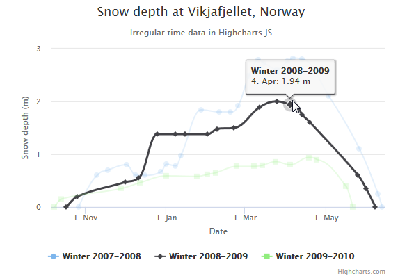
var chart = {
      type: 'spline'
   };
   var title = {
      text: 'Snow depth at Vikjafjellet, Norway'
   };
   var subtitle = {
      text: 'Irregular time data in Highcharts JS'
   };
   var xAxis = {
      type: 'datetime',
      dateTimeLabelFormats: { // don't display the dummy year
         month: '%e. %b',
         year: '%b'
      },
      title: {
         text: 'Date'
      }
   };
   var yAxis = {
      title: {
         text: 'Snow depth (m)'
      },
      min: 0
   };
   var tooltip = {
      headerFormat: '{series.name}
',
      pointFormat: '{point.x:%e. %b}: {point.y:.2f} m'
   };
   var plotOptions = {
      spline: {
         marker: {
            enabled: true
         }
      }
   };
   var series= [{
         name: 'Winter 2007-2008',
            // Define the data points. All series have a dummy year
            // of 1970/71 in order to be compared on the same x axis. Note
            // that in JavaScript, months start at 0 for January, 1 for February etc.
         data: [
             [Date.UTC(1970,  9, 27), 0   ],
             [Date.UTC(1970, 10, 10), 0.6 ],
             [Date.UTC(1970, 10, 18), 0.7 ],
             [Date.UTC(1970, 11,  2), 0.8 ],
             [Date.UTC(1970, 11,  9), 0.6 ],
             [Date.UTC(1970, 11, 16), 0.6 ],
             [Date.UTC(1970, 11, 28), 0.67],
             [Date.UTC(1971,  0,  1), 0.81],
             [Date.UTC(1971,  0,  8), 0.78],
             [Date.UTC(1971,  0, 12), 0.98],
             [Date.UTC(1971,  0, 27), 1.84],
             [Date.UTC(1971,  1, 10), 1.80],
             [Date.UTC(1971,  1, 18), 1.80],
             [Date.UTC(1971,  1, 24), 1.92],
             [Date.UTC(1971,  2,  4), 2.49],
             [Date.UTC(1971,  2, 11), 2.79],
             [Date.UTC(1971,  2, 15), 2.73],
             [Date.UTC(1971,  2, 25), 2.61],
             [Date.UTC(1971,  3,  2), 2.76],
             [Date.UTC(1971,  3,  6), 2.82],
             [Date.UTC(1971,  3, 13), 2.8 ],
             [Date.UTC(1971,  4,  3), 2.1 ],
             [Date.UTC(1971,  4, 26), 1.1 ],
             [Date.UTC(1971,  5,  9), 0.25],
             [Date.UTC(1971,  5, 12), 0   ]
         ]
      }, {
         name: 'Winter 2008-2009',
         data: [
             [Date.UTC(1970,  9, 18), 0   ],
             [Date.UTC(1970,  9, 26), 0.2 ],
             [Date.UTC(1970, 11,  1), 0.47],
             [Date.UTC(1970, 11, 11), 0.55],
             [Date.UTC(1970, 11, 25), 1.38],
             [Date.UTC(1971,  0,  8), 1.38],
             [Date.UTC(1971,  0, 15), 1.38],
             [Date.UTC(1971,  1,  1), 1.38],
             [Date.UTC(1971,  1,  8), 1.48],
             [Date.UTC(1971,  1, 21), 1.5 ],
             [Date.UTC(1971,  2, 12), 1.89],
             [Date.UTC(1971,  2, 25), 2.0 ],
             [Date.UTC(1971,  3,  4), 1.94],
             [Date.UTC(1971,  3,  9), 1.91],
             [Date.UTC(1971,  3, 13), 1.75],
             [Date.UTC(1971,  3, 19), 1.6 ],
             [Date.UTC(1971,  4, 25), 0.6 ],
             [Date.UTC(1971,  4, 31), 0.35],
             [Date.UTC(1971,  5,  7), 0   ]
         ]
      }, {
         name: 'Winter 2009-2010',
         data: [
             [Date.UTC(1970,  9,  9), 0   ],
             [Date.UTC(1970,  9, 14), 0.15],
             [Date.UTC(1970, 10, 28), 0.35],
             [Date.UTC(1970, 11, 12), 0.46],
             [Date.UTC(1971,  0,  1), 0.59],
             [Date.UTC(1971,  0, 24), 0.58],
             [Date.UTC(1971,  1,  1), 0.62],
             [Date.UTC(1971,  1,  7), 0.65],
             [Date.UTC(1971,  1, 23), 0.77],
             [Date.UTC(1971,  2,  8), 0.77],
             [Date.UTC(1971,  2, 14), 0.79],
             [Date.UTC(1971,  2, 24), 0.86],
             [Date.UTC(1971,  3,  4), 0.8 ],
             [Date.UTC(1971,  3, 18), 0.94],
             [Date.UTC(1971,  3, 24), 0.9 ],
             [Date.UTC(1971,  4, 16), 0.39],
             [Date.UTC(1971,  4, 21), 0   ]
         ]
      }
   ];

   var json = {};
   json.chart = chart;
   json.title = title;
   json.subtitle = subtitle;
   json.tooltip = tooltip;
   json.xAxis = xAxis;
   json.yAxis = yAxis;
   json.series = series;
   json.plotOptions = plotOptions;
   $('#container').highcharts(json);

});
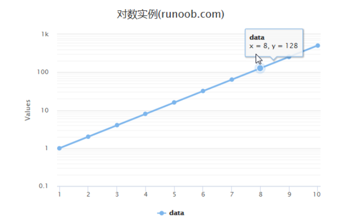
配置 yAxis.type 为 'logarithmic'。它定义了 x 轴类型。可选值有 "linear", "logarithmic", "datetime" 或 "category"。默认值为linear。
var title = {
      text: '对数实例(runoob.com)'
   };
   var xAxis = {
      tickInterval: 1
   };
   var yAxis = {
      type: 'logarithmic',
      minorTickInterval: 0.1
   };
   var tooltip = {
      headerFormat: '{series.name}
',
      pointFormat: 'x = {point.x}, y = {point.y}'
   };
   var plotOptions = {
      spline: {
         marker: {
            enabled: true
         }
      }
   };
   var series= [{
         name: 'data',
         data: [1, 2, 4, 8, 16, 32, 64, 128, 256, 512],
         pointStart: 1
      }
   ];

   var json = {};
   json.title = title;
   json.tooltip = tooltip;
   json.xAxis = xAxis;
   json.yAxis = yAxis;
   json.series = series;
   json.plotOptions = plotOptions;
   $('#container').highcharts(json);

});
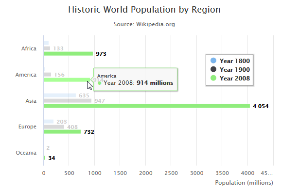
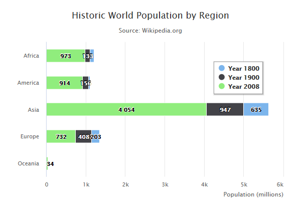
设置 chart 的 type 属性 为 bar ,chart.type 描述了图表类型。默认值为 "line"。
var chart = {
      type: 'bar'
   };
   var title = {
      text: 'Historic World Population by Region'
   };
   var subtitle = {
      text: 'Source: Wikipedia.org'
   };
   var xAxis = {
      categories: ['Africa', 'America', 'Asia', 'Europe', 'Oceania'],
      title: {
         text: null
      }
   };
   var yAxis = {
      min: 0,
      title: {
         text: 'Population (millions)',
         align: 'high'
      },
      labels: {
         overflow: 'justify'
      }
   };
   var tooltip = {
      valueSuffix: ' millions'
   };
   var plotOptions = {
      bar: {
         dataLabels: {
            enabled: true
         }
      }
   };
   var legend = {
      layout: 'vertical',
      align: 'right',
      verticalAlign: 'top',
      x: -40,
      y: 100,
      floating: true,
      borderWidth: 1,
      backgroundColor: ((Highcharts.theme && Highcharts.theme.legendBackgroundColor) || '#FFFFFF'),
      shadow: true
   };
   var credits = {
      enabled: false
   };

   var series= [{
         name: 'Year 1800',
            data: [107, 31, 635, 203, 2]
        }, {
            name: 'Year 1900',
            data: [133, 156, 947, 408, 6]
        }, {
            name: 'Year 2008',
            data: [973, 914, 4054, 732, 34]
        }
   ];

   var json = {};
   json.chart = chart;
   json.title = title;
   json.subtitle = subtitle;
   json.tooltip = tooltip;
   json.xAxis = xAxis;
   json.yAxis = yAxis;
   json.series = series;
   json.plotOptions = plotOptions;
   json.legend = legend;
   json.credits = credits;
   $('#container').highcharts(json);

});
配置图表堆叠使用 plotOptions.series.stacking,并设置为 "normal"。
如果禁用堆叠可设置为 null , "normal" 通过值设置堆叠, "percent" 堆叠则按百分比。
var plotOptions = {
      bar: {
         dataLabels: {
            enabled: true
         }
      },
      series: {
         stacking: 'normal'
      }
   };
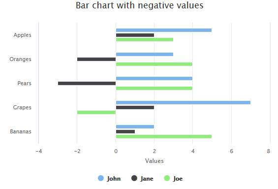
使用负值的,反向条形图。
var series= [{
      name: 'John',
            data: [5, 3, 4, 7, 2]
        }, {
            name: 'Jane',
            data: [2, -2, -3, 2, 1]
        }, {
            name: 'Joe',
            data: [3, 4, 4, -2, 5]
      }
   ];
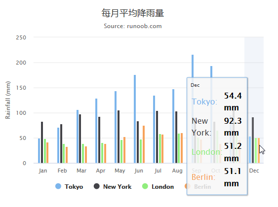
var chart = {
      type: 'column'
   };
   var title = {
      text: '每月平均降雨量'
   };
   var subtitle = {
      text: 'Source: runoob.com'
   };
   var xAxis = {
      categories: ['Jan','Feb','Mar','Apr','May','Jun','Jul','Aug','Sep','Oct','Nov','Dec'],
      crosshair: true
   };
   var yAxis = {
      min: 0,
      title: {
         text: '降雨量 (mm)'
      }
   };
   var tooltip = {
      headerFormat: '{point.key}',
      pointFormat: '' +
         '',
      footerFormat: '{series.name}: 	{point.y:.1f} mm',
      shared: true,
      useHTML: true
   };
   var plotOptions = {
      column: {
         pointPadding: 0.2,
         borderWidth: 0
      }
   };
   var credits = {
      enabled: false
   };

   var series= [{
        name: 'Tokyo',
            data: [49.9, 71.5, 106.4, 129.2, 144.0, 176.0, 135.6, 148.5, 216.4, 194.1, 95.6, 54.4]
        }, {
            name: 'New York',
            data: [83.6, 78.8, 98.5, 93.4, 106.0, 84.5, 105.0, 104.3, 91.2, 83.5, 106.6, 92.3]
        }, {
            name: 'London',
            data: [48.9, 38.8, 39.3, 41.4, 47.0, 48.3, 59.0, 59.6, 52.4, 65.2, 59.3, 51.2]
        }, {
            name: 'Berlin',
            data: [42.4, 33.2, 34.5, 39.7, 52.6, 75.5, 57.4, 60.4, 47.6, 39.1, 46.8, 51.1]
   }];

   var json = {};
   json.chart = chart;
   json.title = title;
   json.subtitle = subtitle;
   json.tooltip = tooltip;
   json.xAxis = xAxis;
   json.yAxis = yAxis;
   json.series = series;
   json.plotOptions = plotOptions;
   json.credits = credits;
   $('#container').highcharts(json);

});

var chart = {
       plotBackgroundColor: null,
       plotBorderWidth: null,
       plotShadow: false
   };
   var title = {
      text: '2014 年各浏览器市场占有比例'
   };
   var tooltip = {
      pointFormat: '{series.name}: {point.percentage:.1f}%'
   };
   var plotOptions = {
      pie: {
         allowPointSelect: true,
         cursor: 'pointer',
         dataLabels: {
            enabled: true,
            format: '{point.name}%: {point.percentage:.1f} %',
            style: {
               color: (Highcharts.theme && Highcharts.theme.contrastTextColor) || 'black'
            }
         }
      }
   };
   var series= [{
      type: 'pie',
      name: 'Browser share',
      data: [
         ['Firefox',   45.0],
         ['IE',       26.8],
         {
            name: 'Chrome',
            y: 12.8,
            sliced: true,
            selected: true
         },
         ['Safari',    8.5],
         ['Opera',     6.2],
         ['Others',   0.7]
      ]
   }];

   var json = {};
   json.chart = chart;
   json.title = title;
   json.tooltip = tooltip;
   json.series = series;
   json.plotOptions = plotOptions;
   $('#container').highcharts(json);
});
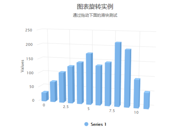
设置 chart 的 type 属性为 column,options3d 选项可设置三维效果。
var chart = {
      renderTo: 'container',
      type: 'column',
      margin: 75,
      options3d: {
         enabled: true,
         alpha: 15,
         beta: 15,
         depth: 50,
         viewDistance: 25
      }
   };
   var title = {
      text: '图表旋转实例'
   };
   var subtitle = {
      text: '通过拖动下面的滑块测试'
   };

   var plotOptions = {
      column: {
         depth: 25
      }
   };
   var series= [{
      data: [29.9, 71.5, 106.4, 129.2, 144.0, 176.0, 135.6, 148.5, 216.4, 194.1, 95.6, 54.4]
   }];

   var json = {};
   json.chart = chart;
   json.title = title;
   json.subtitle = subtitle;
   json.series = series;
   json.plotOptions = plotOptions;
   var highchart = new Highcharts.Chart(json);

   function showValues() {
      $('#R0-value').html(highchart.options.chart.options3d.alpha);
      $('#R1-value').html(highchart.options.chart.options3d.beta);
   }

   // Activate the sliders
   $('#R0').on('change', function () {
      highchart.options.chart.options3d.alpha = this.value;
      showValues();
      highchart.redraw(false);
   });
   $('#R1').on('change', function () {
      highchart.options.chart.options3d.beta = this.value;
      showValues();
      highchart.redraw(false);
   });

   showValues();
});
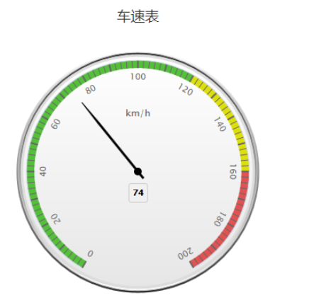
var chart = {
      type: 'gauge',
      plotBackgroundColor: null,
      plotBackgroundImage: null,
      plotBorderWidth: 0,
      plotShadow: false
   };
   var title = {
      text: '车速表'
   };

   var pane = {
      startAngle: -150,
      endAngle: 150,
      background: [{
         backgroundColor: {
            linearGradient: { x1: 0, y1: 0, x2: 0, y2: 1 },
            stops: [
               [0, '#FFF'],
               [1, '#333']
            ]
         },
         borderWidth: 0,
         outerRadius: '109%'
      }, {
         backgroundColor: {
            linearGradient: { x1: 0, y1: 0, x2: 0, y2: 1 },
            stops: [
               [0, '#333'],
               [1, '#FFF']
            ]
         },
         borderWidth: 1,
         outerRadius: '107%'
     }, {
         // default background
     }, {
         backgroundColor: '#DDD',
         borderWidth: 0,
         outerRadius: '105%',
         innerRadius: '103%'
     }]
   };

   // the value axis
   var yAxis = {
      min: 0,
      max: 200,

      minorTickInterval: 'auto',
      minorTickWidth: 1,
      minorTickLength: 10,
      minorTickPosition: 'inside',
      minorTickColor: '#666',

      tickPixelInterval: 30,
      tickWidth: 2,
      tickPosition: 'inside',
      tickLength: 10,
      tickColor: '#666',
      labels: {
         step: 2,
         rotation: 'auto'
      },
      title: {
         text: 'km/h'
      },
      plotBands: [{
         from: 0,
         to: 120,
         color: '#55BF3B' // green
      }, {
         from: 120,
         to: 160,
         color: '#DDDF0D' // yellow
      }, {
         from: 160,
         to: 200,
         color: '#DF5353' // red
      }]
   };

   var series= [{
        name: 'Speed',
        data: [80],
        tooltip: {
           valueSuffix: ' km/h'
        }
   }];

   var json = {};
   json.chart = chart;
   json.title = title;
   json.pane = pane;
   json.yAxis = yAxis;
   json.series = series;

   // Add some life
   var chartFunction = function (chart) {
      if (!chart.renderer.forExport) {
         setInterval(function () {
         var point = chart.series[0].points[0], newVal, inc = Math.round((Math.random() - 0.5) * 20);
         newVal = point.y + inc;
         if (newVal < 0 || newVal > 200) {
            newVal = point.y - inc;
         }
         point.update(newVal);
         }, 3000);
      }
   };

   $('#container').highcharts(json,chartFunction);
});
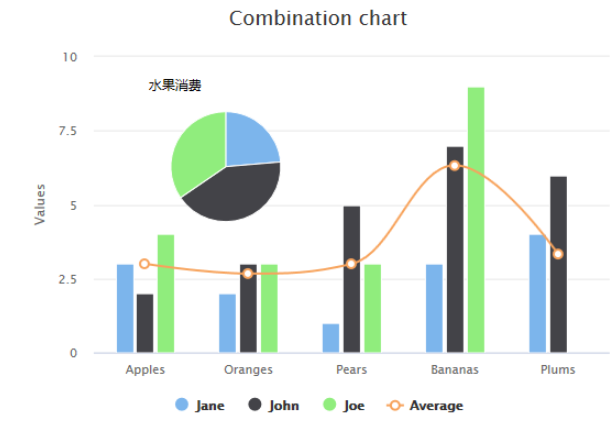
var title = {
      text: 'Combination chart'
   };
   var xAxis = {
      categories: ['Apples', 'Oranges', 'Pears', 'Bananas', 'Plums']
   };
   var labels = {
      items: [{
         html: '水果消费',
            style: {
               left: '50px',
               top: '18px',
               color: (Highcharts.theme && Highcharts.theme.textColor) || 'black'
            }
      }]
   };
   var series= [{
        type: 'column',
            name: 'Jane',
            data: [3, 2, 1, 3, 4]
        }, {
            type: 'column',
            name: 'John',
            data: [2, 3, 5, 7, 6]
        }, {
            type: 'column',
            name: 'Joe',
            data: [4, 3, 3, 9, 0]
        }, {
            type: 'spline',
            name: 'Average',
            data: [3, 2.67, 3, 6.33, 3.33],
            marker: {
                lineWidth: 2,
                lineColor: Highcharts.getOptions().colors[3],
                fillColor: 'white'
            }
        }, {
            type: 'pie',
            name: '总消费',
            data: [{
                name: 'Jane',
                y: 13,
                color: Highcharts.getOptions().colors[0] // Jane 的颜色
            }, {
                name: 'John',
                y: 23,
                color: Highcharts.getOptions().colors[1] // John 的颜色
            }, {
                name: 'Joe',
                y: 19,
                color: Highcharts.getOptions().colors[2] // Joe 的颜色
            }],
            center: [100, 80],
            size: 100,
            showInLegend: false,
            dataLabels: {
                enabled: false
            }
      }
   ];

   var json = {};
   json.title = title;
   json.xAxis = xAxis;
   json.labels = labels;
   json.series = series;
   $('#container').highcharts(json);
});
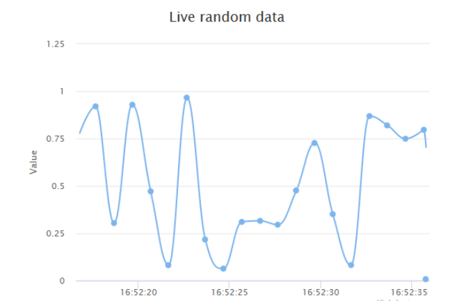
每秒更新曲线图
chart.event 属性中添加 load 方法(图表加载事件)。在 1000 毫秒内随机产生数据点并生成图表。
var chart = {
      type: 'spline',
      animation: Highcharts.svg, // don't animate in IE < IE 10.
      marginRight: 10,
      events: {
         load: function () {
            // set up the updating of the chart each second
            var series = this.series[0];
            setInterval(function () {
               var x = (new Date()).getTime(), // current time
               y = Math.random();
               series.addPoint([x, y], true, true);
            }, 1000);
         }
      }
   };
   var title = {
      text: 'Live random data'
   };
   var xAxis = {
      type: 'datetime',
      tickPixelInterval: 150
   };
   var yAxis = {
      title: {
         text: 'Value'
      },
      plotLines: [{
         value: 0,
         width: 1,
         color: '#808080'
      }]
   };
   var tooltip = {
      formatter: function () {
      return '' + this.series.name + '
' +
         Highcharts.dateFormat('%Y-%m-%d %H:%M:%S', this.x) + '
' +
         Highcharts.numberFormat(this.y, 2);
      }
   };
   var plotOptions = {
      area: {
         pointStart: 1940,
         marker: {
            enabled: false,
            symbol: 'circle',
            radius: 2,
            states: {
               hover: {
                 enabled: true
               }
            }
         }
      }
   };
   var legend = {
      enabled: false
   };
   var exporting = {
      enabled: false
   };
   var series= [{
      name: 'Random data',
      data: (function () {
         // generate an array of random data
         var data = [],time = (new Date()).getTime(),i;
         for (i = -19; i <= 0; i += 1) {
            data.push({
               x: time + i * 1000,
               y: Math.random()
            });
         }
         return data;
      }())
   }];

   var json = {};
   json.chart = chart;
   json.title = title;
   json.tooltip = tooltip;
   json.xAxis = xAxis;
   json.yAxis = yAxis;
   json.legend = legend;
   json.exporting = exporting;
   json.series = series;
   json.plotOptions = plotOptions;


   Highcharts.setOptions({
      global: {
         useUTC: false
      }
   });
   $('#container').highcharts(json);

});
关于“JavaScript图表插件highcharts怎么使用”的内容就介绍到这里了,感谢大家的阅读。如果想了解更多行业相关的知识,可以关注亿速云行业资讯频道,小编每天都会为大家更新不同的知识点。
亿速云「云服务器」,即开即用、新一代英特尔至强铂金CPU、三副本存储NVMe SSD云盘,价格低至29元/月。点击查看>>
免责声明:本站发布的内容(图片、视频和文字)以原创、转载和分享为主,文章观点不代表本网站立场,如果涉及侵权请联系站长邮箱:is@yisu.com进行举报,并提供相关证据,一经查实,将立刻删除涉嫌侵权内容。


 计算
计算 安全
安全 数据库
数据库 网络和加速
网络和加速 企业服务
企业服务


