本文小编为大家详细介绍“怎么用Vue+Echarts实现简单折线图”,内容详细,步骤清晰,细节处理妥当,希望这篇“怎么用Vue+Echarts实现简单折线图”文章能帮助大家解决疑惑,下面跟着小编的思路慢慢深入,一起来学习新知识吧。
Vue+Echarts实现一个折线图,打开vue的项目:
1、在项目里面安装echarts
npm install echarts --save
2、在需要用图表的地方引入
import echarts from 'echarts'
3、打开my.vue
继续写代码,代码如下:
<template>
    <!--为echarts准备一个具备大小的容器dom-->
    <div id="main" ></div>
</template>
<script>
    import echarts from 'echarts'
    export default {
        name: '',
        data() {
            return {
                charts: '',
            /*  opinion: ["1", "3", "3", "4", "5"],*/
                opinionData: ["3", "2", "4", "4", "5"]
            }
        },
        methods: {
            drawLine(id) {
                this.charts = echarts.init(document.getElementById(id))
                this.charts.setOption({
                    tooltip: {
                        trigger: 'axis'
                    },
                    legend: {
                        data: ['近七日收益']
                    },
                    grid: {
                        left: '3%',
                        right: '4%',
                        bottom: '3%',
                        containLabel: true
                    },

                    toolbox: {
                        feature: {
                            saveAsImage: {}
                        }
                    },
                    xAxis: {
                        type: 'category',
                        boundaryGap: false,
                    data: ["1","2","3","4","5"]

                    },
                    yAxis: {
                        type: 'value'
                    },

                    series: [{
                        name: '近七日收益',
                        type: 'line',
                        stack: '总量',
                        data: this.opinionData
                    }]
                })
            }
        },
        //调用
        mounted() {
            this.$nextTick(function() {
                this.drawLine('main')
            })
        }
    }
</script>
<style scoped>
    * {
        margin: 0;
        padding: 0;
        list-style: none;
    }
</style>
这个时候,可以看到,加载出的折线图了,后面可以继续进行完善。
这是最基本的折线图,里面的折线点需要替换的话,要注意一些事情
如下代码 所示
<template>
<!--为echarts准备一个具备大小的容器dom-->
<div id="main" ></div>
</template>
<script>
import {getorder} from '../api/api.js'
import echarts from 'echarts'
export default {
name: '',
data() {
return {
charts: '',
/* opinion: ["1", "3", "3", "4", "5"],*/
//opinionData: ["3", "2", "4", "4", "5"]
opinionData: [],
temp:[],
id:1,
}
},
methods: {
drawLine(id) {
// 前端向后端发送请求,获取数据(折线点)
// 发送请求 要写在drawLine方法里面,不然的话 opinionData 赋予不上数据,做无用功
// params 里面的是 要向后端传递的一些参数,为了获取数据库中的数据,要替换成你自己的参数
let params = {typ:9,id:this.id}
// 这是我个人的 axios 封装,有兴趣的话,可以看我 axios 封装的文章
getorder(params).then((result)=>{
this.temp = result.data.tempdic
// console.log(this.temp)
// 进行赋值
for (let i = 0; i < this.temp.length; i++) {
var str = ''
str += this.temp[i].temp
this.opinionData.push(str)
// console.log(this.temp[i].temp)
}
// 折线图 自带的代码
this.charts = echarts.init(document.getElementById(id))
this.charts.setOption({
tooltip: {
trigger: 'axis'
},
legend: {
data: ['温度展示']
},
grid: {
left: '3%',
right: '4%',
bottom: '3%',
containLabel: true
},
toolbox: {
feature: {
saveAsImage: {}
}
},
xAxis: {
type: 'category',
boundaryGap: false,
data: []
},
yAxis: {
type: 'value',
},
series: [{
name: '温度展示',
type: 'line',
stack: '总量',
data: this.opinionData
}]
})
})
}
},
//调用
mounted() {
this.$nextTick(function() {
this.drawLine('main')
})
}
}
</script>
<style scoped>
* {
margin: 0;
padding: 0;
list-style: none;
}
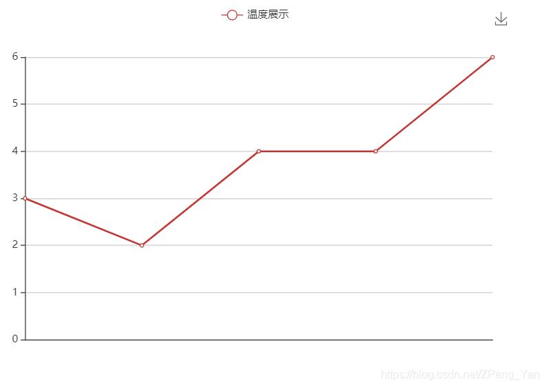
</style>读到这里,这篇“怎么用Vue+Echarts实现简单折线图”文章已经介绍完毕,想要掌握这篇文章的知识点还需要大家自己动手实践使用过才能领会,如果想了解更多相关内容的文章,欢迎关注亿速云行业资讯频道。
免责声明:本站发布的内容(图片、视频和文字)以原创、转载和分享为主,文章观点不代表本网站立场,如果涉及侵权请联系站长邮箱:is@yisu.com进行举报,并提供相关证据,一经查实,将立刻删除涉嫌侵权内容。


