小编给大家分享一下怎么用CSS3和table标签实现一个圆形轨迹的动画,相信大部分人都还不怎么了解,因此分享这篇文章给大家参考一下,希望大家阅读完这篇文章后大有收获,下面让我们一起去了解一下吧!
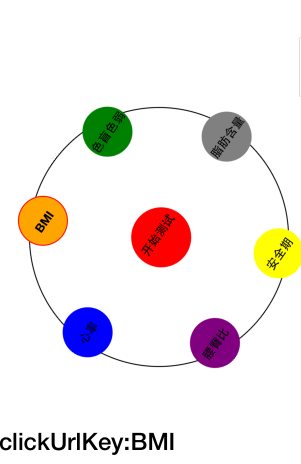
html:其实就是根据table标签把几个实心圆div进行等边六角形的排布,并放入一个div容器中,然后利用CSS3的循环旋转的动画效果对最外层的div容器进行自转实现,当然不要忘了把div容器的外边框设置圆形弧度的。
<div class="animation_div">
        <table class="table_class">
            <tr>
                <td></td>
                <td>
                    <div class="BMI" ng-click="compriseClicked('BMI')" ng-class="{isSelected:clickUrlKey=='BMI'}">
                        <strong>BMI</strong>
                    </div>
                </td>
                <td></td>
                <td>
                    <div class="color_blind" ng-click="compriseClicked('color_blind')" ng-class="{isSelected:clickUrlKey=='color_blind'}">
                        <strong>色盲色弱</strong>
                    </div>
                </td>
                <td></td>
            </tr>
            <tr>
                <td>
                    <div class="space_div"></div>
                </td>
            </tr>
            <tr>
                <td>
                    <div class="HR" ng-click="compriseClicked('HR')" ng-class="{isSelected:clickUrlKey=='HR'}">
                        <strong>心率</strong>
                    </div>
                </td>
                <td></td>
                <td>
                    <a href="#/app/custom_made/counselor/{{clickUrlKey}}" style="text-decoration: none;
                        color: black;">
                        <div class="start_test">
                            <strong>开始测试</strong>
                        </div>
                    </a>
                </td>
                <td></td>
                <td>
                    <div class="fat_content" ng-click="compriseClicked('fat_content')" ng-class="{isSelected:clickUrlKey=='fat_content'}">
                        <strong>脂肪含量</strong>
                    </div>
                </td>
            </tr>
            <tr>
                <td>
                    <div class="space_div"></div>
                </td>
            </tr>
            <tr>
                <td></td>
                <td>
                    <div class="WHR" ng-click="compriseClicked('WHR')" ng-class="{isSelected:clickUrlKey=='WHR'}">
                        <strong>腰臀比</strong>
                    </div>
                </td>
                <td></td>
                <td>
                    <div class="safe_period" ng-click="compriseClicked('safe_period')" ng-class="{isSelected:clickUrlKey=='safe_period'}">
                        <strong>安全期</strong>
                    </div>
                </td>
                <td></td>
            </tr>
        </table>
    </div>

<h4>clickUrlKey:{{clickUrlKey}}</h4>css:因为在圆形的轨迹中有6个实心圆,分别设置了不同的类以方便自定义,所以当中实心圆的样式设置有重复的地方,还可以进行优化,在这就先不处理了
<style>
      /*定义动画*/

      @-webkit-keyframes round_animation {
          0%{
              -webkit-transform:rotate(0deg);
              width:260px;
              height:260px;
          }
          100%{
              -webkit-transform:rotate(360deg);
              width:260px;
              height:260px;
              left:0px;
              top:0px;
          }
      }

      /*定义外框的样式*/
      /*调用动画并设置动画的参数*/

      .animation_div {
          -webkit-transform-origin:center center;                       /*定义旋转中心点*/
          -webkit-animation:round_animation 15s infinite alternate;     /*infinite alternate表示循环播放动画*/

          margin: 60px auto;
          width:260px;
          height:260px;
          border: 1px solid black;
          border-radius: 130px;
          left:0px;
          top:0px;
      }

      .animation_div strong {
          font-size: 12px;
      }

      .BMI {
          width: 50px;
          height: 50px;
          background-color: orange;
          border-radius: 100px;
          text-align: center;

          /*文字垂直居中*/
          vertical-align: middle;
          line-height: 50px;
      }

      .color_blind {
          width: 50px;
          height: 50px;
          background-color: green;
          border-radius: 100px;
          text-align: center;

          /*文字垂直居中*/
          vertical-align: middle;
          line-height: 50px;
      }

      .HR{
          margin-left: -15px;
          width: 50px;
          height: 50px;
          background-color: blue;
          border-radius: 100px;
          text-align: center;

          /*文字垂直居中*/
          vertical-align: middle;
          line-height: 50px;
      }

      .start_test {
          width: 60px;
          height: 60px;
          background-color: red;
          border-radius: 100px;
          text-align: center;

          /*文字垂直居中*/
          vertical-align: middle;
          line-height: 50px;
      }

      .fat_content {
          margin-left: 15px;
          width: 50px;
          height: 50px;
          background-color: gray;
          border-radius: 100px;
          text-align: center;

          /*文字垂直居中*/
          vertical-align: middle;
          line-height: 50px;
      }

      .WHR {
          width: 50px;
          height: 50px;
          background-color: purple;
          border-radius: 100px;
          text-align: center;

          /*文字垂直居中*/
          vertical-align: middle;
          line-height: 50px;
      }

      .safe_period {
          width: 50px;
          height: 50px;
          background-color: yellow;
          border-radius: 100px;
          text-align: center;

          /*文字垂直居中*/
          vertical-align: middle;
          line-height: 50px;
      }

      .space_div {
          width: 50px;
          height: 50px;
          background-color: clear;
          border-radius: 100px;
      }

      .rightmenu_btn {
          height: 60px;
          float: none;
      }

      .rightmenu_btn button {
          margin-top: 50px;
          width: 20px;
          height: 60px;
          border: 1px solid rgb(221, 221, 221);
          border-right: 0px;
          float: right;
      }

      .isSelected {
          border: 1px solid red;
      }
</style>JS:这里的代码可以不实现,因为这跟动画的效果无关,是一个点击的响应事件
angular.module('starter.controllers', [])
    .controller('healthCtrl', function($scope, $location) {
        $scope.clickUrlKey = "BMI";
        $scope.compriseClicked = function(clickUrlKey) {
            $scope.clickUrlKey = clickUrlKey;
        };
})效果图如下:
以上是“怎么用CSS3和table标签实现一个圆形轨迹的动画”这篇文章的所有内容,感谢各位的阅读!相信大家都有了一定的了解,希望分享的内容对大家有所帮助,如果还想学习更多知识,欢迎关注亿速云行业资讯频道!
亿速云「云服务器」,即开即用、新一代英特尔至强铂金CPU、三副本存储NVMe SSD云盘,价格低至29元/月。点击查看>>
免责声明:本站发布的内容(图片、视频和文字)以原创、转载和分享为主,文章观点不代表本网站立场,如果涉及侵权请联系站长邮箱:is@yisu.com进行举报,并提供相关证据,一经查实,将立刻删除涉嫌侵权内容。
原文链接:https://www.jb51.net/css/655434.html


 计算
计算
 安全
安全 数据库
数据库 网络和加速
网络和加速 企业服务
企业服务


